.jpeg)
To build eye-catching websites, we use the modern flexbox layout.
But flexbox is also an integral part of React Native. By default, flexbox is included in React Native.
In this post, we'll first look into the basics of flexbox. After that, we'll look into the differences with flexbox between mobile apps and websites. We'll also look at some examples using flexbox.
To follow along, you should have a basic knowledge of React Native. It'd also be good to have a basic knowledge of flexbox on the web.
Initial Setup
For this project, we'll use React Native CLI. There are different setup steps for different operating system—Windows or Mac—and different platforms—iOS or Android. These are clearly mentioned in the tool's official documents.
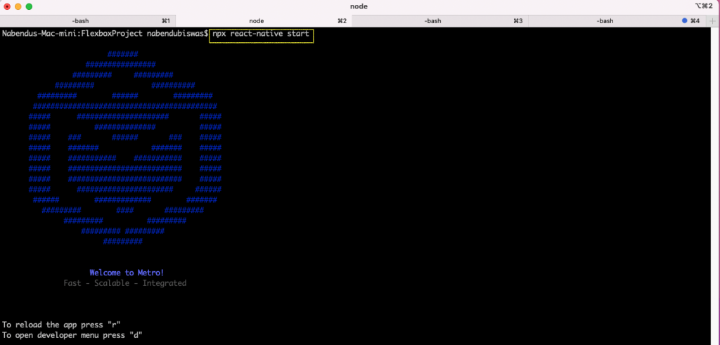
Once the setup is done, we need to create a new React Native project. From the terminal, give the command npx react-native init <project-name> to create a new project.
npx react-native init FlexboxProject
The Flexbox Project
Once the installation is done, change to the directory and run the command npx react-native start. This will show the screen below if everything is sucessful:
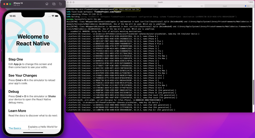
To start a React Native project, we need to run npx react-native run-ios in another terminal. If sucessful, it'll show us the emulator.
Basic Setup
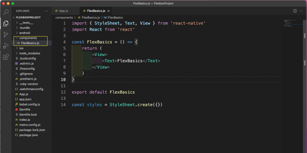
First, create a components folder in the root directory. Create a file called FlexBasics.js inside it and put the basic content in it for now.
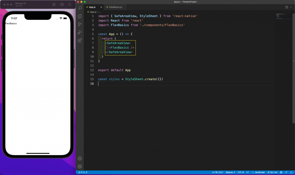
Next, we'll remove all of the code from the app.js file.
In that file, we're rendering the FlexBasics component from inside a SafeAreaView. It'll also look like this in our iPhone emulator:
Flexbox Basics
We'll start with our code in the FlexBasics.js file. As with its web counterpart, flexbox is always applied on the parent. Here, we have a parent view with styles of container. It contains three child views with styles of a box.
Now, with mobile we don't have to give display: flex; it's automatically a flexbox layout.
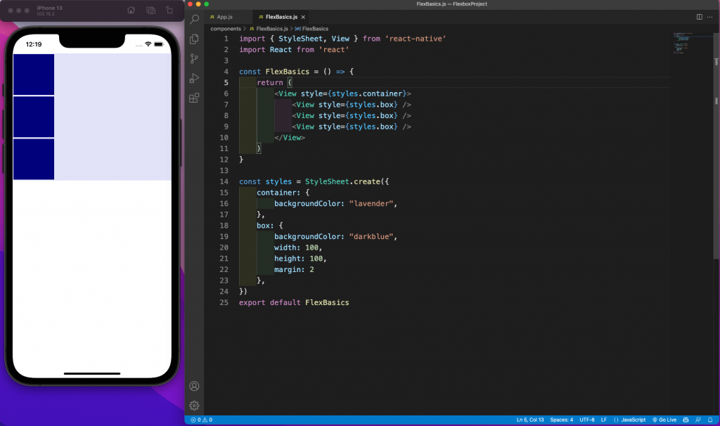
The boxes are aligned vertically in the emulator above because the flex direction is column by default. On the web, it's row by default and we'll get the opposite result.
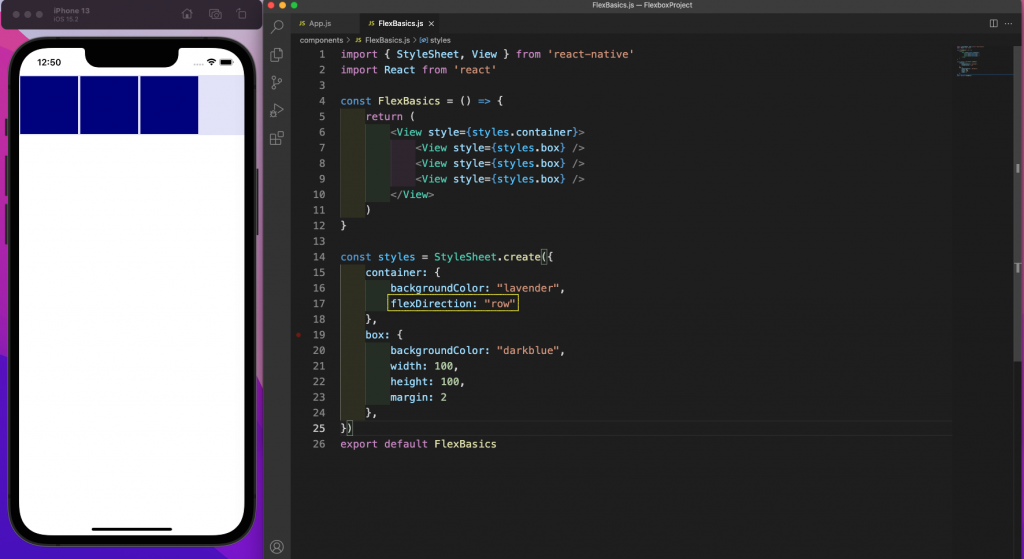
Now, make the flexDirection say "row" and the boxes will move next to each other.
Child Property of Flex
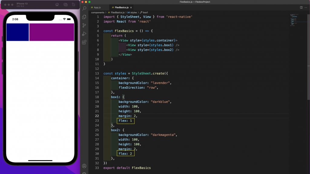
The property of flex is applied to children in flexbox. In the code in FlexBasics.js, it'll be applied to the internal views.
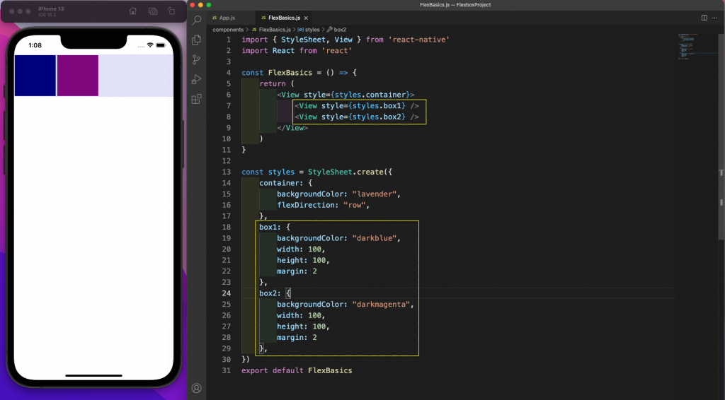
Here, we've updated our code to have two boxes. They have different styles: box1 and box2.
We've also given them different colors. Now, our boxes on the emulator look like this:
The property of flex is about distributing the free space. As from the emulator above, we can see a lot of empty space. Now, we've given box1 a flex:1 property and box2 a flex: 2 property.
In the emulator we can see that box2 is taking up twice the space as box1. One thing to notice is that only the free space is divided.
Property of JustifyContent
This property is used to give the alignment along the main axis. Now, when the flexDirection is a column, the main axis is top to bottom. When the flexDirection is a row, the main axis is left to right.
Since mobile layouts are mainly vertical, we'll look into cases of flexDirection as a column. To do this, first create a new Alignments.js file inside the components folder. We'll also add the same in the app.js file.
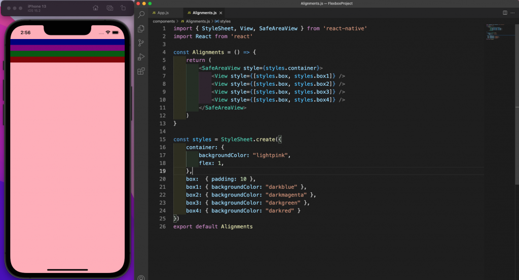
Now, in the Alignments.js file, add the content below. Notice that we've made the parent container of SafeAreaView a flex:1. This is generally taken in all React Native code to make the style expand to a whole view.
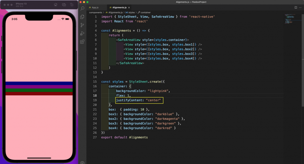
Next, all of the children elements of view have a padding of 10, as well as different colors. If we don't give any justifyContent property, the value of flex-start will be taken. In that case, all elements will appear at the start.
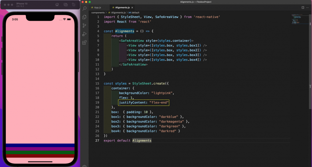
Now, we'll give the justifyContent property as flex-end. With this, all elements will shift to the end of the container.
Next, we'll give the justifyContent property as center, and all elements will move to the center of the container.
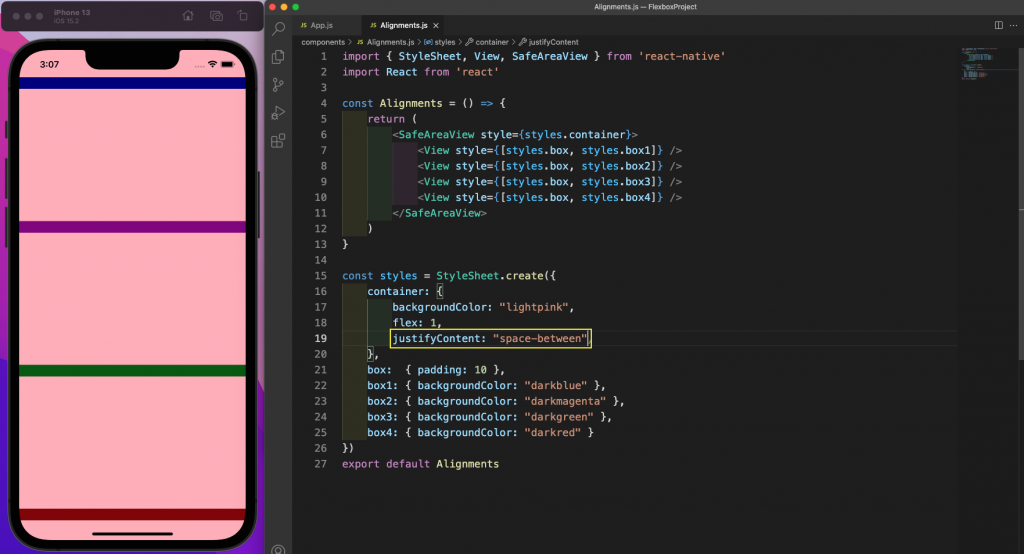
Next, we'll give the justifyContent property as space-between. With this command, the first and last elements will be at the end, with all elements being distributed equally.
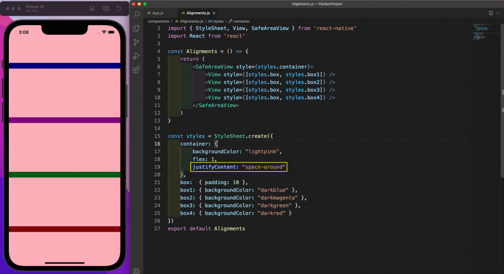
After that, we'll give the justifyContent property as space-around. With this, the first and last elements will have some space at the end, and all elements will be distributed equally.
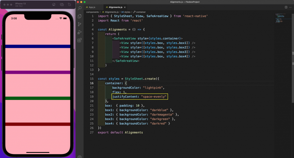
Lastly, we'll give the justifyContent property as space-evenly. This will distribute all elements equally.
Property of AlignItem
This property is used to give the alignment along the cross axis. When the flexDirection is a column, the cross axis is from left to right, and when the flexDirection is a row, the cross axis is from top to bottom.
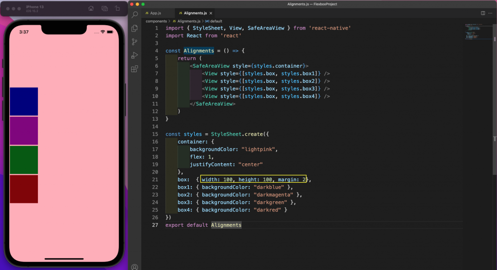
In the Alignments.js file, we've given width, height, and margin to the boxes. If we don't give alignItems, flex-start is used by default. All the elements are at the left side of the screen.
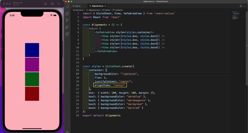
Now, we'll give the alignItems property as center, and all elements will shift to the center of the container.
Next, we'll give the alignItems property as flex-end. With this, all elements will shift to the end of the container.
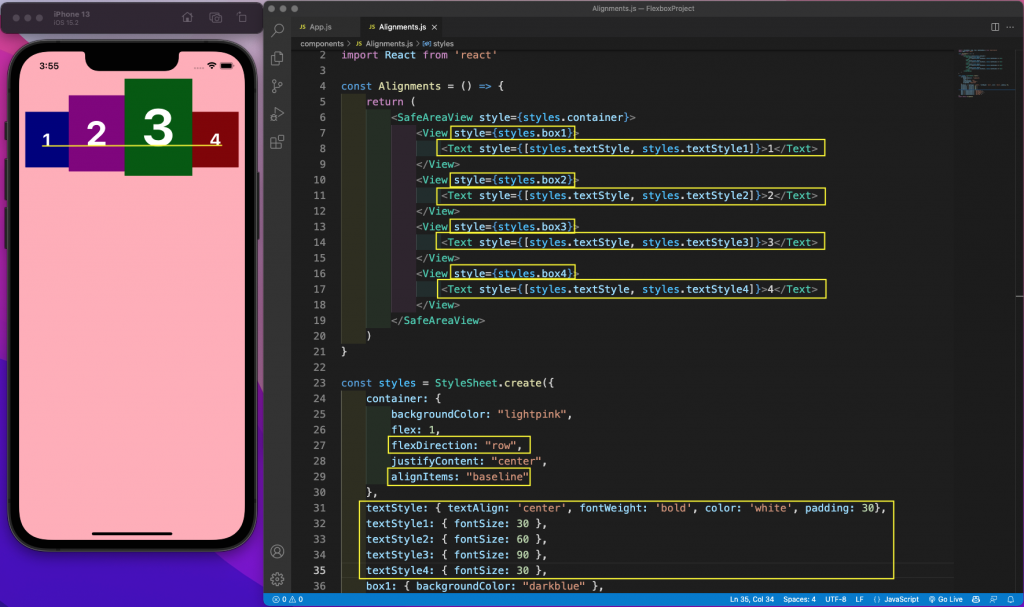
We'll see the property of baseline. For this, we'll change the flexDirection to row. We've also added text of different sizes inside the view. With the property of baseline, all of the bases of the text are alligned.
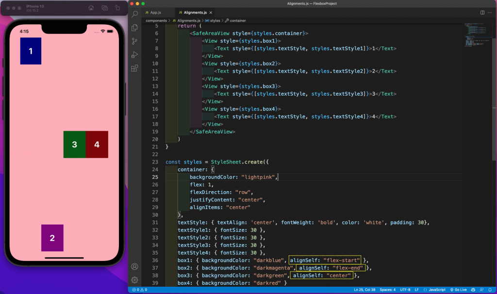
Property of AlignSelf
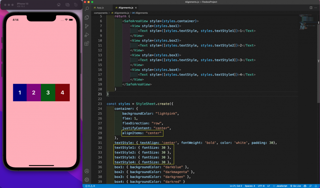
This property is similar to alignItems, but it's used to set individual cross-axis properties of children. To see this in action, we'll change the code used earlier to have alignItems as center. We've also changed all text to have the same font size.
Then, we'll add the alignSelf property on three individual boxes and their alignment will be changed. The cross axis goes from top to bottom because flexDirection is set to row.
In this case, box1 and box2 are moving to start and end, respectively. Box3 remains at the center. We also have a property of baseline in alignSelf.
Differences Between Mobile and Web
Now that we've learned about some of the features with React Native flexbox, let's look at some of the differences between mobile and web.
Unlike React Native, the default layout of the web is not flexbox.
By default, flexDirection is a row on the web while it's a column in React Native.
The alignContent default is stretch for web, but it's flex-start for React Native.
Additionally, we have a long form in the flex property, which has flexShrink property. This refers to the ability to shrink in the case of less space. It defaults to 1 on the web and 0 in React Native.
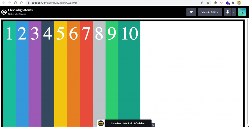
Now, let's see a simple example in a website. Here, we've created a simple flexbox code in an online editor. Notice that we have to make the parent as display: flex.
Here, the flex-direction is row by default. So, alignItems will be on the cross axis of top to bottom.
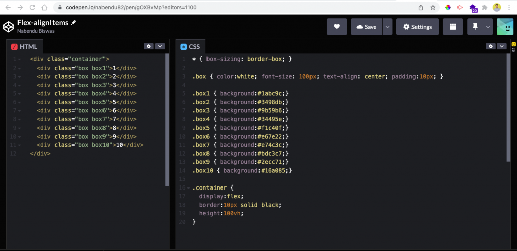
Here, we're not taking anything from alignItems. But all items are stretched because alignItems is stretch by default.
As we've seen earlier in the Alignments.js file, if we don't give alignItems, flex-start is used by default. As told earlier, we're also not mentioning display: flex in the container.
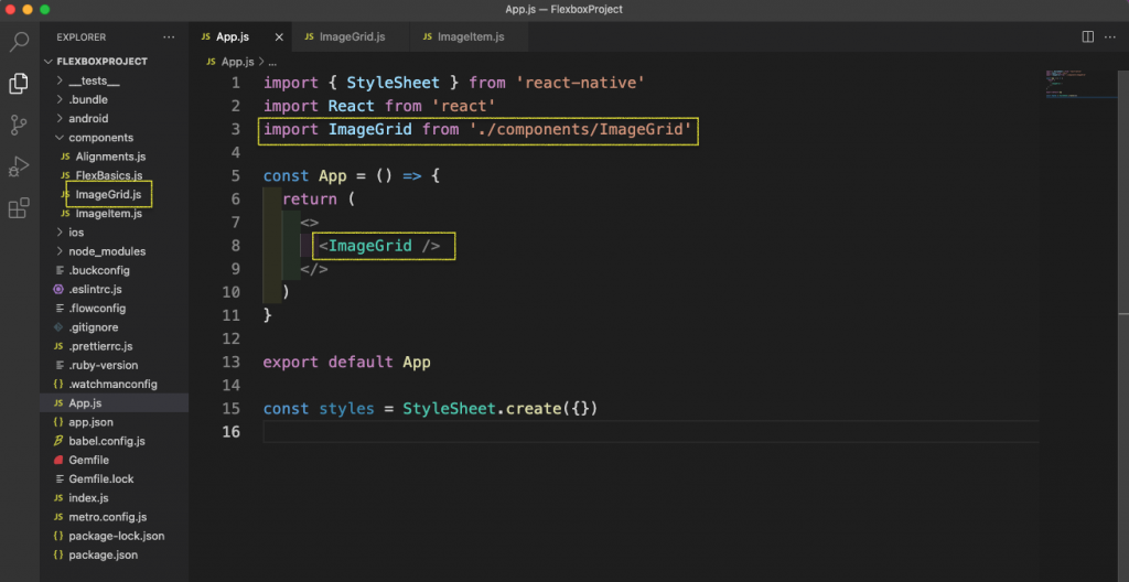
Creating an Image Grid
Now, we'll learn to create a simple image grid using flexbox. We'll first create a new component called ImageGrid and import it in the app.js file.
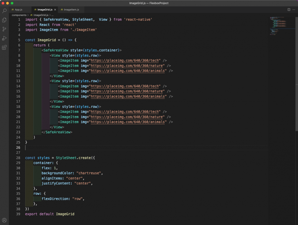
Next, in the ImageGrid.js file, we'll add the content below.
Here, we have a parent component of SafeAreaView, which we made flex: 1. We've also used alignItems and justifyContent set to center. This'll have everything placed at the center.
The SafeAreaView has three children elements of view.
Let's make flexDirection a row. Each of them has three children, and they'll be placed in a row.
Now, we're sending different images to a new ImageItem component.
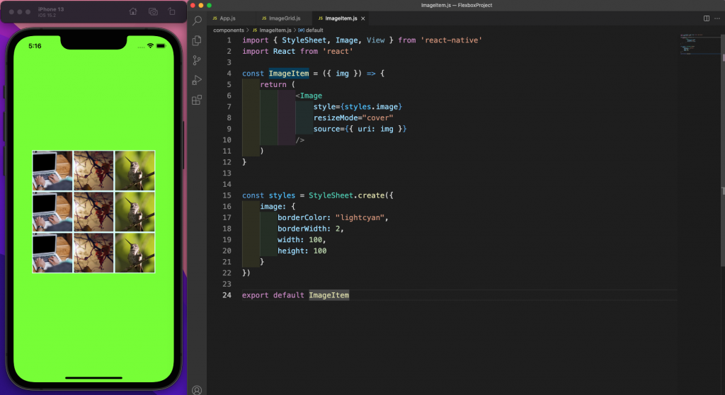
Next, create an ImageItem.js file in the components folder and add the content below in it.
Here, we're using the Image component from React Native to display the images, passed as props.
As seen in the emulator, we're getting a nice image gallery with different images.
Background Image With Text
Next, we'll create a simple component that'll show a background image with centered text. We'll first create a new component called BackgroundImg.js and import it into the app.js file.
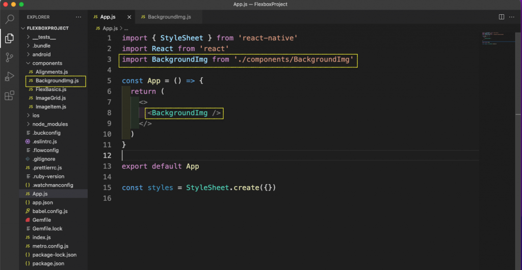
Next, in the BackgroundImg.js file, we'll add the content below.
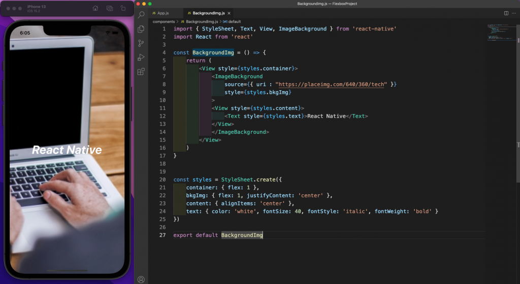
Here, we have a parent component of view that we made flex: 1. After that, we'll use ImageBackground from React Native. The ImageBackground component allows text to be passed in it. This text is displayed over the image.
Now, in this ImageBackground component, we've also used justifyContent as center and flex: 1. This'll have everything placed at the center and make it expand across the whole page.
Then, we're centering the text by giving a style of alignItems of center.
Testing the App
Now, it's time to test our app. We'll use snapshot testing with Jest.
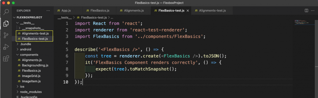
First, in the __tests__ folder, remove the file called app-test.js. Inside the __tests__ folder, add the two files called FlexBasics-test.js and Alignments-test.js.
In the FlexBasics-test.js file, add the content below. In this test, we're matching all the tags within our component to those rendered on the emulator.
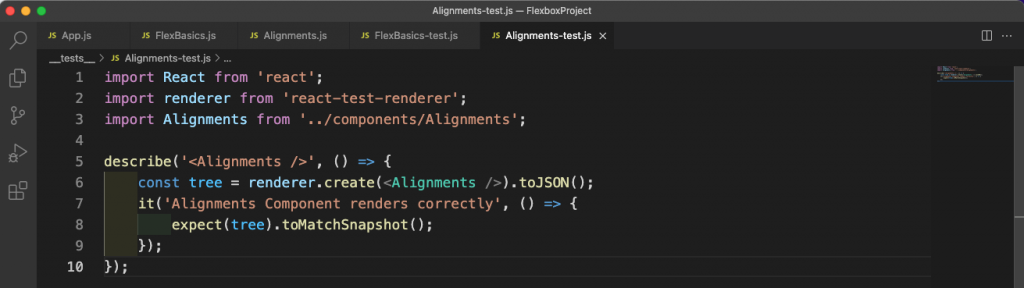
Similarly, in the Alignments-test.js file, add the content below. Here we're also matching all the tags within our component to those rendered on the emulator.
Now, to run the test from the terminal, give the command npm run test.
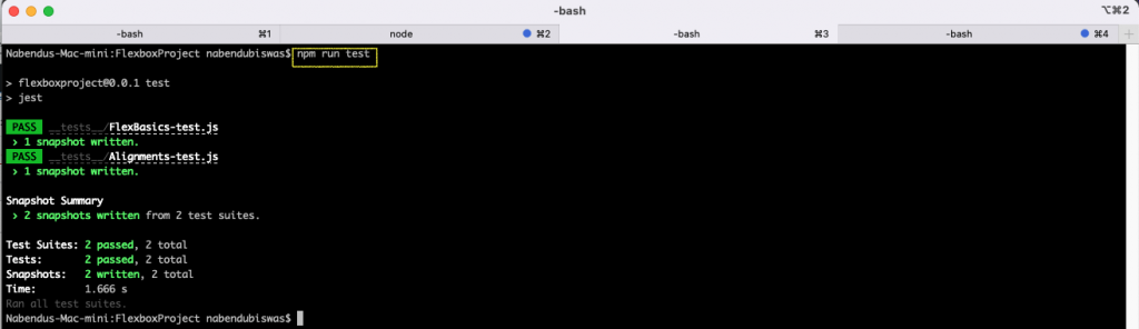
As seen above, all of our test cases ran successfully.
If we add the BackgroundImg, ImageGrid, and ImageItem to the testing, it would require writing a complicated test case.
However, we can use Waldo instead of writing all test cases manually.
Waldo is a no-code testing platform in which we just need to upload the APK or IPA file. After that, we need to test the app by interacting with it. Then, it will automatically produce tests.
So, go ahead and create a free Waldo account here.
Conclusion
In this post, we've learned about flexbox in React Native.
First, we've learned about flexbox basics in React Native. We've also covered the child property of flex, as well as the important properties of justifyContent, alignItems, and alignSelf.
Additionally, we've learned about the differences in flexbox across the web and mobile with React Native.
Finally, we saw these things in practice by completing two small layouts for Image Grid and entering text within an image.
We tested our app through Jest, and learned that we also can test our app with the no-code testing platform Waldo.
Automated E2E tests for your mobile app
Get true E2E testing in minutes, not months.