.jpeg)
Today we'll go through some fundamentals and talk about React Native flexbox in general and justifyContent specifically so that you can have a solid ground for working with UI layouts in React Native.
First, we'll explain what a flexbox is and why it exists. Then we'll go through some of the basics of the layout system React Native uses. Following that, we'll focus on the justifyContent property for flexbox, what it is, and how it works. Finally, we'll teach you how to properly use the justifyContent property so you can lay out content effectively.
Before that, though, we want to make sure that you're ready to get into some coding in React Native. And to do that, we want you to create your own React Native project. This project will be the playground where you can test the concepts explored in this article.
If you already know how to create a React Native project, feel free to skip the next section.
Otherwise, let's get into it, shall we?
Starting on React Native
Alright, so in order to get you up and running, we want to make sure your environment is ready. So, here's a brief setup guide for React Native.
Necessary tools:
- Expo CLI command line utility
- NodeJS runtime
- Visual Studio Code (or your code editor of choice)
Setup
Ok, so first things first. Install NodeJS.
You can go to the official NodeJS portal and download the installer there or use the package manager within your OS. For example, if you use macOS, you can use homebrew in the terminal and input the following command to install NodeJS:
Next, you need to install the Expo CLI command tool. To do that, input the following command on the terminal:
Lastly, proceed to install Visual Studio Code or use your code editor of choice. Here's the installer if you need it.
Creating a New Project
To create a new project, all you have to do is use the scaffolding tool in Expo. Type the following command and let Expo know what type of project you want to create.
You can change MyProject to anything you like.
Now, to start your newly created project, input the following command and select the target platform:
And you're good to go.
Understanding Flexbox in React Native
Flexbox is a layout model designed originally for the web, and CSS in particular, to structure and position elements on a web page more efficiently and comprehensively. Its purpose is to replace the previous block and inline layout model used in website styling.
Moreover, flexbox was designed as a one-dimensional layout model to offer space distribution between items in an interface and powerful alignment capabilities. And when I say one-dimensional, I'm referring to the fact that flexbox handles layout one dimension at a time, either by row or column.
The main advantage of flexbox is that it allows responsive elements within a container to be automatically arranged depending on the screen size and orientation. This behavior, and the fact that it is already an established technology, make it the ideal layout model mechanism for mobile technologies like React Native, which adopted it to create layouts on multiple platforms.
.png)
React Native Layout Basics
The basics of the flexbox layout model rely on the flex property rule, which defines how your components will fill the available space in a container. As the Mozilla development documents state, "When working with flexbox you need to think in terms of two axes — the main axis and the cross axis. The main axis is defined by the flex-direction property, and the cross axis runs perpendicular to it. Everything we do with flexbox refers back to these axes, so it is worth understanding how they work from the outset."
Let's illustrate with an example.
This code renders the following:

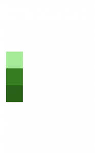
Here you can see that the green boxes are aligning vertically under the y-axis, which, unlike on the web, is the default axis in React Native. Also, the proportion of space occupied by the items is determined by calculating the value distribution of elements. So, if 1+2+3=6, the first element occupies 1/6 of the total, the second 2/6, and the third 3/6.
.png)
Now, change the value of the 'flexDirection' property to 'row' and see what happens.
As you can see, the 'flexDirection' property determines the axis used by the flex model. You can choose between 'column', 'row', 'column-reverse', and 'row-reverse.'
Typically, to achieve more complex layout arrangements, you would use a combination of the 'flexDirection,' 'alignItems,' and 'justifyContent' properties.
React Native justifyContent 101
The 'justifyContent' property describes how flexbox aligns child elements within the main axis of a container. If a container's child components flow vertically, the 'justifyContent' property governs how they align vertically. This property essentially emulates the behavior of the justify content rule in CSS.
The following are options available for the 'justifyContent' flexbox property:
- flex-start indicates that child components must align at the start of the container's main axis.
- flex-end indicates that child components must align at the end of the container's main axis.
- center indicates that child components must align at the center of the container's main axis.
- space-between indicates that child components must align evenly across the container's main axis, distributing any remaining space between elements.
- space-around indicates that child components must align evenly across the container's main axis, distributing any remaining space around the children. Unlike the space-between option, space-around distributes space around elements equally, to the beginning of the first child and the end of the last child.
- space-evenly indicates that child components must distribute evenly within the alignment container along the main axis. In this case, however, the spacing between each pair of adjacent items is the same.
How to Use justifyContent in React Native
To illustrate how to use the 'justifyContent' flexbox property, let's modify the previous code.
This would render like the following:
Notice that the elements are centered vertically in this example and not horizontally. This is because the main axis is the y-axis. If you want to center your elements horizontally, you can do so by changing the 'flexDirection' property to 'row.'
Go ahead and do it.

Excellent.
Feel free to play with all the other options available and see how the code responds.
Conclusion
One of the most complicated aspects to grasp in the development world is UI structure and its quirks. Not only is it a tricky subject that requires a lot of unintuitive learning, but it is also easy to misinterpret, which can end up causing headaches later on.
Layout bugs are notoriously hard to address, especially in complex layouts comprising dozens and dozens of components and hundreds of style rules. This is even more common in technologies that use proprietary mechanisms for layout design that are convoluted and hard to navigate, like iOS's auto layout.
Sadly, not having a solid understanding of the fundamentals of UI layout is a common issue for many developers out there, and many teams lose a lot of productive hours and money for their clients because of it. That's why we recommend that you use testing solutions like Waldo's code-free testing platform. Waldo's solution can offer you tools to monitor and ensure the quality of your product.
You can check it out here.
Automated E2E tests for your mobile app
Get true E2E testing in minutes, not months.