In this article, we'll explore how to create an elegant and functional segmented control picker in SwiftUI. Not only will we learn what a segmented control is, but we'll also build a fully-featured Pokémon starter picker utilizing a segmented picker and have a test workflow to validate our work. That's right: By the end of this article, you'll have a nice and shiny application to validate your work, and you'll be able to pick your favorite Pokémon partner. Sweet!
I think it goes without saying, but if you don't yet have a background in Swift, you probably won't be able to follow this article. That said, I'll do a brief introduction to SwiftUI so everyone is on the same page.
You can find more articles introducing you to Swift on the blog index here.
Alright, let's get into it.
.png)
SwiftUI Introduction
SwiftUI is the evolution of the standards of UI design envisioned by Apple and specifically designed to work with the Swift language infrastructure. As a result, SwiftUI represents an entirely new mechanism for building app user interfaces by using code and intuitive design language. It's quite robust and easy to work with in iOS, macOS, and all the other Apple ecosystems.
As Apple states in its documentation, "SwiftUI provides views, controls, and layout structures for declaring your app's user interface. The framework provides event handlers for delivering taps, gestures, and other types of input to your app, and tools to manage the flow of data from your app's models down to the views and controls that users see and interact with."
A common SwiftUI project starts with two files in it: a ContentView.swift file and an <APP_NAME>App.swift file where APP_NAME is the name you used for the project.
SwiftUI views are defined in classes referred to as View Classes, and they follow a basic structure. A View struct defines the view structure and functionality, and a PreviewView struct serves as a helper for the emulator to display your work in real time.
Additionally, a variable of type View called "body" defines the body of the ContentView. Any modification to this variable will result in a visual change to the current view.
All new view classes typically contain a simple TextView element with the text "Hello World!".
If you want to learn more about the structure and logic that makes SwiftUI tic, I suggest you check out these other articles.
Let's move on.
What Is a Segmented Control?
You might be wondering why I've been referring to the segmented control as "segmented picker" or simply "picker." This is not a mistake on my part. Segmented controls in SwiftUI are quite literally just customized pickers.
So, what is a picker, then?
Well, in its simplest form, a picker is an interactive element that allows the user to pick a value from a list. You can see it in dropdowns, selectors, and, yes, segmented pickers.
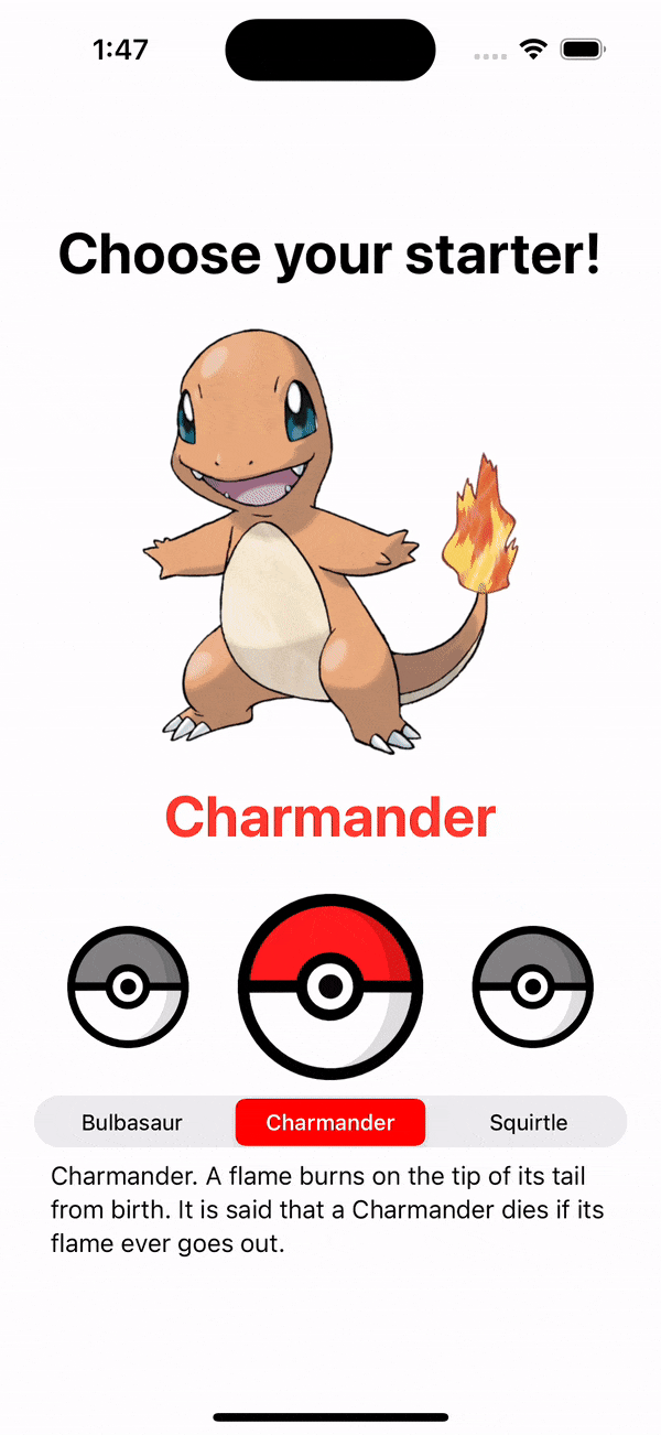
Visually, a segmented picker is just a horizontal element consisting of segments that work together as mutually exclusive options. You've interacted with many of them already, either to choose between tabs on a complex view structure or to indicate your gender in a simple form. The segmented pickers are one of the fundamental visual elements that Apple introduced in the early days of iOS.
Here's an example:
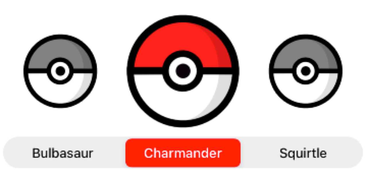
Wow, that looks pretty cool! So, how do we do that?
Funny you ask; I'm just about to walk you through it.
How to Implement a Segmented Control in SwiftUI
Alright, let's start with the basic class view structure we explained previously and create a simple picker.
Here, you'll first create an array containing the possible selections for the picker. You can do this as an array of strings that will hold the name of the three Pokémon starters.
Then, inside the body variable, create a Picker element with the following code:
Notice that we're using the values in the starters array to build multiple Text elements inside the Picker body. This is achieved with the ForEach helper function, which iterates through the array and provides both a value for the Text elements and a unique identifier for each selection. This is necessary so the Picker can adequately handle the selection of options by the user.
Additionally, we're using a state variable prefixed with the @State keyword to bind the state of the selection between views and classes. More on that later.
Finally, we're specifying the type of picker our element is with the pickerStyle() modifier and the segmented option.
And that's pretty much all you need for the most basic segmented pickers, really. As you can see, there's not much to it.
But we're not stopping here. Let's unleash all the power of this powerful tool.
Reading Values From a Segmented Control
First, let's ensure we capture the picker's selection to use it for something.
As I stated before, the selection is bound to the state variable called "choice." This variable will hold the selected value in memory, and Swift will update any element with this variable as a binding parameter. This mechanism is called state management and is one of the fundamentals of SwiftUI.
Apple expands: "When the value changes, SwiftUI updates the parts of the view hierarchy that depend on the value. Use state as the single source of truth for a given value stored in a view hierarchy. A State instance isn't the value itself; it's a means of reading and writing the value."
This mechanism makes it more manageable for developers to keep a cohesive view hierarchy and orchestrate the behavior of multiple views and elements in a complex app. Having a single source of truth also makes it easy to diagnose an issue with your app's behavior because you can track all the binding resources by the variable itself.
Passing State in a Segmented Control
Now that you have a state variable, adding more elements that can respond to the segmented picker is possible.
Modify the code with the following:
I know there's a lot more code there. Don't worry; I'll break it down.
First, we added two new functions below, typeColorOf() and dexEntryOf(). Depending on the value in the "choice" state variable, these functions return either a color or a description.
Next, we added some Text elements to display the chosen Pokémon information. Notice that they're also bound by the "choice" variable and will update accordingly.
Finally, we added an image of the chosen Pokémon. The image resources reside in the assets bundle and are named with the same strings as the starters array.
All these elements have some styling configurations set with their respective modifiers.
Now, let's customize the segmented picker itself.
How to Customize a Segmented Control in SwiftUI
Customizing a segmented picker in SwiftUI is tricky because some APIs are not available with modifiers. This might change in a future version of SwiftUI, but this is what we have now.
Update the code to the following:
Once again, we've added two more functions to aid the view's functionality, checkIs() and isPicked(). These functions merely provide a boolean response depending on the value passed.
Then, we added a second HStack that contains three Image elements. These are there to make the view more interactive. And as you can see, they each have an onTapGesture() modifier that updates the "choice" variable. This means that you can now also tap on the images to update the choice and the segmented picker will respond, too.
Finally, we added an init() method on the top to set up the properties of the segmented picker. This is the only way to modify the properties of the segmented control, like the selectedSegmentTintColor and setTitleTextAttributes. Aside from that, we also added some padding to the segmented picker with a modifier.
As you can see, everything remains very readable and easy to understand.
Now, check out your work.
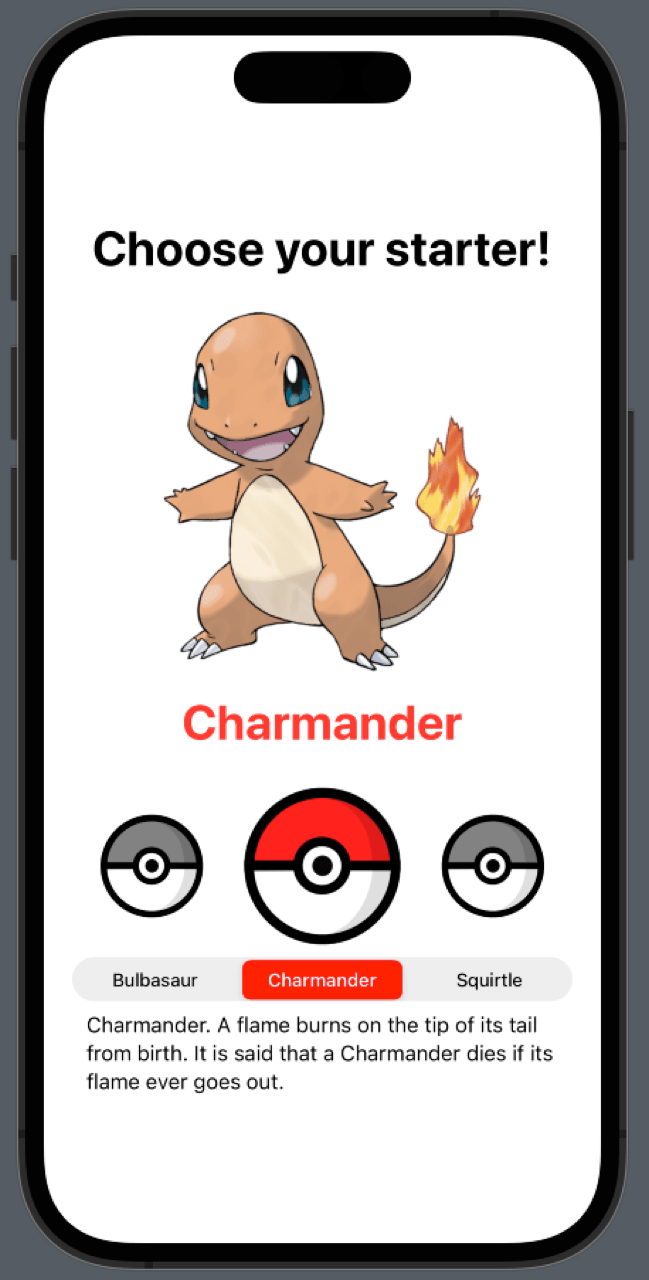
That looks pretty cool, right?
Now, you might've noticed that we added an extra modifier to many of the elements called accessibilityIdentifier(). This modifier allows you to add an identifier that you can use to retrieve the element during UI tests.
Now, let's ensure our work is solid with a simple UI test.
Testing a Segmented Control With UI Testing in SwiftUI
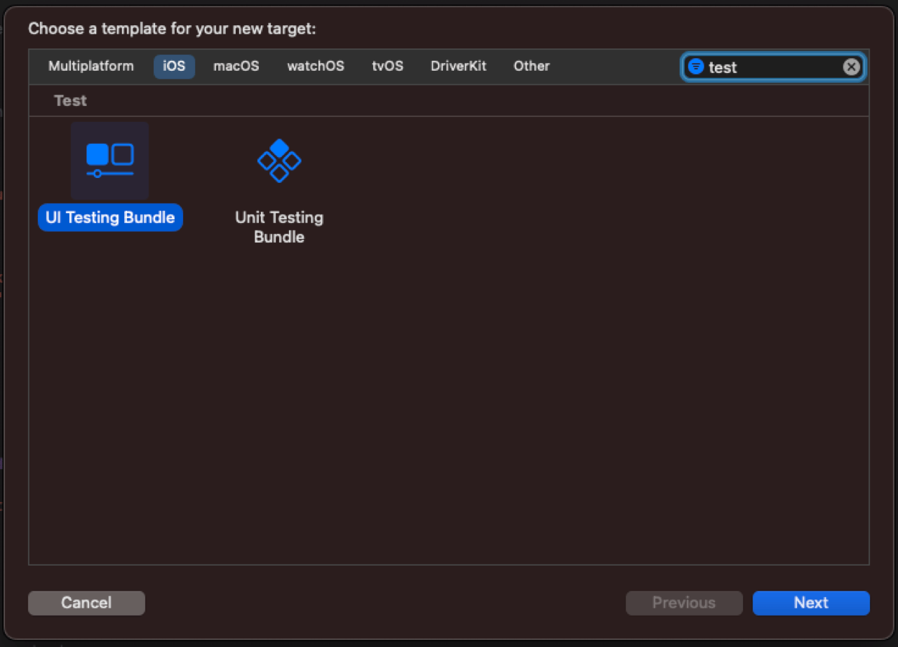
The first step to enable testing in your project is to create a test target.
To do this, go to File > New > Target in XCode and select a new UI Testing Bundle.
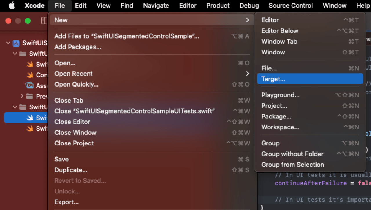
Now, XCode will generate a new test workflow for you. You can open the file ending in UITest.swift to build your test.
All you have to do in this file is add the following code:
As you can see, these two methods test different ways to interact with the app. One is through a tap on the segmented picker, and the other is through a tap on the images associated with the picker.
Both of these methods follow a similar path:
- Get a reference of the app instance
- Invoke a launch event to launch the app
- Initialize the choices array
- Retrieve references to the elements in the view through the respective identifiers already set
- Trigger an action—in this case, a tap event
- Assert our expected behavior and the result from the action
We expect the same behavior, whether it's a tap on the image or the specific button segment in the picker. So, if you run these tests, you'll see that the app behaves as expected and our work is validated.
You can find the completed code in this repository.
Conclusion
If you want to dive deeper into the intricacies of UI testing or Unit Testing in Swift, you can read more about it in this article.
However, if you don't want to deal with the complexities of developing a testing workflow, I recommend that you check out Waldo's comprehensive toolset for SwiftUI testing. It requires no coding and is very approachable, even for non-developers.
Automated E2E tests for your mobile app
Get true E2E testing in minutes, not months.