The purpose of this article is to get you acquainted with SwiftUI Picker. In the process, we’ll be creating a sample code, customizing the appearance of our Picker, and implementing some functionality with them.
Once you have completed this article, you’ll be able to implement your own pickers in Xcode and prove the quality of your work with some basic testing procedures.
For the purpose of brevity, the tutorial that follows will assume that you have experience working with Swift and Xcode 12. If you don’t, please explore them here.
SwiftUI Workflows
If you haven’t worked on a SwiftUI project, I highly recommend reviewing it first before continuing to read this article, considering that a lot has shifted in the workflow required to develop SwiftUI projects.
Here’s a brief summary of what will be in all SwiftUI projects when creating them.
The template project holds two files: a ContentView.swift file and an <APP_NAME>App.swift file. (The APP_NAME is the name you used for the project.)
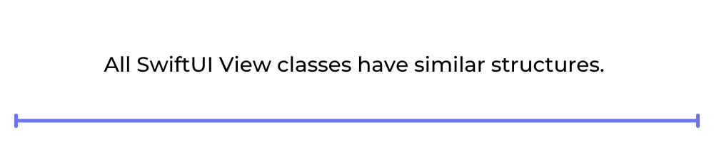
All SwiftUI View classes have similar structures. A View struct defines the view structure and functionality, and a PreviewView struct serves as a helper for the emulator to display your work in real time.
A variable of type View called “body” defines the body of the ContentView. And so any modification that you want to make to your View must be done in this variable.
This ContentView contains a TextView object with the text “Hello World!”
Now that all that is out of the way, let’s dive into our project.
Pickers on SwiftUI
Prior to adding our Picker, we need to make sure we understand State variables.
If you don’t know what a State variable is, in simple terms, it’s a variable (prefixed by @) that keeps the “state” of a property in the View. The purpose of State variables is to inform the parent View and its hierarchy of the state of dynamic elements in the View. Without them, there would be inconsistencies in the behavior of the app on navigation.
A State variable would look something like this: @State var title : String = “”.
Notice that it has been initialized. If you can’t initialize it due to the structure of your code, you should change it to a @Bind and pass to it a reference to a parent @State variable.
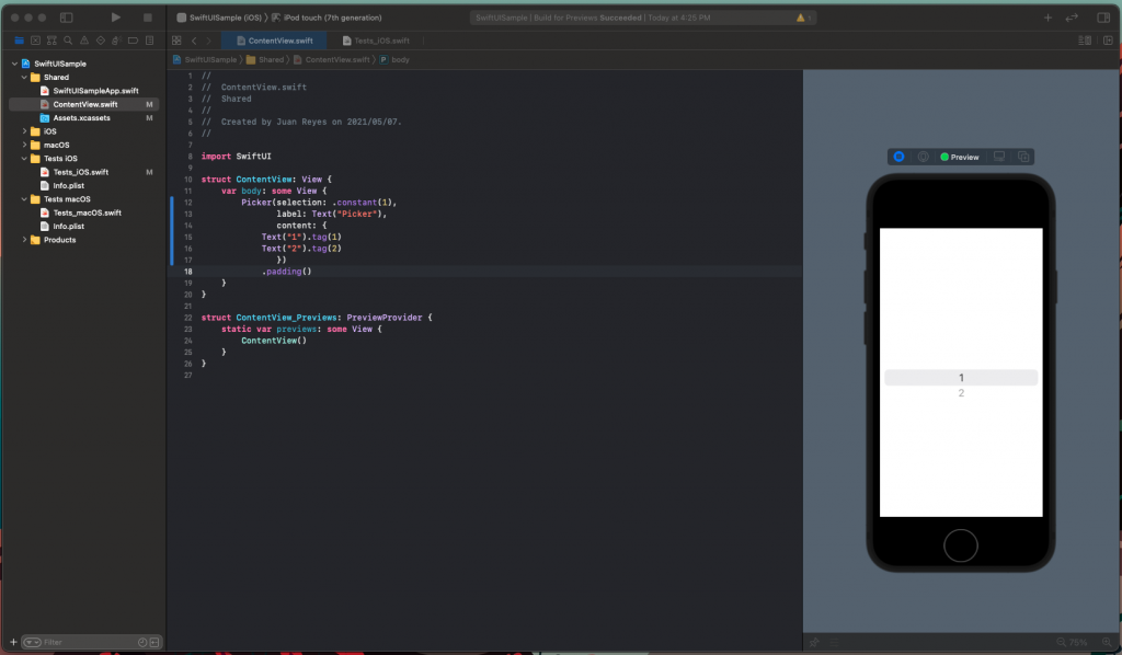
Excellent. Now, let’s add our Picker to the body.

As you can see, the constructor is simple. It requires only an initial selection, title, and content items to display in the scroll view.
You can proceed to test the Picker in the previewer by pressing the play button and interacting with it. See that, despite looking plain, it has all the expected functionalities right off the bat.
Modifying Our Pickers’ Appearance
The first thing in order is to add some padding to our Picker so it doesn’t monopolize the screen width.
This code will result in the following.
A very subtle change, but essential nonetheless.
NOTE: If you’re confused about why adding ‘.padding()’ to the element did the trick or what this clause is, I’d recommend reading further about SwiftUI modifiers.
Depending on the target platform you selected for your project, there are specific designs available for our Picker. In this case, we’ll be focusing on the iOS ecosystem.
The modifiers available for our Picker are the following:
- DefaultPickerStyle: This is the default style for the development platform. In our case, this is equal to the WheelPickerStyle.
- WheelPickerStyle: This is the most familiar wheel style where you can directly scroll and select a value.
- InlinePickerStyle: This style presents all the options together with other views in the container.
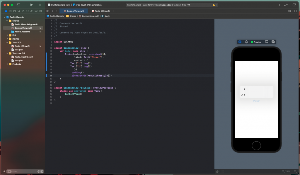
- MenuPickerStyle: This style presents the Picker as a button that displays the options as a pop-up for the user to pick.
- SegmentedPickerStyle: This style presents the options horizontally next to each other and only allows one option at a time to be selected.
Here is an example:
This code would yield the following.
Feel free to try them all.
Notice that, when pressed, the options are available to pick, but your selection doesn’t persist.
To solve this, we need to add some functionality to our Picker.
Functionality on Our Pickers
To reflect what value the user selects in our Picker, we first need to add a Text element below it.
To do that, let’s embed the Picker in a VStack and add a Text that will indicate the selected value. Then, let’s add a @State variable that will persist the selected value index.
Now when you change the selection, the text reflects the change. Simple, right?
But what if we want to have our options defined somewhere else, or we want to ensure the options are the correct type? You’ll want to have a more robust implementation with enums for this scenario and have something more like this:
Nevertheless, any robust implementation requires proper testing. This case is no exception. So let’s build some simple tests to guarantee the quality of our code.
Test Your Pickers
Having a comprehensive implementation of SwiftUI Picker in your hands, it’s recommended that you build some tests to guarantee that your code is accurate and continues to work as expected. To achieve that, you can work with Xcode’s UI testing infrastructure, which comes already bundled with the project.
When you open the Test iOS group in the left bar, you’ll see a Test_iOS.swift class file. You can see that everything you need to set up a test is there for you. Now, you can continue and run it if you want to see the app running in the emulator.
Nice!
Now, to test our code, add the following to the testExample() method:
For this specific test, it’s necessary to implement an XCTWaiter, which tells the system to wait for some time to execute the next instruction in the test. This behavior is needed because the pop-up needs time to display before tapping on an option.
When running the code, you’ll notice that the Picker is successfully tapped, and the value “two” is selected.
For testing, quality is always more important than quantity. However, if you want to have a more complete and comprehensive testing workflow, you can check out Waldo and their no-code testing solution. You can also find more info on how to implement testing in Xcode UI here.
Picking Our Next Steps
Developing in the Apple ecosystem has always been one of my greatest delights. I rejoice in the experience of reaching my full potential with the tools and expertise available.
Now you have a more comprehensive understanding of the Picker element with a working example as well as more testing options to ensure your work quality. With this, you can hopefully find a similar level of productivity and enjoyment in your development journey.
Hopefully, this article helps you find the missing piece if you were lost or inspires you to create something extraordinary in your career.
Automated E2E tests for your mobile app
Get true E2E testing in minutes, not months.