Introduction
As an app developer, you want to keep users of your app informed of important information, especially when you apply big changes in your app. In user interface design, we use alert dialogs for this purpose.
An alert dialog is a pop-up that displays on top of all the other content on the screen. While the alert dialog is visible, the user can’t interact with any other part of interface besides the alert dialog. The alert dialog contains a short message describing the situation and buttons underneath. Once the user clicks one of the buttons, the alert dialog disappears and the user can continue to interact with the app as before.
An example of when you might see an alert dialog is when you tap the sign-out button on an app. Usually, there’s a pop-up message with text such as “Are you sure you want to sign out?” and two buttons: Cancel and Sign Out. This alert dialog ensures that the user understands what’s about to happen and the user can acknowledge that they truly want to proceed.
Flutter provides widgets to enable developers to include alert dialogs in their Flutter apps. In this article, we’ll learn about:
- The visual layout of an alert dialog
- The different styles of alert dialogs that Flutter provides
- How to include alert dialogs in Flutter apps
Alert Dialog Layout
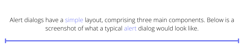
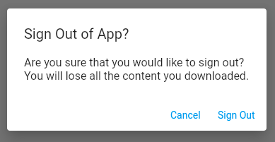
Alert dialogs have a simple layout, comprising three main components. Below is a screenshot of what a typical alert dialog would look like.
The alert dialog is a card that floats on top of the content in the app. At the top of the card is a title widget that shows the overall message or question posed to the user. Directly underneath the title is a content widget that shows more detailed information about the alert. At the bottom of the card is a row of buttons. These buttons represent all the options that the user can select from as the next action.
Defining an Alert Dialog
Now that we know what the basic layout of an alert dialog looks like, let’s explore how to define these within a Flutter app.
Flutter provides two widgets for creating alert dialogs: one for defining an alert dialog that’s themed in alignment with Material Design, and another that’s themed to look like standard iOS alert dialog widgets. This allows developers to use the widget that best fits with the mobile platform the app will run on. We’ll explore each of these in the sections below.
Material Alert Dialog
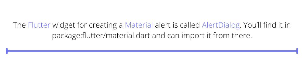
The Flutter widget for creating a Material alert is called AlertDialog. You’ll find it in package:flutter/material.dart and can import it from there.
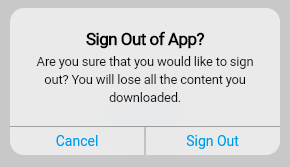
The screenshot below shows how the AlertDialog looks when used in an app.
The code to create this AlertDialog is shown below.
In this code snippet, we use the minimal properties for generating an AlertDialog, but the widget provides many more properties for customization.
Alert Title Configuration Properties
- The title property sets the wording for the text to display at the top in large font.
- The titlePadding property configures the padding to apply around the title text widget.
- The titleTextStyle property sets the styling for the text in the title widget.
Alert Content Configuration Properties
- The content property sets the wording to use under the title in a smaller font.
- The contentPadding property configures the padding to apply around the content widget.
- The contentTextStyle property sets the styling for the text in the content widget.
Alert Action Button Configuration Properties
- The actions property sets the list of buttons that display at the bottom on the AlertDialog. For example, this could be a list of TextButton widgets, as in the sample code snippet above. Note that when the onPressed property for any button is null, then that button appears disabled on the AlertDialog.
- The actionsPadding property sets the padding around the set of action buttons.
- The buttonPadding property sets the padding around each action button.
- The actionsAlignment property configures the alignment of the buttons at the bottom of the AlertDialog. Its type is MainAxisAlignment, therefore you can set this to align left, right, or center, similar to the elements in a row or a column.
- The actionsOverflowButtonSpacing property comes into play when there are too many buttons to show horizontally. When this happens, the layout switches from a row to a column. This property allows you to add additional vertical spacing between the buttons.
- The actionsOverflowDirection comes into play when the action buttons display vertically. You can set the order of the buttons to start at the top or to start at the bottom.
Alert Container Configuration Properties
- The backgroundColor property sets the color of the alert dialog card.
- The clipBehavior property configures how the AlertDialog contents clip when a shape is set, such as when there are rounded corners.
- The elevation property sets how high above the main app content the AlertDialog floats.
- The insetPadding property configures how much space is between the alert dialog and the edge of the screen,
- The scrollable property is a boolean value — if true, the title and content widgets are scrollable.
- The semanticLabel property configures accessibility, for example, in screen readers, to inform users about the alert dialog opening and closing. You can configure what to announce to your users.
- The shape property defines the overall shape of the dialog. By default, it’s a rectangle with rounded borders, but you can customize this to your needs.
Cupertino Alert Dialog
The Flutter widget for creating an iOS style alert dialog is called CupertinoAlertDialog. You’ll find it in package:flutter/cupertino.dart and can import it from there.
This is what the CupertinoAlertDialog looks like when used in an app.
The code to create this CupertinoAlertDialog is shown below. You’ll notice that this is almost exactly the same as the code used for the Material alert dialog. The only difference is that we have replaced AlertDialog with CupertinoAlertDialog, and the function showDialog with showCupertinoDialog.
The CupertinoAlertDialog has fewer properties for customization than AlertDialog, described below.
- The title property sets the text at that displays at the top, in bold.
- The content property sets the text that displays under the title, in light text.
- The actions property defines the set of buttons on the alert dialog.
- The actionScrollController property comes into play when there are too many action buttons, therefore requiring scrolling. You can use this property to set the ScrollController.
- The scrollController property sets the ScrollController to control the scrolling behavior of the alert dialog’s content.
- The insetAnimationCurve property comes into play when a keyboard appears on the screen while the alert dialog is shown. This sets how fast the animation speeds up and slows down as the dialog adjusts to accommodate the keyboard.
- Similarly, the insetAnimationDuration property sets the duration of the animation when the dialog adjusts to accommodate a keyboard appearing on the screen.
Customizing How to Show Alert Dialogs
Notice that in the sections above, we made use of built in functions to trigger the display of both the Material and Cupertino dialogs. These were the showDialog and showCupertinoDialog functions respectively. You can customize these functions by passing additional parameters to them.
For example, when the dialogs display, a partially transparent barrier appears between the main content of the app and the dialog. You can customize the color of this barrier when using an AlertDialog. Furthermore, for both AlertDialog and CupertinoAlertDialog, you can set the dialog to dismiss when the user taps the barrier.
Conclusion
In this article you learned about alert dialogs and how to use them to provide users with information that must be acknowledged before they can proceed using the app. We discussed the basic layout of an alert dialog, and we saw that Flutter provides two types of alert dialog widgets — one that conforms to the Material design style, and another that conforms to the iOS (Cupertino) design style. This lets you create apps that feel native on both iOS and Android.
With this knowledge, you can now build apps that alert users and will get their acknowledgment or decision at key points in your app’s user experience journey.
If you’d like to learn more about app development, please explore the Waldo to find excellent content on design, development, and testing.
This post was written by Daliso Zuze.Daliso is an expert in agile software delivery using Scrum. Besides that, he’s an experienced digital transformation consultant and entrepreneur. His technical skills center around mobile app development and machine learning.
Automated E2E tests for your mobile app
Get true E2E testing in minutes, not months.