Introduction
When designing user experiences for your app, you may decide to show or hide widgets as conditions change in the app, such as in response to user actions or to adapt to available space on the screen.
Consider a calculator app, for example. If the calculator is in portrait orientation, then the advanced scientific keys may not be visible, but if it’s in landscape orientation, then all the scientific keys can be visible.
Showing and hiding widgets could also be useful when designing a data visualization user interface, where you can selectively hide a component, such as a pie chart segment.
Another application is when designing a game. For example, when a player knocks an object, it can disappear from the scene.
Flutter provides a widget named Visibility to enable these types of user experiences. In this tutorial, we’ll
- explore the properties of the Flutter Visibility widget,
- learn how to build a Visibility widget for use in an app, and
- build a demo app to apply what we’ve learned.
Visibility Widget Properties
The Flutter Visibility widget contains a number of properties to enable customizing its behavior. This provides the Visibility widget with a lot of flexibility for various use cases.
Basic Properties
- The child property is the only property that requires a value assigned to it. The child property is the widget that will be visible or invisible.
- The visible property controls whether or not the child widget defined above is visible or not. This is a boolean value. When visible = true, the child widget is visible. When visible = false, the child widget is invisible. By default, visible = true.
- The replacement property is an alternative widget that displays in place of the child widget when visible = false. It’s important to note that in order to use this property, the five maintain properties described below must have their values set to false.
Advanced Properties
- The maintainSize property is a boolean value that controls whether or not the space that would have been occupied by the child widget remains there when visible = false. By default, maintainSize is false, which means that the space left by the widget shrinks to 0 as if the widget were never there. If true, then the space that the widget occupied remains there.
- The maintainState property is a boolean value that controls whether or not state variables in the child widget are preserved when the child widget is not visible. By default, this is false which means that any state variables defined in the child widget get reinitialized when the widget becomes visible. Set maintainState to true if you would like the state variables to keep their previous values when the widget becomes invisible and then visible again.
- The maintainAnimation property is a boolean value that controls whether or not animations that were running when the widget became invisible continue to run while it is invisible.
- The maintainInteractivity property is a boolean value that controls whether or not the child widget receives touch events when it is invisible. By default, this is false, and the child widget won’t receive touch events when invisible.
- The maintainSemantics property is a boolean value that defines how accessibility tools, such as screen readers, behave when there’s an invisible widget. By default, maintainSemantics is false. If maintainSemantics is true, then the screen reader would report the widget as if it were not hidden.
For a complete list of Visibility widget properties, you can review the details on flutter.dev. In the next section, we’ll learn how to define a basic Visibility widget.
Building a Visibility Widget
Creating a Visibility widget is easy. Simply set the widget that you want to control to the child property, and set a boolean variable to the visible property.
Below is an example use case of Visibility. Here, we’re building a column of widgets embedded in a Card. In the card, there’s an image displayed as the second item in the column, wrapped in a Visibility widget.
Notice how we assign the variable imagesVisible to the visible property of the Visibility widget. By dynamically updating the imagesVisible variable, we can make the image appear or disappear from the card.
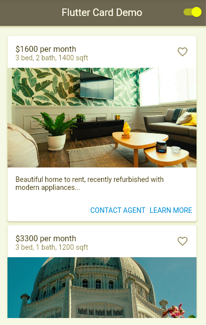
Demo App
For our demo, we’ll build upon the real estate app that we created in my previous post How Do I Create a Flutter Card? Examples and Use Cases. We’ll modify the app to give the user the ability to show or hide photos.
This demo app doesn’t depend on any third party libraries. Therefore, you can use DartPad to follow along. DartPad is a web-based editor where you can try out Flutter code without the need to install anything on your computer. To follow along with this tutorial, head over to https://dartpad.dev/
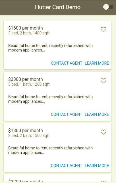
Below is what the final app will look like.
Step 1: Build the App Shell
The first step is to create a basic app shell as a foundation to start us off. Paste the code below into your code editor and run the app. You should see an AppBar with the title “Flutter Visibility Demo.” In the body section, you should see the text “Flutter Visibility Demo” in the center of the screen.
Step 2: Declare State Variables
Next, we declare our two state variables. The first, imagesVisible, controls whether or not the photos in the cards appear. The second variable, cardContent, will be populated with content that will be displayed inside our real estate property cards in the next step.
Step 3: Populate Card Content with Random Data
Let’s now generate all the content that will go into the real estate property cards. Since this is only a demo, we’ll create random content for the cards. In a real world app, this data would be sourced from a database.
Add the initState function below to the _MyHomePageState class. This will create the content we need for each card’s heading, subheading, image, and supporting text.
Step 4: Add The buildCard Function
Next, we create a function that builds a single card. We can call this function multiple times to create as many cards as we need. Notice how we use the imagesVisible state variable to control the visibility of the card’s image.
Step 5: Add The List of Cards to the App Body
Now it’s time to add the cards to the body of our app’s Scaffold widget. The code below creates a scrollable list of cards. The code converts the card data that we generated in Step 3 into Card widgets.
Step 6: Add The On/Off Visibility Switch for Images
In this step, we add a switch that enables us to control the visibility of the card images. We’ll use a switch placed in the AppBar for this. When the switch value is changed, the value of the imagesVisible variable updates to match the value of the switch. Use the code below to set the appBar property for your Scaffold widget.
Step 7: Test the Complete App
You should now have a fully working app. Make sure the show/hide feature works as expected. As apps get more complex, it’s important to test each new feature you add, while also ensuring that any existing features haven’t been broken. If you get stuck, you can refer to the full code listing here: https://dartpad.dev/?id=ddc9f12833ce0ed45f282332201a4712
Conclusion
In this tutorial, we learned how to use the Flutter Visibility widget to enrich a mobile app’s user experience to make it more dynamic and adaptive. We explored the properties of the Visibility widget that allow you to customize it to your needs. With this knowledge, you can build your own Flutter apps using the Visibility widget.
If you want to learn more, you’ll find a lot of useful content on mobile design, mobile engineering, QA & testing, and more on Waldo.
This post was written by Daliso Zuze.Daliso is an expert in agile software delivery using Scrum. Besides that, he’s an experienced digital transformation consultant and entrepreneur. His technical skills center around mobile app development and machine learning.
Automated E2E tests for your mobile app
Get true E2E testing in minutes, not months.