If you come from a web background, you know that CSS transforms are extremely helpful. You can use them to create animations and visually appealing UI elements. In fact, a lot of modern web design is inspired by transforms.
React Native comes with default support for transforms. It’s very similar to how transforms work on the web and can be used in a number of scenarios. In this roundup, I’ll break down transforms for you. You’ll understand what they are and how they work, and eventually you’ll learn how to use them in your React Native project.
Transforms in Theory With Examples
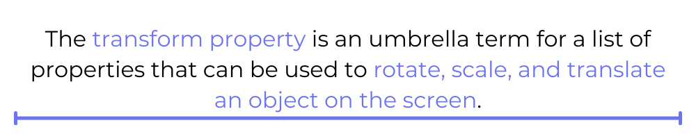
The transform property is an umbrella term for a list of properties that can be used to rotate, scale, and translate an object on the screen. In other words, it’s a combination of some properties that you can use to change the orientation and position of an object.
However, before you can use these properties, you must understand how they work. There’s a little math and theory involved, but I can assure you it’s child’s play! Let’s get started by creating an empty React Native project where we can see code and some examples.
Create React Native Project
I am using Expo CLI to quickly get started with creating a React Native project. If you’re new to Expo, you can get started with it here.
Create a new Expo app by running:
Then, open the Expo project by running:
Now you have an empty React Native project up and running. Next, let’s add some boilerplate code.
Add Boilerplate Code
To experiment with the transform properties, I’ll create a simple two-dimensional box using the <View> component. Inside App.js, add the following lines of code:
The above code should render a violet, square box at the center of your screen as shown:

The <View> component that renders the box on the screen also takes an array of styles. The first object represents some minimal styles to give background color, height, and width to the box. On the other hand, the second object represents the styles where you can assign the transform properties.
The transform property is a key that expects an array of objects. Each object is a transform property you wish to apply to the given element. There are primarily three transform properties—translate, scale, and rotate. Let’s first look at the translate property in action.
The Translate Property
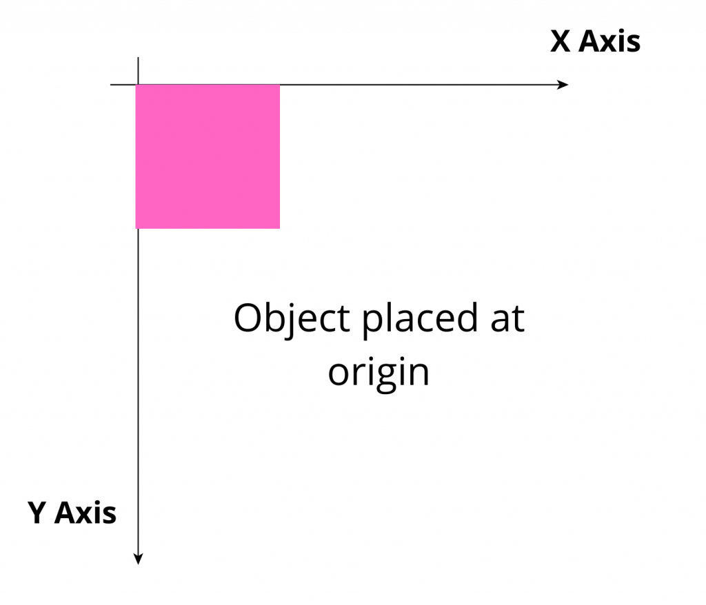
The word translate literally means moving or displacing an item from one place to another. You can only move an object either horizontally or vertically. The below diagram represents a 2D coordinate axis with an object placed at the origin. Your element will be translated with respect to the below reference axis.
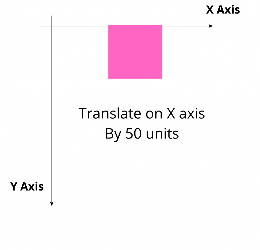
You can move your element along the x-axis by specifying the translateX property to your transform array as shown below:
The above code should shift your object 50 units to the right of its current position (i.e., origin):
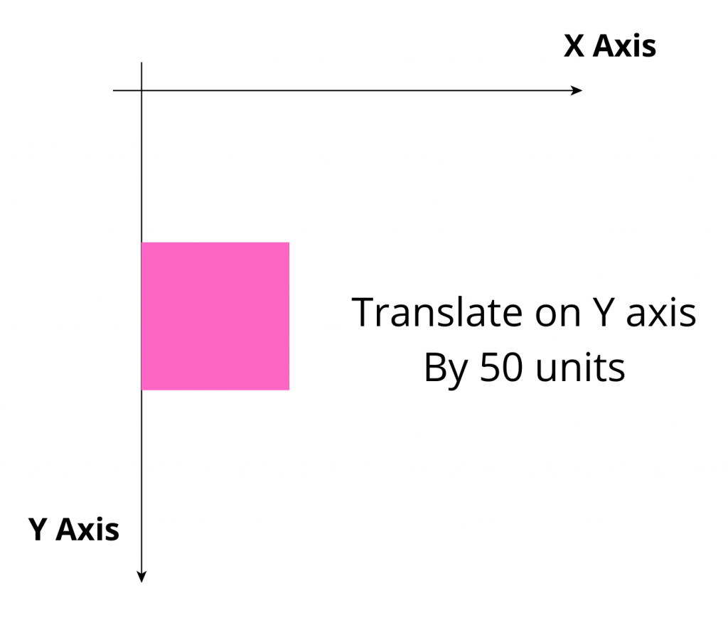
Similarly, if you translate the object along the y-axis, you can specify the translateY property as shown:
A positive value to translateY will cause your element to shift vertically downward, and a negative value will cause your element to shift vertically upward. In this case, your object will move down vertically by 50 units.
It’s important to note that the y-axis for the translate property is reversed with respect to the conventional y-axis in geometry.
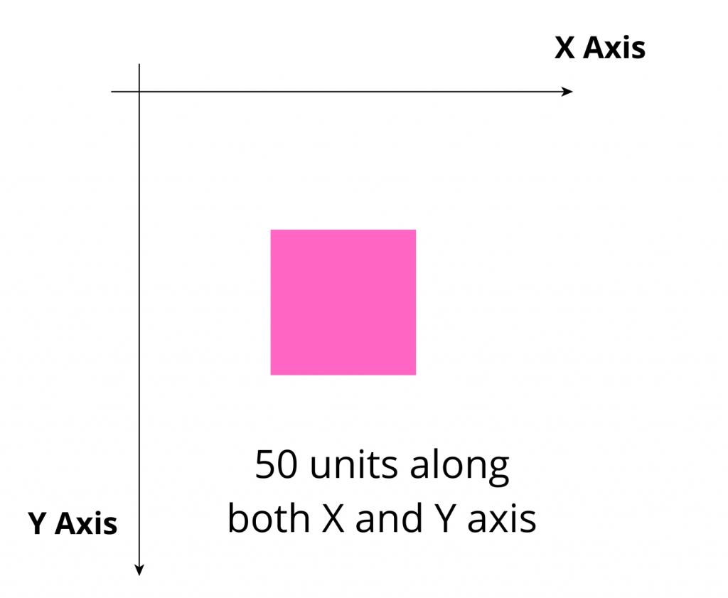
Finally, you can also translate your object along both axes simultaneously. You can pass an array to the translate property as shown:
The above code would displace your object 50 units along both the x-axis and the y-axis. Your object’s final position would look like this:
Next, let’s explore the rotate property with some examples.
The Rotate Property
The rotate property allows you to orient your object along different axes of rotation. You can rotate it along the x-axis, the y-axis, or the z-axis. A rotational plane is a three-dimensional plane as shown below:
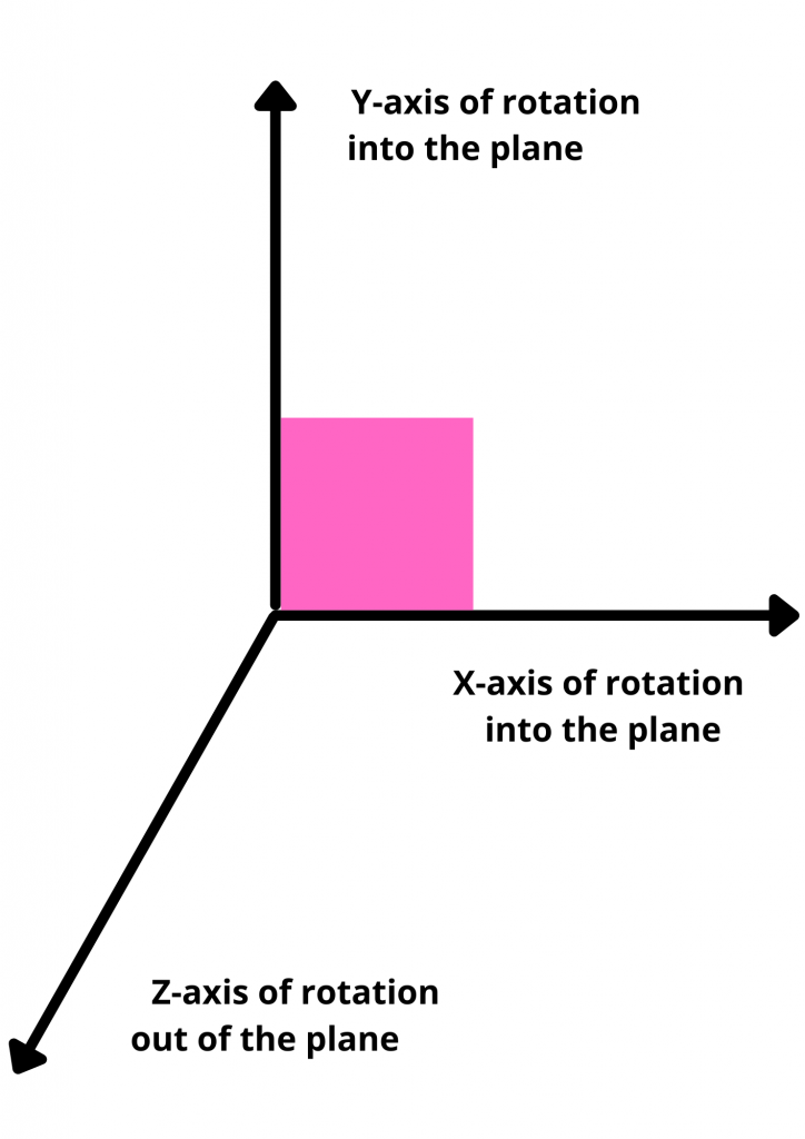
The above diagram represents a 3D rotational plane. The x- and y-axes are oriented toward the plane, and the z-axis is oriented toward you.
To rotate an object along the x-axis, you can specify the rotateX property. This property expects a string value for the angle of rotation, along with the unit of the specified angle. It can be either rad for radians or deg for degrees.
The above code will cause your object to rotate inward with respect to your screen.
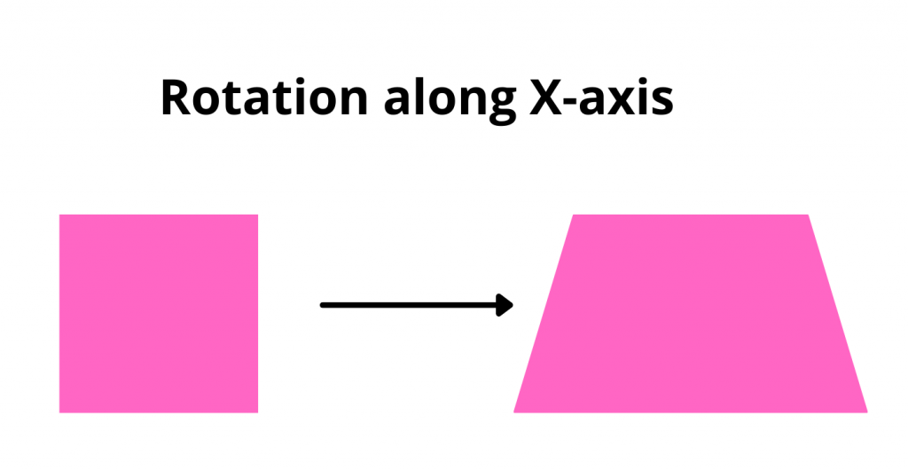
Thus, your violet box, which originally looked like a two-dimensional square, would now appear to be a trapezium.

In a similar fashion, you can specify the rotation along the y-axis using the rotateY property as shown:
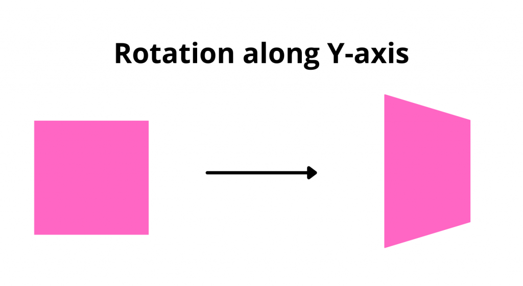
The above code would change the orientation of your element like this:
The rotateZ property will rotate your object along the z-axis of rotation. Let’s give the rotateZ property a value of 60deg and see what it looks like.
Your rotated object will look like this:
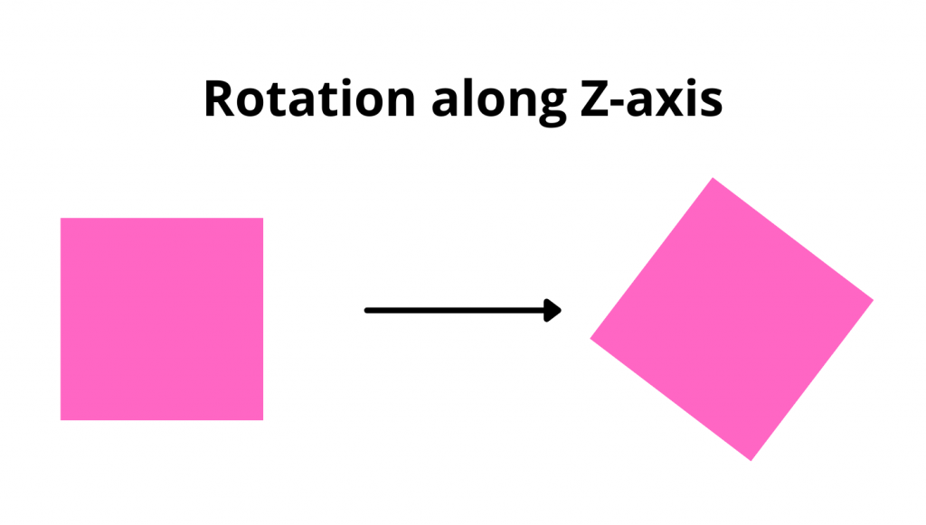
If you’ve used image editing tools that allow you to flip or rotate an image, they’re rotating the image along the z-axis of rotation. Let’s look at the last property in action, the scale property.
The Scale Property
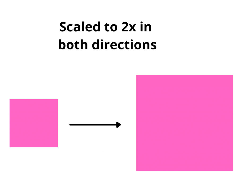
The scale property specifies how large the object should be with respect to its original size. Originally, all elements are given a scale of 1, meaning their size is what you specify using the height and width style properties.
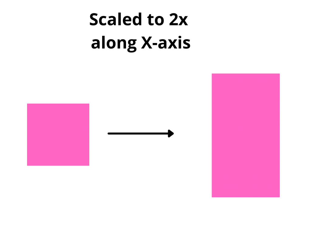
You can scale the object to become twice its size by giving it a scale of 2 as shown below:
The above would cause your object to grow twice in size:
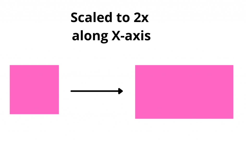
Alternatively, you can scale along the x-axis or the y-axis, as well. In this context, scaling twice along the x-axis would mean elongating the object’s width.
Therefore, the object, which was originally a square, would now appear as a rectangle:
Similarly, if you scale the object along the y-axis, it would elongate by its length instead.
Use Transforms in a Product Page
Now that you understand how transforms work, let’s use the knowledge in a practical project. As I mentioned at the beginning, transforms are used extensively in animations. Another area where they’re widely used is in e-commerce applications or educational apps.
A lot of e-commerce applications allow you to view a product from different angles and zoom in on the product image. We can use the rotateZ and scale properties to implement something similar for our own app. Let’s create a simple product page that displays the image of a product and allows you to zoom in, zoom out, and rotate the product’s image.
Create Product Page UI
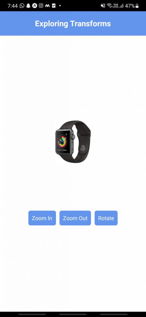
Let’s create a simple UI that renders some <View> components with some buttons. Inside App.js, add the following code:
The above code renders a header, an image of the product, and some buttons at the bottom. If you’ve done everything correctly, you should be able to see a minimal UI.
Great! Next, let’s create the functionalities for the buttons to zoom in, zoom out, and rotate the image.
Add Transforms to Product Image
First, we need to create a state that contains some default transform styles for our image.
Since initially, the product is of the original size and unrotated, we have kept the scale property to be 1 and rotateZ to be ‘0deg’. When the user presses the Zoom In button, we need to set the scale property to 2. Let’s do that inside the zoomIn method.
Similarly, we can populate the zoomOut method to set the scale back to 1.
Lastly, we need to make the rotate method functional. Inside the rotate method, we first extract the current degree of rotation that the product image has using a regex pattern. Consequently, we add another 90 to this number to compute our new degree of rotation. Thus, if originally the product image was at zero degrees, it should now be rotated to 90 degrees.
Then, we assign the newDegreeOfRotation to the rotateZ property inside the transform object of our productStyles state.
And that’s it! Our zoom in, zoom out, and rotate buttons should now be functional. Let’s test our product demo page on a physical device.
Test Product Demo Page
Expo allows you to test your apps live on a physical device as you build them. If you’re running your project on an emulator, here’s a simple guide where you can run your app on your own device using Expo Go. On the other hand, if you’re already running it live on your device, then we’re all good to test.
If your product page works as shown above, it’s in good shape! If something seems off, you can refer to the entire App.js code for the product page below
While this allows you to test your app directly on a physical device, you might also want to test your app on multiple devices at the same time. You can check out Waldo, a no-code testing platform that allows you to directly record and run tests in your browsers on a number of devices concurrently.
Explore Further
I hope you’re all comfy with using transforms in your React Native projects. It’s a tricky thing to understand at first, but it will ease a lot of pain when you’re developing animations or building custom components to rotate and scale images, SVGs, etc.
The syntax itself is a bit difficult to understand, so make sure you read through the docs to stay updated on the latest syntax and API changes. If you wish to dive deeper, go ahead and try animating a car from one end to the other end of the screen. It’ll be an interesting exercise, and if you get stuck, here’s a spoiler—use the translateX property. Until next time!
Automated E2E tests for your mobile app
Get true E2E testing in minutes, not months.