Whether it’s a call to action on your landing page or a signup form, buttons are everywhere!
They’re an important UI component in web apps as well as native apps. What makes them so interesting is how you can use them creatively in loads of different scenarios. Therefore, you can create most of the UI magic of your app by using buttons the right way.
In this roundup, I’ll help you learn all you need to know about buttons in React Native. We’ll use various types of native buttons, so you’ll understand which button component to use when. Finally, we’ll write some automated unit tests for these components.
So, let’s jump straight into it!
Create an Expo App
We’ll use Expo to build a simple React Native app. If you’re new to it, read about it here.
Let’s create a fresh Expo app by running:
If you’re on a newer version of Expo, you might see a prompt to select a template. So, I’ll select the basic template for this tutorial. However, feel free to use the one that suits you best.
Next, let’s kickstart the app by running:
And you should have the Expo app up and running.
Great! Let’s move ahead and write some code.
The Basic Button Component
React Native provides a built-in <Button/> component out of the box. It’s the simplest way to build a button for your app.
First, you need to import it from react-native:
The <Button/> component takes two mandatory props. These are title and onPress. The title denotes the label that you wish to display on the button. The onPress prop takes a function and fires it when you press the button.Let’s render this <Button/> component with these props in our App.js file:
If you look at your app now, you should see a blue button rendered on the screen as shown:

That was easy! Let’s take a look at some common props that allow us to use this button effectively.
The Color Prop
You can customize the color of the button by passing the color prop to your <Button/> component:
You should now have a red button as shown:

The Disabled Prop
If you’re using this button with a form, you can use the disabled prop to disable it.
The above should now turn the button gray and remove the drop shadow to make it look disabled.

Furthermore, your onPress event handlers shouldn’t be fired in such cases. Let’s cross-verify this by running a simple console.log on the onPress handler.
I’ll create a function inside App.js called onPressHandler that looks like this:
Next, I’ll pass this to the onPress prop of the button:
Now, every time you press the button, you should have a simple log on your console. Let’s try to see if it works correctly:
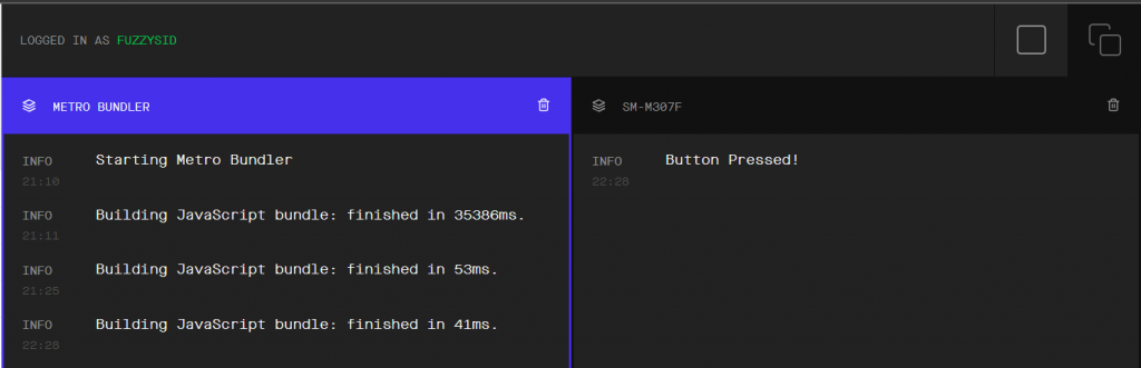
It does! And now, if you set the disabled prop back to true, you should no longer get the console.
The Button Component Is Minimal!
The <Button/> component above is great, but it doesn’t offer a lot of customization. For instance, it’s hard to change the color of the text rendered inside the button. Also, you can’t wrap other native components inside it.
Therefore, a more elegant way of using buttons in your app is using other higher-order components. For this, React Native provides the TouchableWithoutFeedback, TouchableHighlight, and TouchableOpacity components.
They offer a lot of customization and are built for specific use cases of your app. So, let’s look at each of these in detail.
The TouchableWithoutFeedback Component
Let’s address the first concern with the <Button/> component. We can’t render other native components as children inside it.
This problem is easy to solve using the <TouchableWithoutFeedback/> component. You can render a single child component inside it.
First, import this component at the top:
Next, render it inside your App.js file as shown:
Just as we did previously, we pass the onPress prop that fires the event handler when someone presses the button. However, in the case of a <Button/> component, we used the title prop for the label of that button. Here, we’re using a simple <Text/> component to give a title to our button. We’ve also given styles to that <Text/> component, which allows us to easily customize how the label of that button appears.

What if you want to render more than one child component? In that case, you can also wrap them inside a <View/> component. In the above case, we only see a simple text as a button. But by wrapping the <Text/> component in a <View/>, we can make it look more like a regular button.
And now, check this out:

It looks more like a button. Great!
The TouchableHighlight Component
A major drawback with the <Button/> and <TouchableWithoutFeedback/> component is that there’s no visual indicator for the press action. In other words, a user doesn’t know for sure whether they’ve pressed the button or not. This is crucial in situations where you want the button to be pressed only once. It’s also a sign of bad UX for your app.
The <TouchableHighlight/> works similar to the above components but also shows an underlay on the pressed area. This indicates to the user that they’ve pressed the button.
Common Use Case of TouchableHighlight
The most common situation you can use this information for is in the case of icons. Let’s say your app has a simple bell icon to toggle notifications.
In this case, your icon acts as the button that does the operation, but it doesn’t look like a regular button. Therefore, it’s imperative to give a visual indication to the user when the icon or button is pressed.
In the next section, we’ll be working with the default icons that Expo provides. Up to this point, you haven’t needed to install any library to follow what I’m doing. However, if you’re on a React Native CLI project, you might have to install a relevant icons library in your project first.
Use TouchableHighlight With Underlay Color
Let’s take that notification bell icon example to demonstrate the <TouchableHighlight/> component. Inside the App.js, let’s create a simple state to keep track of notifications status:
Initially, the notifications are disabled on our app. But remember we created an onPressHandler in the previous section? Inside that function, we’ll toggle the notifications on or off:
Now, let’s import the icon library at the top:
We’re doing well!
Next, let’s finally render the <TouchableHighlight/> component:
The <TouchableHighlight/> component takes in three essential props. These are activeOpacity, underlayColor, and the onPress event handler. The underlayColor specifies the color of the underlay that forms when someone presses the button. Similarly, activeOpacity represents the opacity of that underlay.
In the above code, we’ve also given some styles to the <TouchableHighlight/> component. These styles are passed on to the styles of the underlay it forms.
Unlike the traditional <Button/> component, we can wrap <TouchableHighlight/> around other components and render them as children. In this scenario, we render our icon conditionally on the basis of the notification state. Finally, let’s also render the notification status underneath the icon.
Awesome! Let’s check out how our bell icon performs as a button using the <TouchableHighlight/> component:
That neat little underlay behind the icon when you press it gives a great UX for your app!
The TouchableOpacity Component
What if you want your button to look like a button that also gives haptic feedback? That’s where you can use the <TouchableOpacity/> component. It’s similar to <TouchableHighlight/>, but instead of an underlay, it dims the opacity of the pressed area.
Let’s see it in action first.
Use TouchableOpacity
As always, we need to import this component first:
import {TouchableOpacity } from 'react-native';
All we need to do now is render it in our component. <TouchableOpacity/> also renders its children component, so you can wrap it around any UI component that you want to render as a button.
Notice that I’ve given some styles to the <TouchableOpacity/> component. If you don’t give any styles, the component by default gives an appearance similar to a regular <View/> component.
Here are the styles for this component:
And now, you should have a brown button as shown:

Awesome! Let’s also try to press the button.
We get an opacity fading effect when we press the button. That’s a great visual indicator that the button has been pressed!
Control Opacity
You can control the dim effect of the <TouchableOpacity/> component using the activeOpacity prop. It takes in a number between 0 and 1. This number denotes the opacity of that area when you press it. By default, it’s taken as 0.2, but you can set it to be anything you want.
Here’s how you can do that:
And now, if you press the button to check, the dim effect should be more opaque.
Test Button Components
Let’s write a simple automated test for our <TouchableOpacity/> component. First, we need to isolate it from App.js. So, inside the project, create a new file Button.js with the following code:
All we’ve done above is abstract away the <TouchableOpacity/> example we saw in the previous section.
Let’s render it inside our App.js:
Now we need to install a few libraries for setting up a test environment using Jest. Run the following commands:
We also need some additional configuration inside our package.json file:
We’re all set now!
Let’s write a simple test to validate the font size of the text that appears inside our <Button/> component. Create a new file called App.test.js, and add the following code:
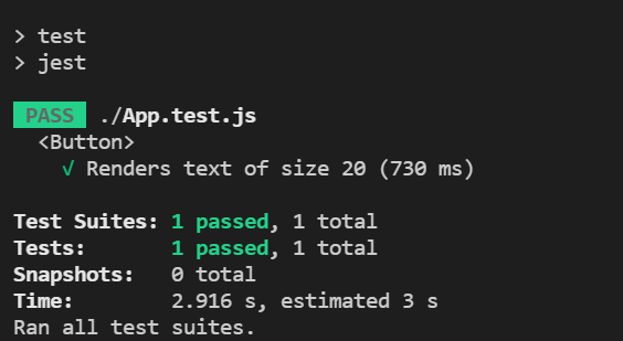
Finally, we’ll run the above test using the command:
npm run test
And voilà! Our test passes with flying colors.
We saw loads of different examples in this section. It’d be a pain to write an automated unit test for each scenario. That’s where the no-code testing platform Waldo comes in! You can use it to directly test your APKs on the browser and generate automated tests for your app. There’s a searchable blog, and you can try it for free.
Conclusion and Moving Forward
You should be a wizard now in using buttons in your React Native app! Remember to use <TouchableWithoutFeedback/> and <Button/> rarely. Most of the time, <TouchableOpacity/> should get you through almost anything. Of course, for icon buttons, stick to <TouchableHighlight/>.
The best way to move forward is to make your own custom <Button/> component, as we did in the final section. You can then conditionally render any of these components we discussed based on your use case.
Until next time!
This post was written by Siddhant Varma. Siddhant is a full stack JavaScript developer with expertise in frontend engineering. He’s worked with scaling multiple startups in India and has experience building products in the Ed-Tech and healthcare industries. Siddhant has a passion for teaching and a knack for writing. He’s also taught programming to many graduates, helping them become better future developers.
Automated E2E tests for your mobile app
Get true E2E testing in minutes, not months.