Waldo sessions now support scripting! – Learn more
App Development

How to Use Swift TabView With Examples

Nabendu Biswas
Nabendu Biswas
How to Use Swift TabView With Examples
January 10, 2023
6
min read

One of the most popular ways to create an app with different multiple areas of content is to have tabs. In iOS, the most common is a bottom tab; one click of each tab icon will show a different screen. For example, take the Instagram iOS app, which has Home, Search, Video, Notifications, and Profile tabs. Clicking any of them will take you to a different screen.

In this post, you’ll learn about TabView, with which you can easily create tabs. You’ll create a simple SwiftUI project with a tab. And you’ll also integrate different screens into the project.

What Is TabView in SwiftUI?

TabView, a feature available in the latest SwiftUI, lets you easily create a tab bar in an iOS app. Now, SwiftUI is the new way to create an iOS app that Apple is pushing developers to adopt. It differs from the earlier UIKit-based Storyboard apps in that here, easy-to-use Views help you develop apps more quickly with widgets.SwiftUI resembles Flutter, which has customized widgets to create everything.

The Project Setup

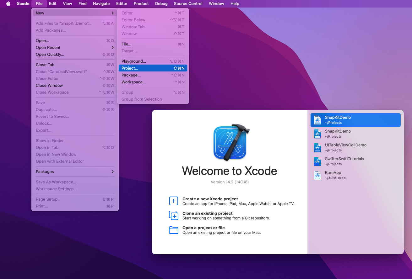
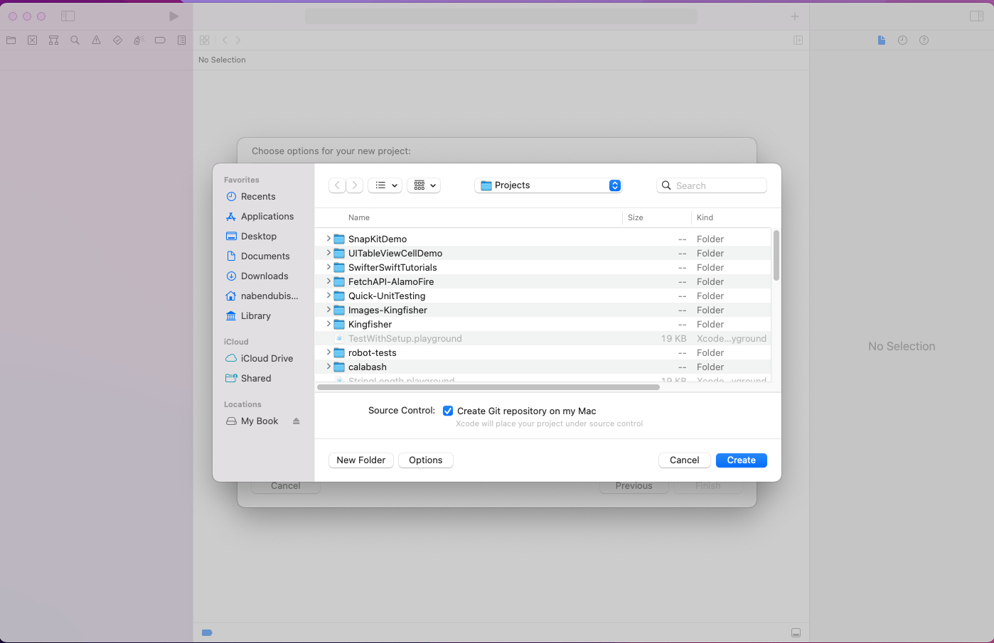
We need to first create a new project by opening Xcode and clicking on New>Project:

Xcode startup screen shows selecting "project" under "file" and "new"

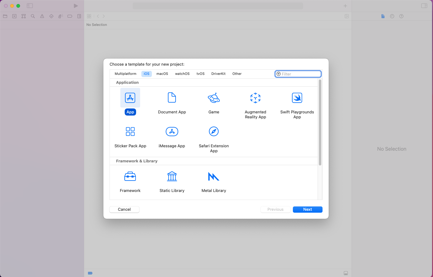
A pop-up opens, where you can click on App and then the Next button:

Pop-up titled "Choose a template for your new project." iOS is selected for platform. App is selected for type. "Next" button is located on botom right of pop-up window.

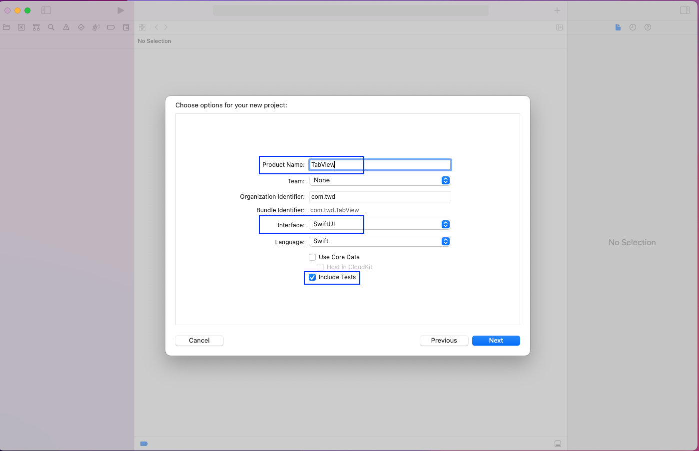
In the next pop-up, give any suitable name as the Product Name. In our case, we’ll use TabView. Select SwiftUI as the interface and make sure to check Include Tests because you’re going to test your app later.

Pop-up titled "Choose options for your new project:". Image highlights the following- Product Name: "TabView," Interface: "SwiftUI," Checkbox titled "Include Tests" is selected.

In the next pop-up, just click on the Create button.

Pop-up shows file save location preferences. "Create" button is located on the bottom right corner of pop-up

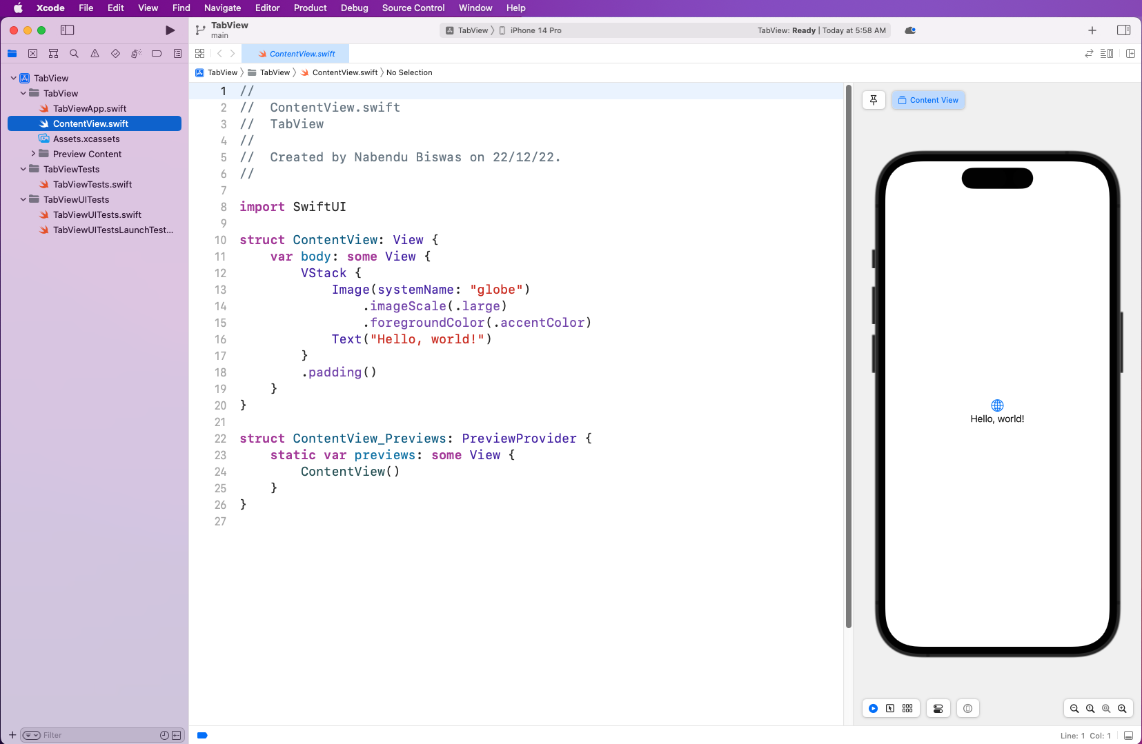
Notice that the structure and files are different from those of a Storyboard project. Also, SwiftUI displays an iPhone screen for each file. It will immediately reflect code changes so you don't need to re-run the simulator every time you add code.

IDE Shows "ContentView.swift" content view on right side displays an iPhone with "Hello, world!"

Creating a Tab Bar

To create a Tab Bar with TabView, you’ll create a new SwiftUI View file in the root directory.

Pop-up titled "Choose a template for your new file:". "SwiftUI View" is selected. "Next" button is located on the bottom right of pop-up window.

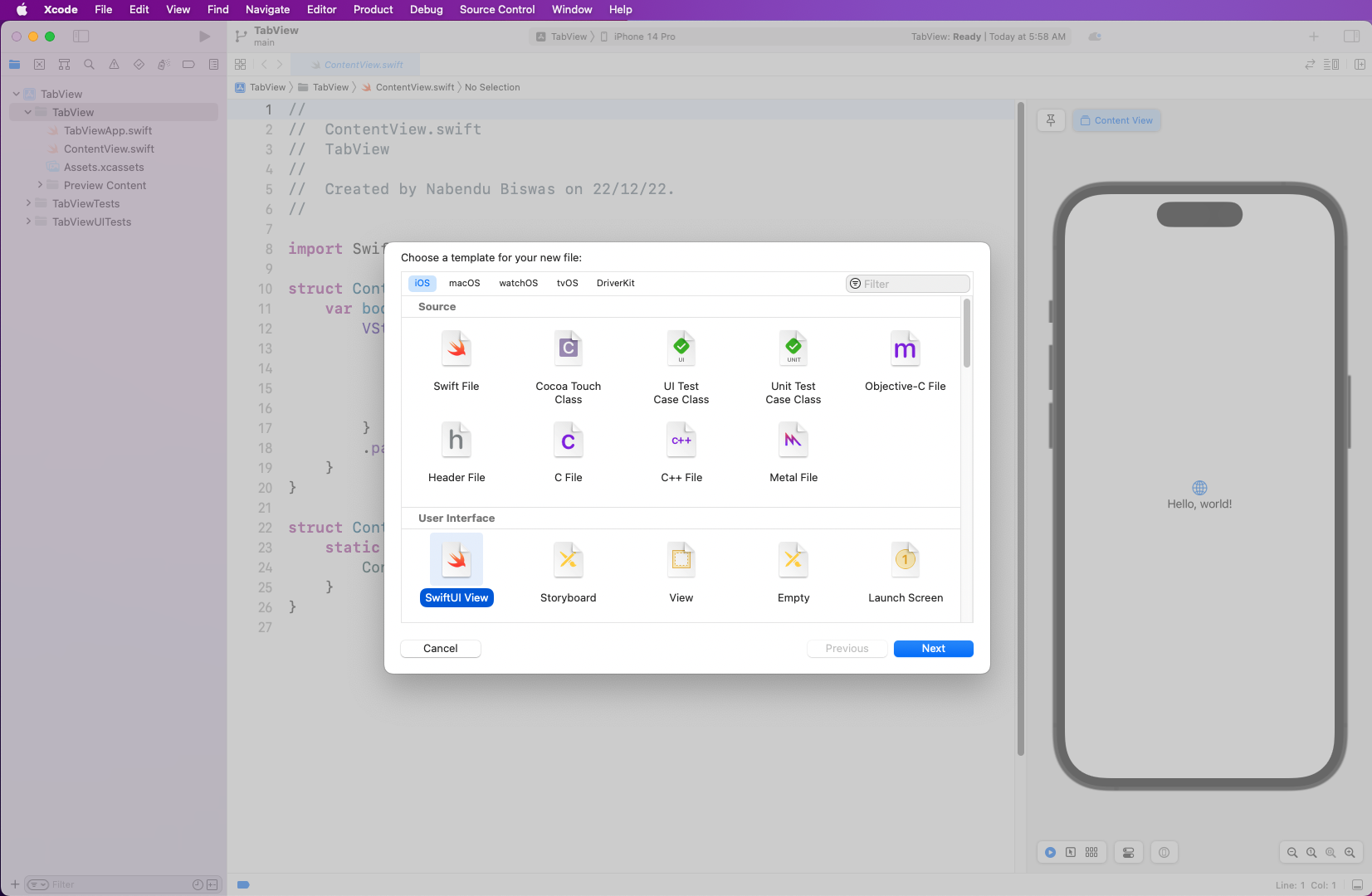
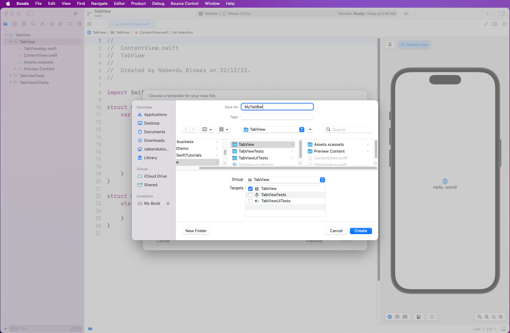
In the next tab, name the file MyTabBar. Make sure that the Target matches the product name TabView.

Pop-up shows saving the file as "MyTabBar." The section labeled "Targets" shows "TabView" selected.

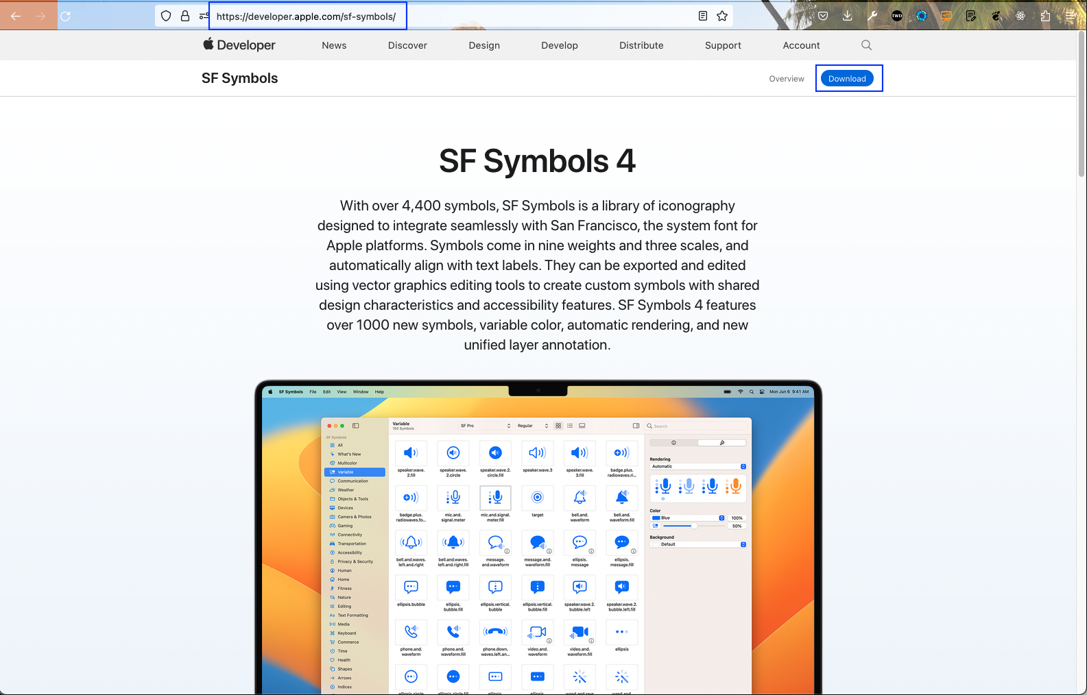
You’ll use the newly released icons called SF Symbols in your project. So head over to the official Apple SF Symbols page and download them.

Apple Developer website displaying "SF Symbols" and SF Symbols 4"

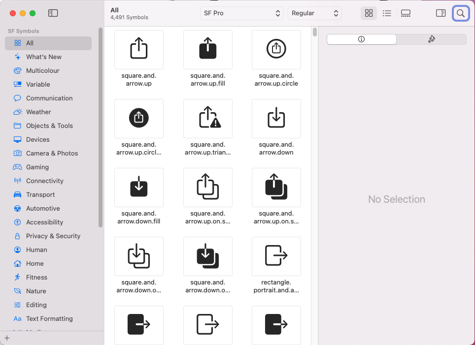
Once you install it on your Mac, you’ll see all the symbols available. You just need to know the name of the symbol you want to use, but you don't need to install it in Xcode.

Shows window displaying all SF Symbols

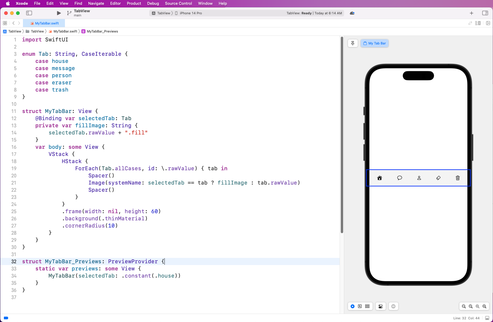
Now, in the MyTabBar.swift file, we use enum and list all icons as cases, using names taken from the SF Symbols library. Inside the struct MyTabBar, we first bind the Tab to the selected tab variable. After that, we have a fillImage value, in which add .fill to the selected tab.

All the SF Symbols have their corresponding fill image, like for example, the house.fill symbol, which is filled. Next, we loop through the enum and in each iteration show a space, then use an image to show the symbol, and then another space. Also, note that we show the filled image for the selected tab.

Next, we give some additional styles with frame, background, and cornerRadius. You’ll see the result in the iPhone image instantly.


import SwiftUI

enum Tab: String, CaseIterable {
   case house
   case message
   case person
   case eraser
   case trash
}

struct MyTabBar: View {
      @Binding var selectedTab: Tab
      private var fillImage: String {
        selectedTab.rawValue + ".fill"
     }
     var body: some View {
        VStack {
           HStack {
             ForEach(Tab.allCases, id: \.rawValue) { tab in
                 Spacer()
                 Image(systemName: selectedTab == tab ? fillImage : tab.rawValue)
                 Spacer()
               }
            }
            .frame(width: nil, height: 60)
            .background(.thinMaterial)
            .cornerRadius(10)
       }
    }
}

struct MyTabBar_Previews: PreviewProvider {
     static var previews: some View {
         MyTabBar(selectedTab: .constant(.house))
     }
}
Shows MyTabBar.swift. iPhone displays a row/bar located in the middle of the iPhone with a house, chat bubble, person, eraser, and trash can icon.

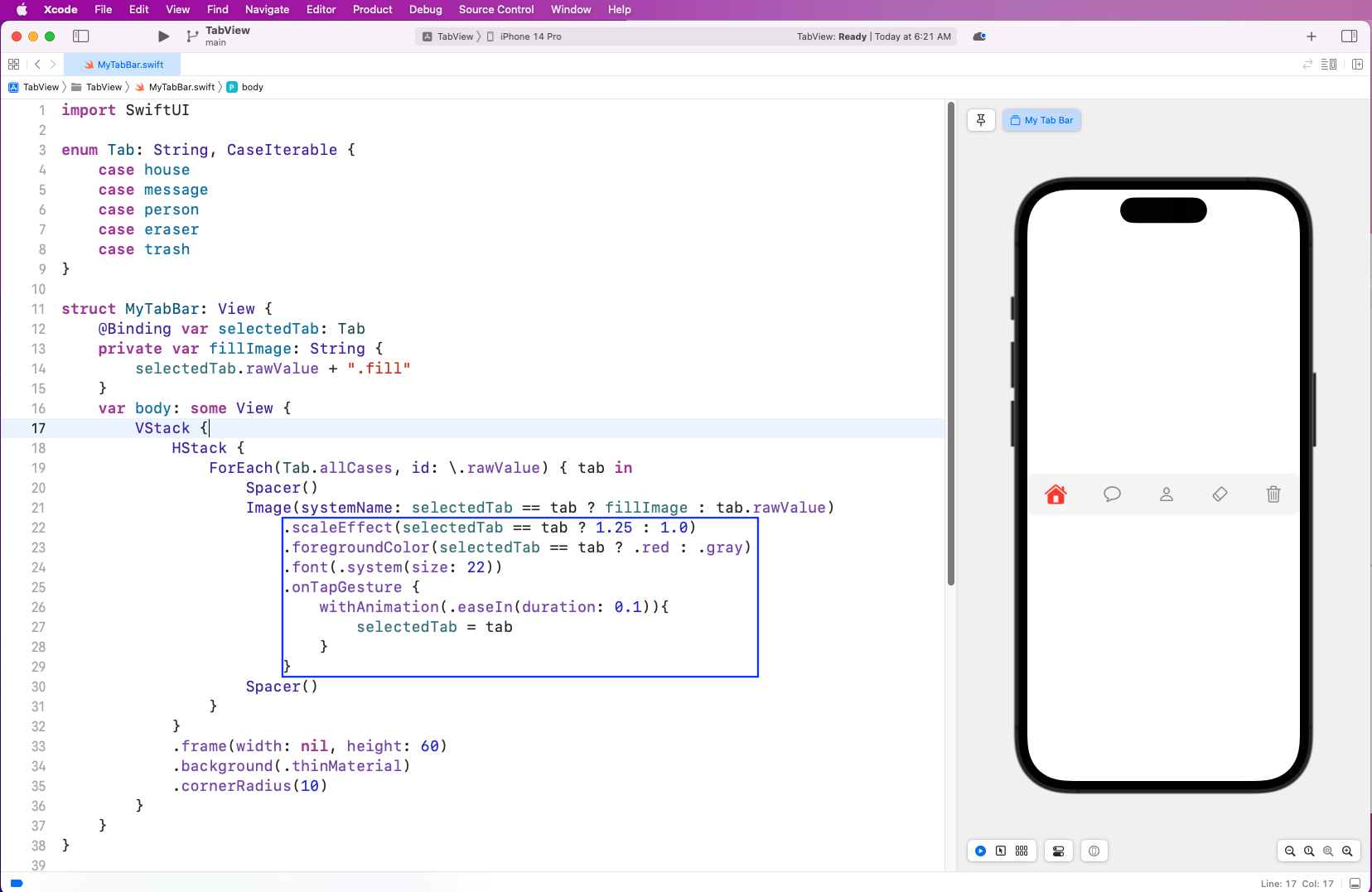
Next, let's add some more animation effects to our selected symbols. First, we scale them if selected, then change their color to red and increase the font size. We’ll also give the selected tab smooth animation.


.scaleEffect(selectedTab == tab ? 1.25 : 1.0)
.foregroundColor(selectedTab == tab ? .red : .gray)
.font(.system(size: 22))
.onTapGesture {
     withAnimation(.easeIn(duration: 0.1)){
         selectedTab = tab
     }
}
Shows MyTabBar.swift. iPhone display now has the house colored red

Display Tab Bar in App

You’ve created the tab bar, but to display it in the app you need to add it in the ContentView.swift file. Here, in the ContentView you first show house as the selected tab. And after that, you’ll show the MyTabBar component with the selected tab. The user can click on whichever tab they want to show.


@State private var selectedTab: Tab = .house
var body: some View {
   MyTabBar(selectedTab: $selectedTab)
}
Shows MyTabBar.swift. iPhone display now has the trash can colored red

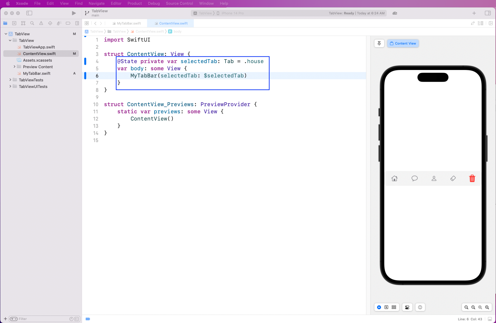
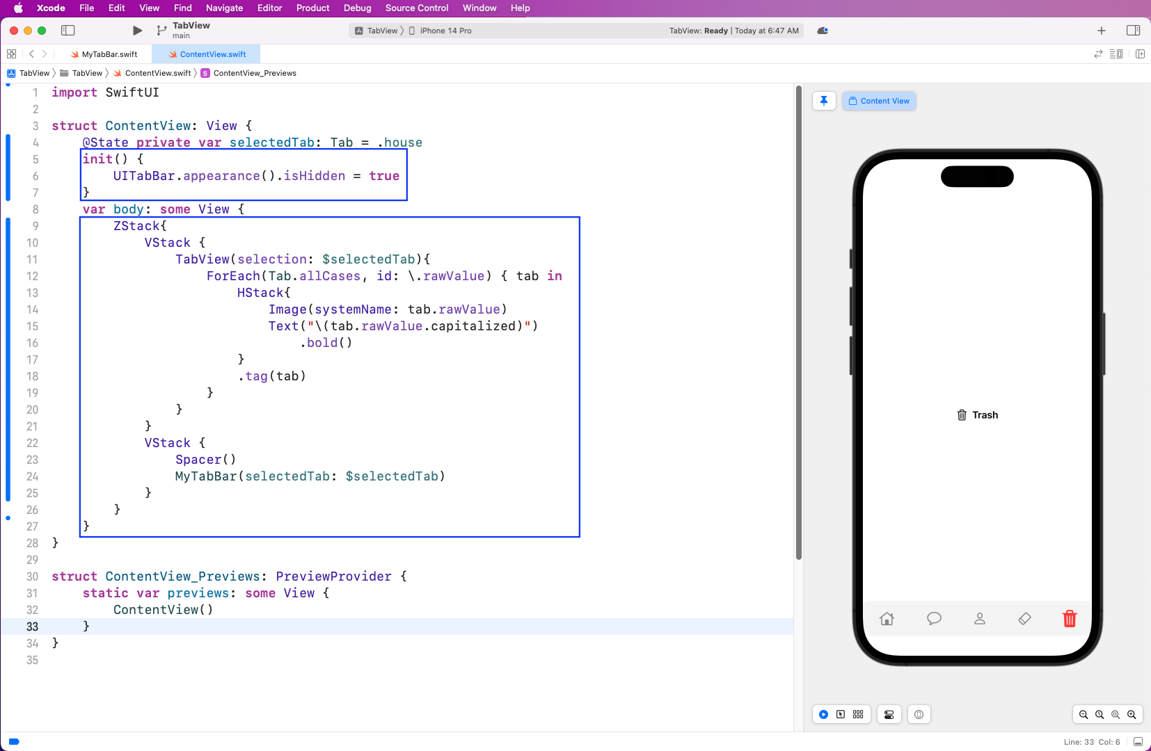
Next, add an init code in the ContentView.swift file. At first, you need to make it hidden. Then, inside the body, create a ZStack, which will contain two VStacks. The first one will show an image and text corresponding to the selected tab.

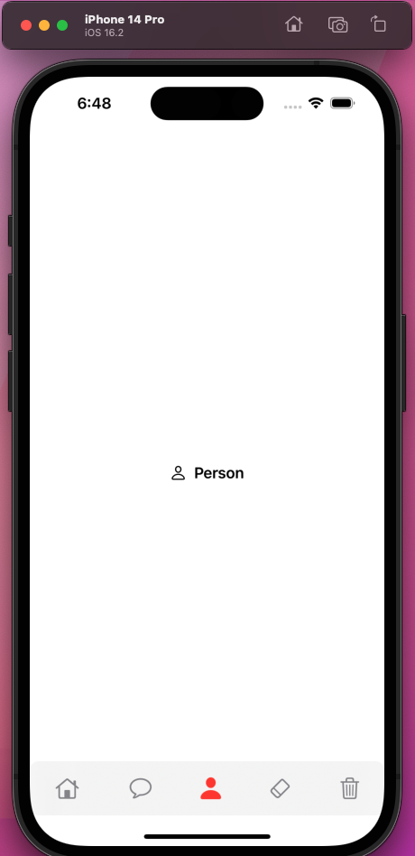
The second VStack shows your tab bar. To learn more about ZStack, VStack, and HStack (which you used in the code above), refer to this post. The iPhone image now shows your app perfectly and clicking the tab works properly.


init() {
   UITabBar.appearance().isHidden = true
}

ZStack{
   VStack {
     TabView(selection: $selectedTab){
       ForEach(Tab.allCases, id: \.rawValue) { tab in
          HStack {
            Image(systemName: tab.rawValue)
            Text("\(tab.rawValue.capitalized)")
              .bold()
          }
        .tag(tab)
      }
     }
   }
   VStack {
     Spacer()
     MyTabBar(selectedTab: $selectedTab)
    }
  }
}
Shows MyTabBar.swift. iPhone display now has the trash can colored red. The row/bar is now located on the bottom of the screen. A trash can icon and "Trash" are now displayed in the middle of the screen.

But you should always check your app in iPhone simulator after a milestone. If you start one, you’ll see that everything works correctly.

iPhone display now has the person colored red. The row/bar is now located on the bottom of the screen. A person icon and "Person" are now displayed in the middle of the screen.

Separate Screen for Each Tab

In a real app, when we press a tab icon a different screen should appear. Let’s update our app to do the same. Again, create a new SwiftUI View file.

Pop-up titled "Choose a template for your new file:". "SwiftUI View" is selected. "Next" button is located on the bottom right of pop-up window.

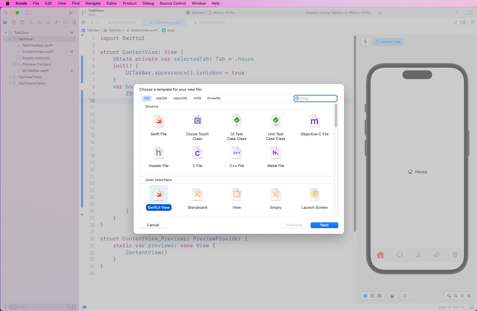
Name it FirstScreen and make TabView the Target.

Pop-up shows saving the file as "FirstScreen". The section labeled "Targets" shows "TabView" selected.

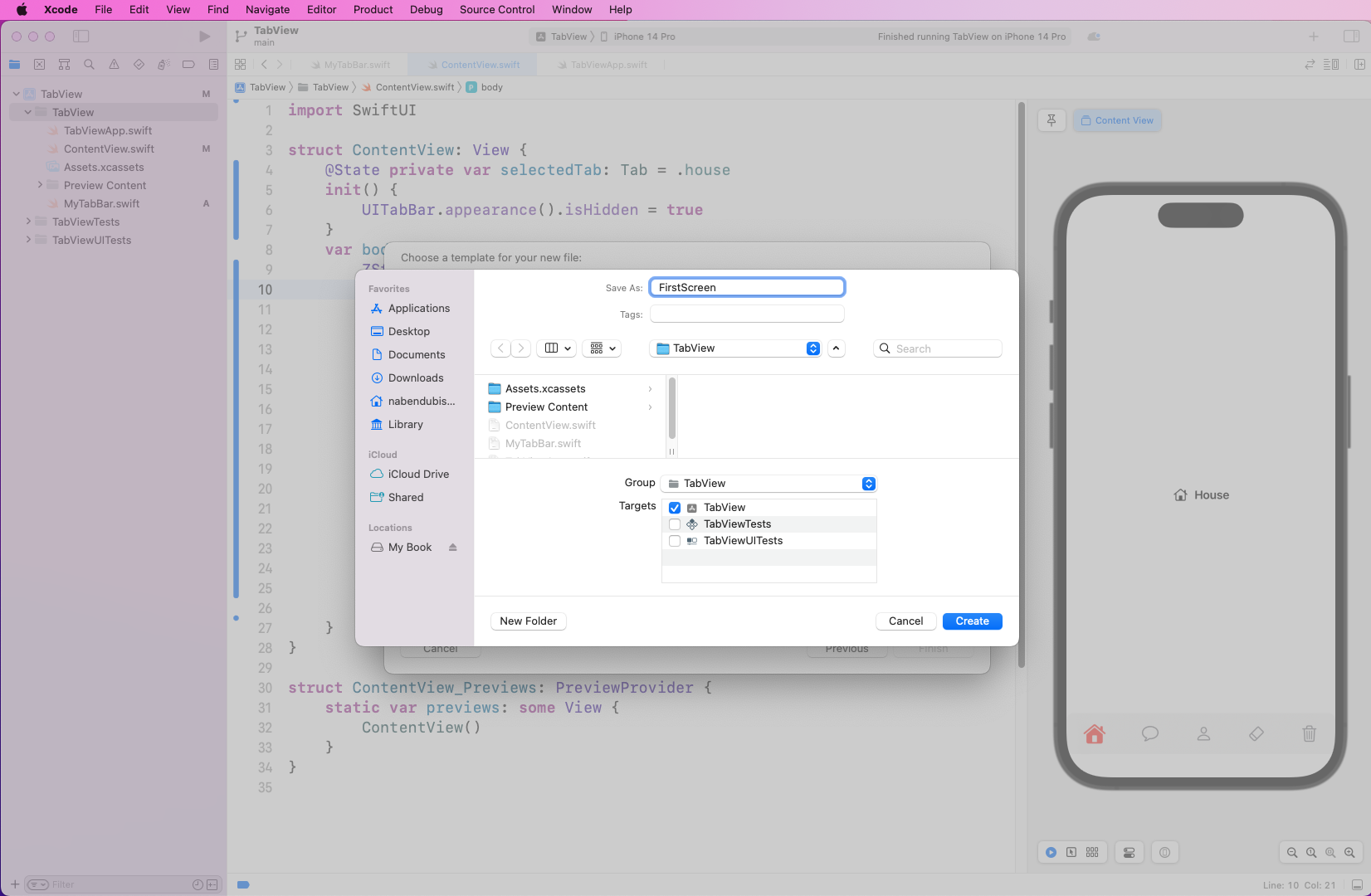
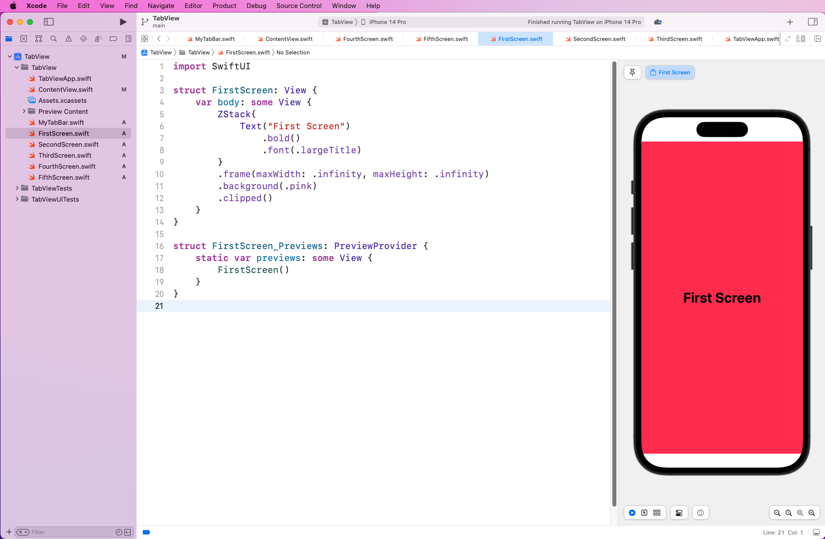
In the FirstScreen.swift file, add the code below, which will show large text with a pink background color.


var body: some View {
    ZStack{
       Text("First Screen")
        .bold()
        .font(.largeTitle)
    }
    .frame(maxWidth: .infinity, maxHeight: .infinity)
    .background(.pink)
    .clipped()
}
IDE shows "FirstScreen.swift" content view on right side displays an iPhone with a pink background and "First Screen" located in the middle of the screen.

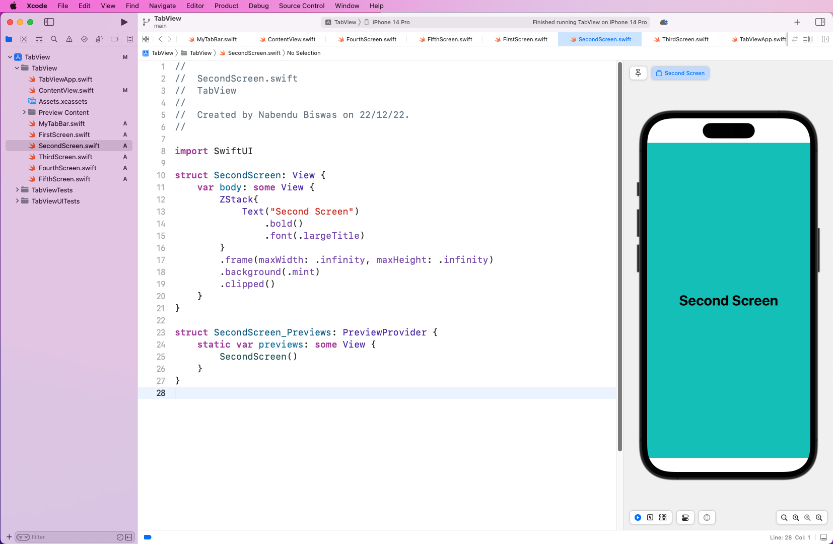
Next, create another SwiftUI View file called SecondScreen.swift. This file is similar to the earlier file, except it has a different title and color for the background.


var body: some View {
      ZStack{
         Text("Second Screen")
           .bold()
           .font(.largeTitle)
      }
      .frame(maxWidth: .infinity, maxHeight: .infinity)
      .background(.mint)
      .clipped()
}
IDE shows "SecondScreen.swift" content view on right side displays an iPhone with a mint background and "Second Screen" located in the middle of the screen.

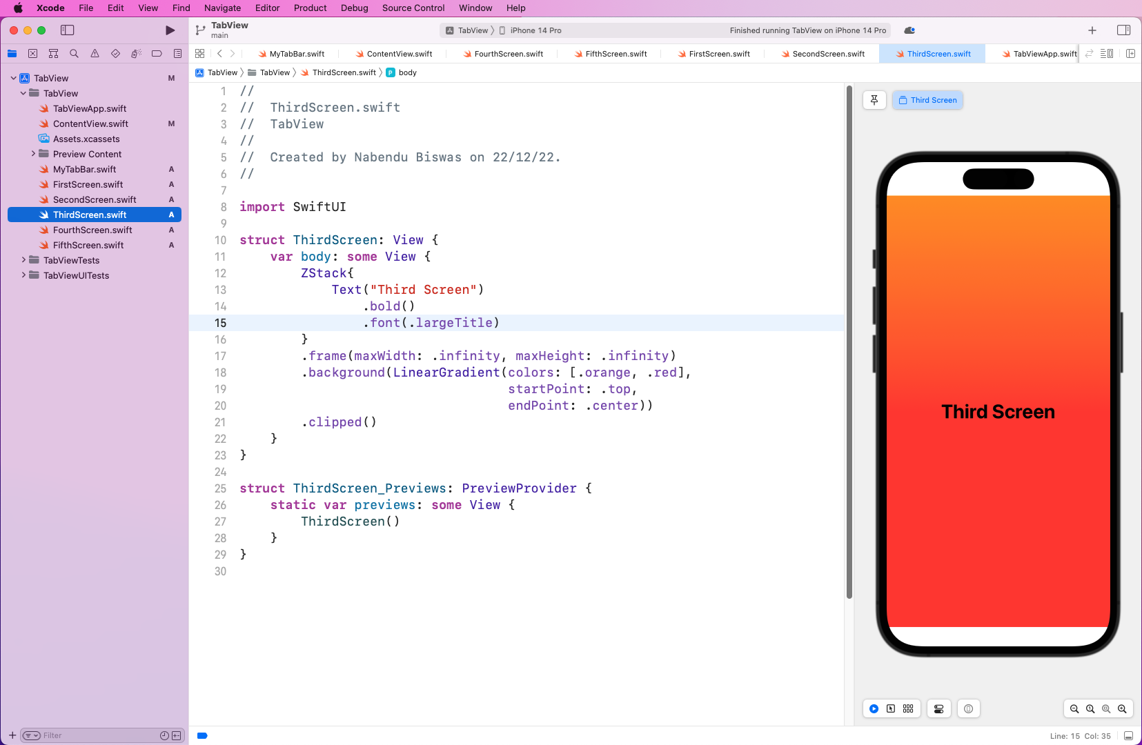
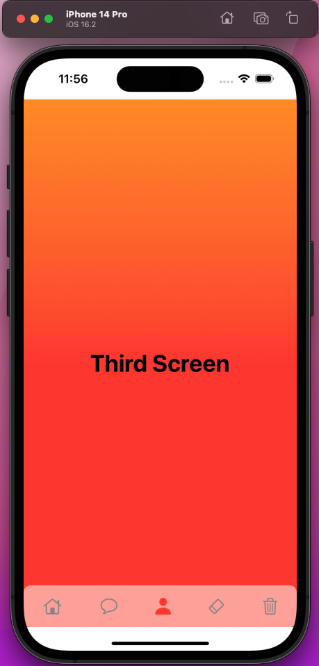
Create another SwiftUI View file called ThirdScreen.swift. This file is also almost similar to an earlier file, but the text is different. Also, you’ll show a nice linear gradient for the background color.


var body: some View {
      ZStack{
          Text("Third Screen")
              .bold()
              .font(.largeTitle)
          }
          .frame(maxWidth: .infinity, maxHeight: .infinity)
          .background(LinearGradient(colors: [.orange, .red],
                                     startPoint: .top,
                                     endPoint: .center))
          .clipped()
}
IDE shows "ThirdScreen.swift" content view on right side displays an iPhone with an orange-red gradient background and "Third Screen" located in the middle of the screen.

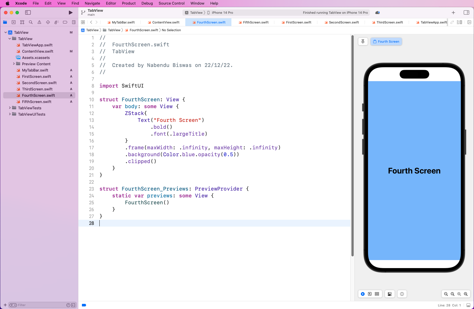
Next, make a file called FourthScreen.swift, which is similar to SecondScreen.swift, except for a different title and different background color.


var body: some View {
     ZStack{
        Text("Fourth Screen")
          .bold()
          .font(.largeTitle)
        }
       .frame(maxWidth: .infinity, maxHeight: .infinity)
       .background(Color.blue.opacity(0.5))
       .clipped()
}
IDE shows "FourthScreen.swift" content view on right side displays an iPhone with a blue background at half (0.5) opacity and "Fourth Screen" located in the middle of the screen.

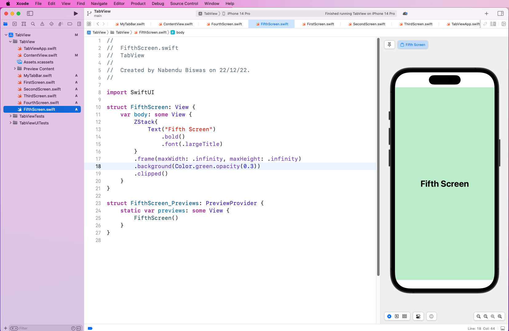
Lastly, make a file called FifthScreen.swift, which resembles an earlier file, except again, it has a different title and different color background.


var body: some View {
     ZStack{
        Text("Fifth Screen")
           .bold()
           .font(.largeTitle)
        }
        .frame(maxWidth: .infinity, maxHeight: .infinity)
        .background(Color.green.opacity(0.3))
        .clipped()
}
IDE shows "FifthScreen.swift" content view on right side displays an iPhone with a green background at 0.3 opacity and "Fifth Screen" located in the middle of the screen.

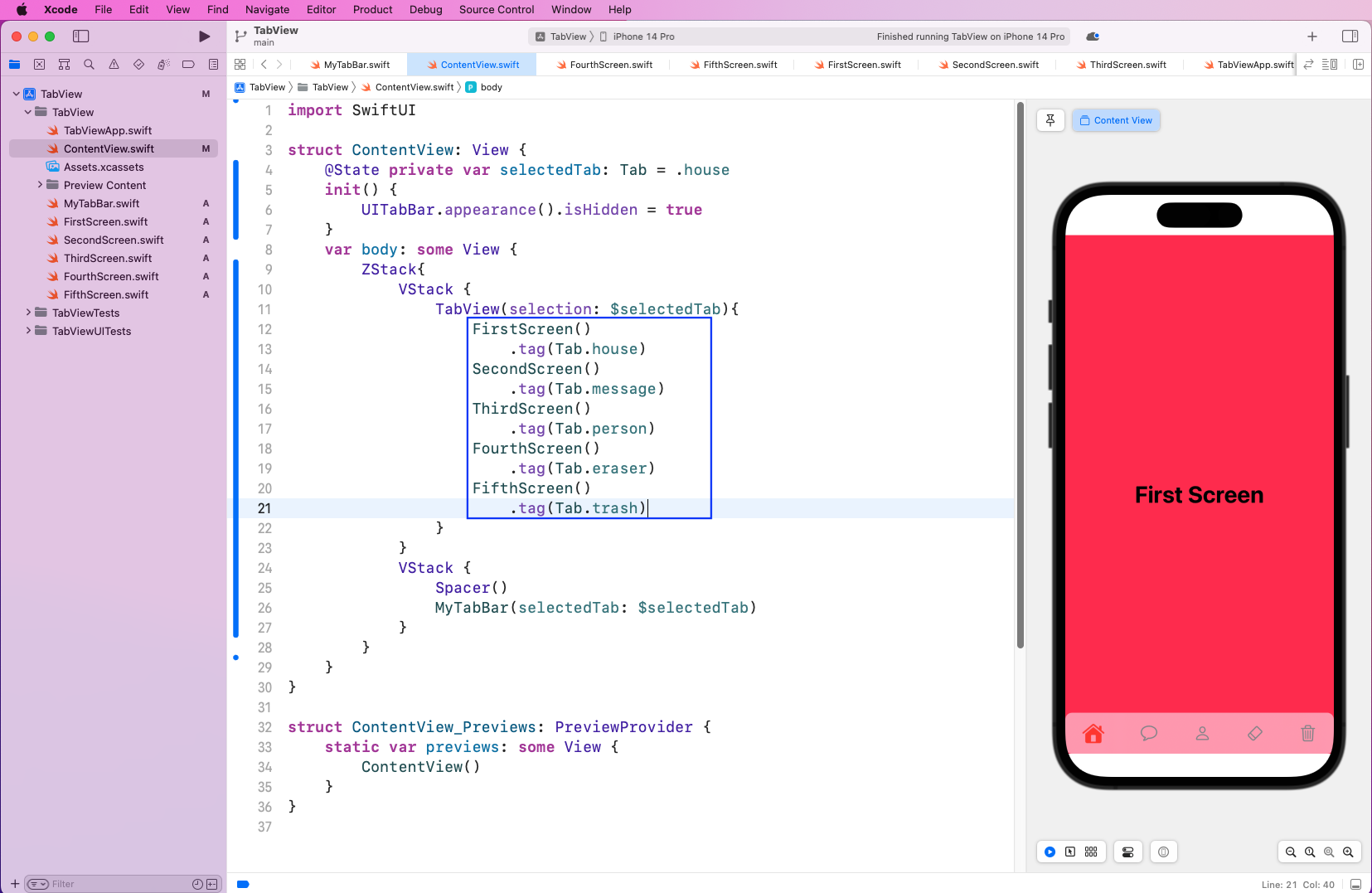
To show your five different screens, you need to update your ContentView.swift file. In the TabView for the selected tab, you want to list the five screens. Also, notice the tag function on each screen. It needs to have the correct identifier for each tab.


TabView(selection: $selectedTab){
      FirstScreen()
       .tag(Tab.house)
     SecondScreen()
       .tag(Tab.message)
     ThirdScreen()
       .tag(Tab.person)
    FourthScreen()
      .tag(Tab.eraser)
    FifthScreen()
      .tag(Tab.trash)
}
IDE shows "ContentView.swift" highlighting "1st, 2nd, 3rd, 4th, 5th screen" tagging.

On running the app in simulator, everything works well.

iPhone displays a semi-transparent bar located at the bottom of the screen. The person icon is colored red. The phone has an orange-red gradient background with "Third Screen" located in the middle of the screen.

Testing the App

You can test the app with XCTest, and take the initial steps from our post on XCUI methods.

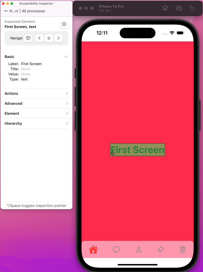
For testing, you need a unique ID for each element. You can find the IDs with the Accessibility Inspector. To open it, click on Xcode > Open Developer Tool > Accessibility Inspector.

Keep the iOS simulator running on the side. Use the pointer from the Accessibility Inspector to click on different elements. Here, we clicked on the text of the First Screen. And the Label, or unique ID, for this element is First Screen.

"Acessibility Inspector" window shows "First Screen" as "Label:" and "text" as "Type:" under "Basic" section

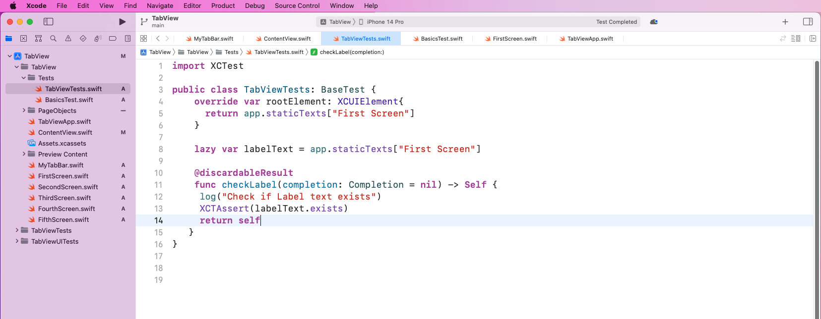
Now, create a file called TabViewTests.swift inside the Tests folder. In the file, create a checkLabel function, which will use XCTAssert to check if the label exists.


import XCTest

public class TabViewTests: BaseTest {
      override var rootElement: XCUIElement{
        return app.staticTexts["First Screen"]
      }

     lazy var labelText = app.staticTexts["First Screen"]

     @discardableResult
     func checkLabel(completion: Completion = nil) -> Self {
        log("Check if Label text exists")
        XCTAssert(labelText.exists)
       return self
   }
}
IDE shows "TabViewTests.swift"

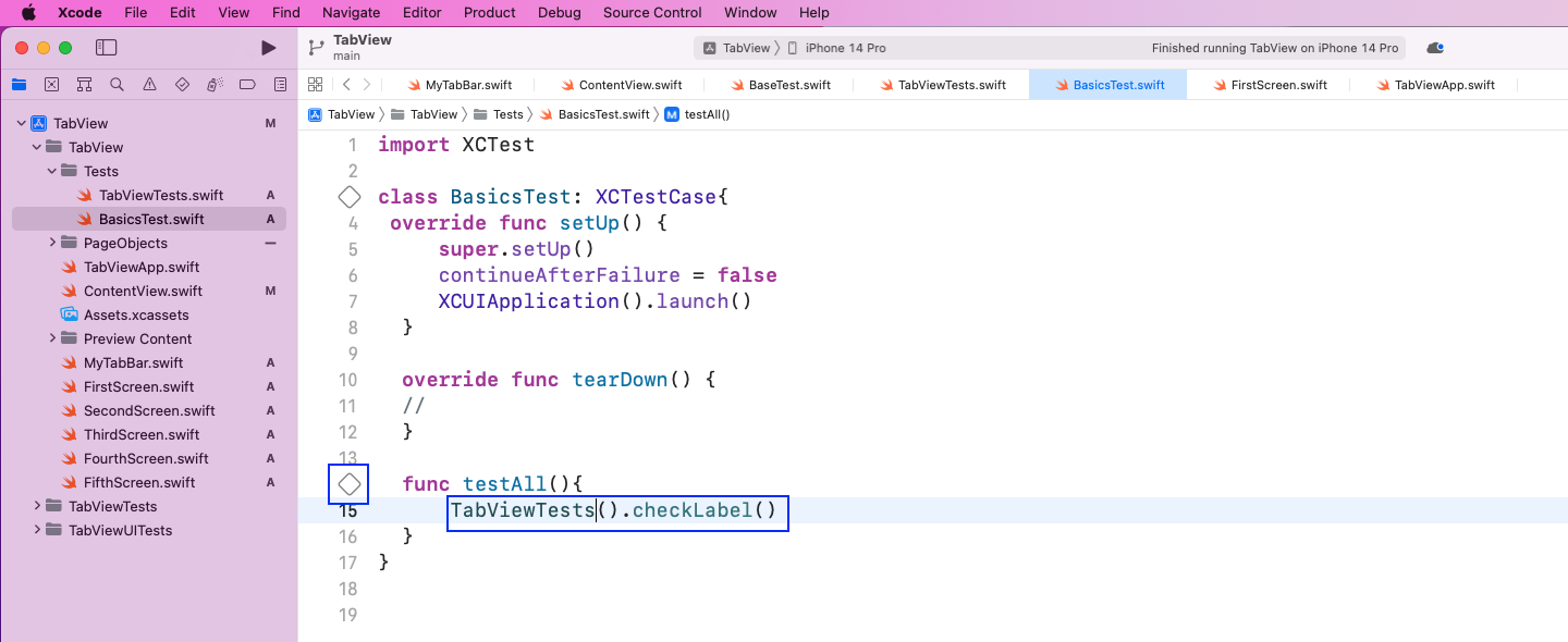
In the BasicTests.swift file, call the TabViewTests class and then the checkLabel function. After that, click on the play test button next to the function.


TabViewTests().checkLabel()
IDE shows "BasicsTest.swift" highlighting "TabViewTests().checkLabel()" and diamond shaped "tick box" button

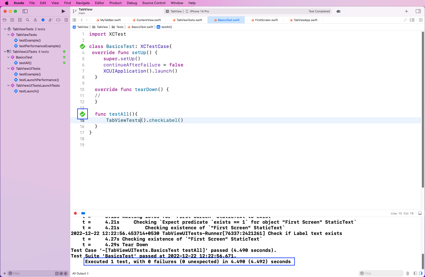
The tests will take 10-20 seconds to run and once completed, you’ll see the green ticks checked. It will also show the result in a log.

IDE shows "BasicsTest.swift" highlighting a diamond shaped "tick box" button as checked. Image also highlights "Executed 1 test, with 0 failures (0 unexpected) in 4.490 (4.492) seconds.

What We've Covered About TabView in SwiftUI

In this post, we talked about TabView in SwiftUI. Using the easy-to-use code of SwiftUI, we created a fully working tab bar. We also wrote simple test cases using XCTest.

However, test cases emulating each press of a tab and showing the corresponding screen will be very complicated. To make your testing less complicated, try Waldo. You need only provide an APK or IPA file, and then just interact with your app. Waldo automatically generates test cases and emails you the results.

Automated E2E tests for your mobile app

Waldo provides the best-in-class runtime for all your mobile testing needs.
Get true E2E testing in minutes, not months.

Reproduce, capture, and share bugs fast!

Waldo Sessions helps mobile teams reproduce bugs, while compiling detailed bug reports in real time.