As iOS developers (and, more recently, Apple Platform developers, given the flexibility available to us now to create device-agnostic apps), we’re no strangers to the essential elements that the vast majority of applications share.
Chances are, if you’re working on an application, you’re implementing most of these elements.
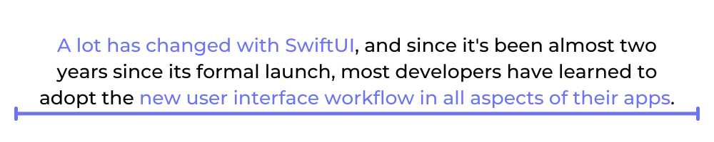
A lot has changed with SwiftUI, and since it’s been almost two years since its formal launch, most developers have learned to adopt the new user interface workflow in all aspects of their apps. One such aspect is Buttons.
Maybe you haven’t had the opportunity to stretch your muscles with this new workflow. Or perhaps you’re new to the platform, and you’re looking for a simple and straightforward introduction to SwiftUI. Either way, this is the article for you.
This article will briefly introduce the SwiftUI button. You’ll learn about customizing and adding functionality to buttons, and you’ll find out about some basic testing. By the end of this article, you’ll have in your hands a simple iOS project with the fundamentals already implemented.
This article assumes you have experience working with the Swift language and XCode 12. If you have no background in these tools, please take some time to explore them first here.
Understanding the SwiftUI Workflow
Although a lot has changed in the workflow required to develop SwiftUI projects, XCode still feels familiar. Yet, if you haven’t had the opportunity to work on a SwiftUI project before, I would highly recommend that you get acquainted with it.
Nevertheless, I’ll give you a brief summary of what you’ll have in front of you when you create your first project.
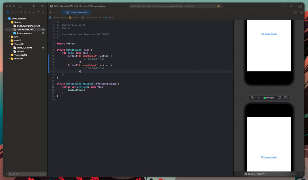
As you can see, your project currently has two files in it: a ContentView.swift file and an <APP_NAME>App.swift file, where APP_NAME is the name you used for the project.
The latter is the root application class. Don’t worry about it for now. The former, however, is where we’ll be working.
All SwiftUI View classes have the same structure: a View struct that defines the view structure and functionality and a Preview View struct that serves as a helper for the emulator to display your work in real time.
As you can see, in the ContentView struct there’s a body variable of type View that defines the body of that view. Therefore, any modification that you want to make to your view must be done in this variable.
Currently, that view contains a Text view object containing the titular “Hello World!” statement.
Now, you can start working on your view.
Adding Buttons With SwiftUI
The first thing to do is, of course, to add a button. Simply replace the Text view inside the body with a Button view.
With the introduction of this declarative workflow, SwiftUI enables developers to create views efficiently while getting immediate feedback from changes with the previewer.
It’s all very simple and clean.
Want to add more buttons? Make sure you embed them on what’s known as a Stack. A Stack, another addition to SwiftUI, tells the framework how to display the views correctly. This can be either horizontally (HStack), vertically (VStack), or on top of each other (ZStack).
Otherwise, you’ll end up with something like this.
Alternatively, if you want to have a more DRY approach for multiple buttons, you can use this constructor instead.
Customizing Button Appearance in SwiftUI
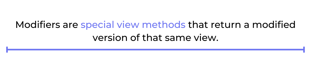
Wow, that was easy. But it doesn’t really look that great, does it? So how do you add some styling to that button? Again, it’s simple. You can use another of SwiftUI’s new additions: modifiers.
Modifiers are special view methods that return a modified version of that same view.
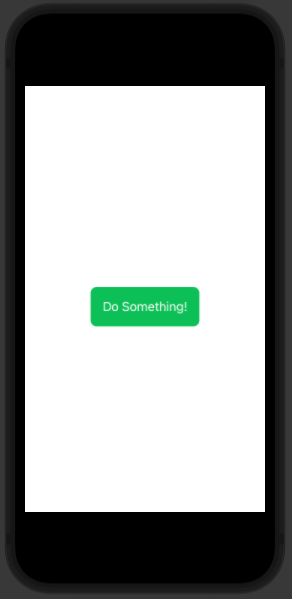
First, add background color so the tappable area is visible to the user.
Great. Now, let’s add a few more modifiers to make it look more like a proper button.
Note: Be mindful of the order in which you put your modifiers since they aren’t commutative. To read more about this issue, you can go here.
Neat!
Now, you might not want to add all these modifiers to every button you introduce. So, how do you DRY this? Easy—just define what’s known as a StyleProtocol and add your modifiers there. Once you’ve done that, you can specify that protocol to every button you have, and voila!
That’s all great and dandy, but you want your buttons to do something when users interact with them. So let’s add functionality to those buttons.
Adding Functionality to SwiftUI Buttons
This is quite simple and straightforward. But first, you need to add a State variable that’ll hold the state of the button in the view.
Why do this? Because the view, and its hierarchy, need to have some idea of the state of dynamic views in the app. Otherwise, there would be inconsistencies in the behavior of the app on navigation.
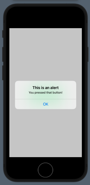
Once this is done, you can then add an alert modifier to your button and declare the alert in it. Don’t forget to modify the state variable in the action block, so the button triggers the state properly.
Testing Your Work
Now that you’ve experimented with the SwiftUI button, you should create some tests to ensure that your code is clean and always works as intended. To do that, you can work with Xcode’s UI testing framework, which is already bundled in the project.
If you open the Test iOS group in the left bar, you’ll see a Test_iOS.swift class file. In it, you can see that you have pretty much everything you need set up for you. Therefore, you can proceed and run it if you want to see the app running in the emulator.
To test that the code is working as intended, add the following code to the testExample() function.
Now run that test and check that the button’s displaying correctly. When pressed, it should present the alert with the message.
Nice!
Find more info on how to implement testing in Xcode UI here.
Wrapping Up
If you’re coming from creating your views programmatically, SwiftUI’s new workflow might look a bit more approachable than UIKit’s more graphical-design-focused workflow. It’s quite intuitive to create your views once you’ve gotten used to the interface.
Also, if you’d like to learn about the world’s first no-code testing platform, check out Waldo. The site has lots of information about quality assurance and testing.
Automated E2E tests for your mobile app
Get true E2E testing in minutes, not months.