The goal of this article is to explore the React Native swiper component and to show you how to implement it effectively. Additionally, we'll examine the different aspects of swiper-like elements in the platforms that React Native supports.
First, we'll define what React Native swiper components are and why they're helpful for user interaction. Then we'll explore the most common examples of React Native swiper components and help you understand their intricacies. Finally, we'll provide some basic customization options so that you can adjust them to suit your needs.
Since this is an introductory article and we want everyone to be able to get the most out of it, we'll provide you with a brief introduction to how to set up your environment for React Native development. If you don't need introduction to these topics, please skip this section.
React Native Intro
The process of setting up a React Native environment for development is super easy and only requires a few commands. If you have read some of our other React Native articles, you might have already gone through this process. But here's a quick refresher anyway.
For the environment, you'll use the Expo CLI Command Line utility, NodeJS runtime, and Visual Studio Code. To set them up, first install NodeJS on your system. You can either go to the official NodeJS portal and download the installer or use the package manager within your OS through the command line.
If you use macOS, you can homebrew by inputting the following command on the terminal:
Now install the Expo CLI tool by inputting the following command on the terminal:
That's about it.
For Visual Studio Code, you can find it here.
To create your project, type the following command and let expo know what kind of boilerplate project you want to build:
Feel free to change ProjectName to anything you want.
Finally, run the following command and select the platform to get the application running:
The result will be the following:
You can find more information on the React Native developer website here.
What Is a React Native Swiper?
A swiper is a component that behaves like a scrollable gallery for views or other components to be displayed. The most common use case for swipers is as introduction screens for mobile applications.
The primary method of interaction for users with mobile applications is with gestures and taps. A swiper is a great tool to enable a seamless and intuitive first impression for new users since it allows the presentation of information in the most intuitive way possible. You just swipe screens and see the information until you reach the end or loop to the beginning.
Now, React Native does not have a swiper component built within the core components. However, there are many great robust and versatile libraries for you to implement in your projects.
For this demonstration project, we'll implement a simple intro screen with the react-native-swiper library. You can find the documentation for this library here.
Implementing a React Native Swiper With react-native-swiper
Alright, so the first step in implementing your intro screen for your application is to install the library. You can do this by simply running the following command:
This command will install the library locally. Keep in mind that you need to make sure the dependencies are not conflicting, so keep an eye on what the console tells you.
Once you've done that, you can reference the library in the App.js class file by adding the following line of code:
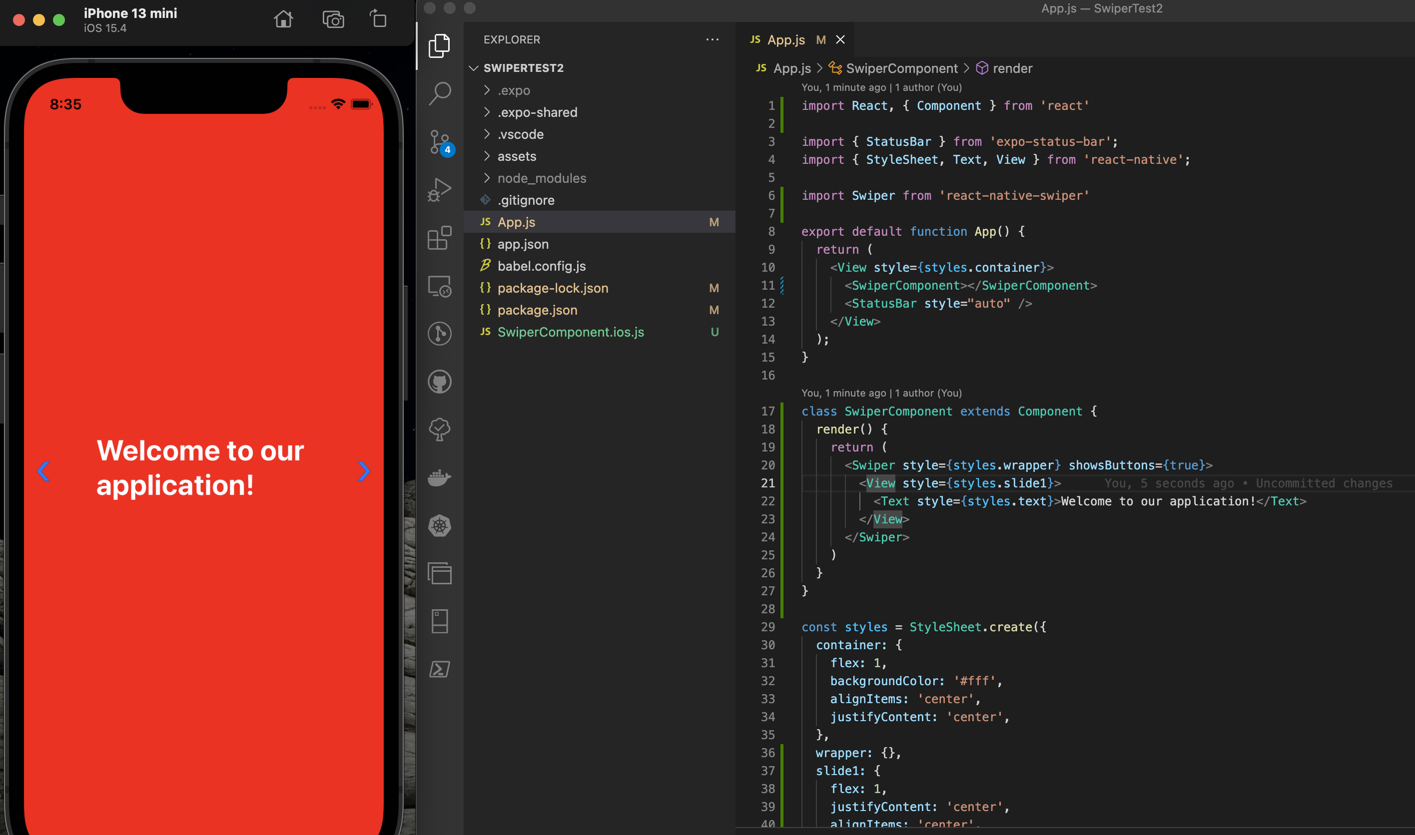
Now you need to create your swiper component by extending the component class. You can do this by creating a class called SwiperComponent and adding a render function with a return that makes a simple view with a text.
You also need to add some styles to the style directive below so that your view looks elegant and clean.
Finally, replace the text component in the app function with a 'SwiperComponent', and voila!
Fantastic.
Notice that this project is running on an iOS emulator. Unfortunately, the swiper library only works with mobile platforms, so you might want to consider other options if you also plan to target the web.
OK, so next add some more views so you actually have something to swipe to. All you have to do is duplicate the slide views and modify the content and styles.
This code will result in the following screen:

Pretty neat, right?
A More Elegant Solution
So now that you have a lovely introductory view for your application, let's see what else the swiper has to offer.
To implement a more elegant and flexible solution to satisfy a broader range of needs, you can use a secondary library called react-native-snap-carousel. Now, don't let the name fool you. Despite this library referring to itself as a carousel, it is, in essence, a swiper and fulfills the same needs.
To install it, once again, all you have to do is run this command on the terminal:
Once you've done that, you have to add the reference to the library, much like you did before with the previous library.
Next, you need to create the class that will generate the component view. You can take this code as a base and work from it.
Now, I know that it looks like a lot of code, but don't let it intimidate you. It's actually quite simple.
Rendering Items
The core of the component lies in the '_renderItem' function, which is used inside the container that lies inside the primary render function. This means that the carousel component will call the '_renderItem' function to generate every instance of an item. This is essentially what a prototyping class does. And the items are provided in the state props.
Notice that we pass the items in the data prop of the carousel component together with some other configuration props, which are pretty self-explanatory.
Finally, all you have to do is, once again, replace the old swiper with the new carousel component, and that's it.

Awesometastic!
Now, if this view layout doesn't satisfy your need for elegance, you can explore other options by simply changing the 'layout' prop in the 'Carousel' component.
You can get results like this:

Or even this:

All these features and more are available to be explored on the official documentation page here.
Next Steps
Libraries for components like the swiper or carousel are powerful and versatile. There's no denying that their features offer a robust and elegant way to interact with applications and tools. However, it's crucial to keep in mind that much of this is achieved by mountains of code that lie behind the scenes and are touched by many hands. This is why it's vital to have a reliable and recurrent mechanism to continually test your project and ensure that the product responds and behaves as expected.
To achieve this, we recommend considering Waldo's code-free testing solution. The powerful testing tools allow you to create multiple testing scenarios without ever having to type a single line of code.
You can learn more here.
Automated E2E tests for your mobile app
Get true E2E testing in minutes, not months.