Charts are one of the most valuable tools for displaying data comprehensively and interactively. They allow us to get insights into data that otherwise would be challenging to discern, and they organize information in extremely valuable and easy-to-understand ways.
In this article, we will provide you with a step-by-step guide on how to implement charts in React Native that includes some helpful examples. This process will apply to projects targeting the iOS and Android platforms.
We will start with a brief introduction to React Native and how to set up your project with the react-native-chart-kit package library. This will be the package we use to demonstrate how to implement some basic charts in a React Native project. Then we will explore the different kinds of charts available and some of the customization options for them. Finally, we will offer some alternative packages you could implement if you find that chart-kit doesn't satisfy your needs.
Beginning With React Native
Since this is an introductory topic, we will first provide a brief React Native setup refresher, in the interest of beginners and experts alike. However, if you find this information unnecessary, feel free to skip this section.
Setting up React Native is relatively easy and only requires a few commands and tools. You'll need the Expo CLI command line tool, Node.js runtime, and Visual Studio Code.
Setup
First, install Node.js. To do this, you can either go to the official Node.js portal and download it there or use the package manager within your OS.
For example, if you use macOS, you can use Homebrew by inputting the following command:
Now you need to install the Expo CLI. Input the following command to install it:
Finally, install Visual Studio Code. If you have another editor that you prefer, feel free to use it instead.
Creating a New Project
Now, to create a new project, we will be using Expo. Just type the following command to let Expo know what kind of project you want to scaffold:
Feel free to change "MyProject" to anything you like.
Installing Chart Kit
To install the react-native-chart-kit package library, input the following command:
Finally, input the following command to run the project and select the target platform:
.png)
Chart Examples in React Native
For a framework like React Native, which builds on top of other frameworks, providing a solution that looks and feels elegant and cohesive can be challenging, depending on your targets. However, much work has been done in the community to create packages and libraries that facilitate this work.
That is where react-native-chart-kit comes in.
Chart Kit is a library that allows you to create visualization elements to present data elegantly. Some of these elements include line charts, pie charts, bar charts, progress charts, and other graphs. In addition, the package provides an API that is easy to implement, responsive, and highly customizable.
To illustrate how to create charts, we will be adding a line chart, a bar chart, and a pie chart to the project you just created.
In order to keep the code streamlined and maintainable, we recommend that you create a components folder and add your new charts component there individually. However, you can add them directly to the class file if you choose.
Line Chart
To create a line chart, add a new file called "MyLineChart.tsx" to the components folder. Then proceed to create a basic structure for a functional component. Here's a simple example:
Now import the LineChart class from the package and add the component element to the return function like the following. Don't worry so much about the props. We will explain shortly.
Here you can see that the LineChart component class contains a few props that you must provide to render appropriately. Many of them are self-explanatory and easy to figure out, like width, height, and yAxisLabel, while others might not be so clear.
Firstly, the data is a JSON structure that needs to specify at least two properties: the dataset and labels. Labels are the labels on the y-axis, while the dataset is an array of objects containing the data itself and other optional properties.
An example of this data would be the following:
Notice that you are providing the data to the component through the props. Therefore, the props data element must conform to the ChartData interface.
Finally, the chartConfig prop indicates how to draw the chart to the package library. You can see that we are setting the background color and text color in this case. You can find a complete list of additional props to customize your charts further on the documentation website.
Once you import your newly created component into the main class file (App.tsx), just add the JSX element and run your code.
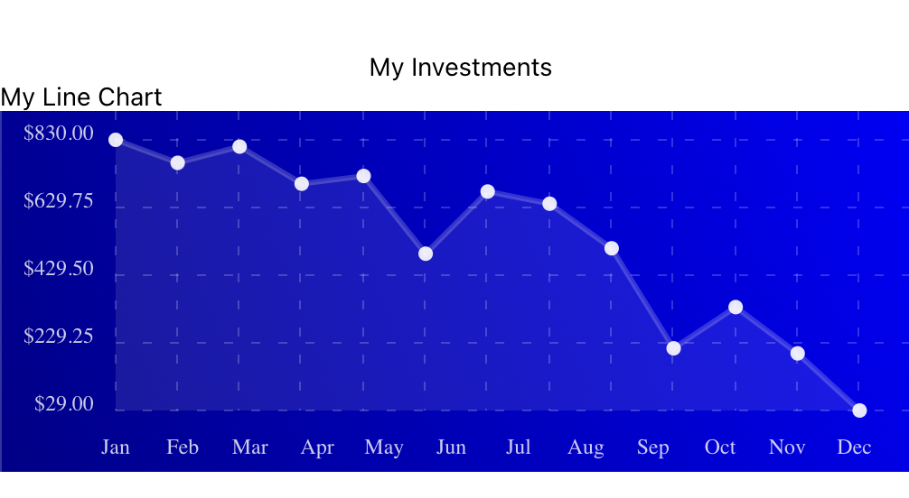
Pretty cool, right?
Alright, how about a bar chart? Let's get to it.
Bar Chart
To create a bar chart, follow the previous steps by creating a new component file named "MyBarChart.tsx" and adding the following code:
Notice that this code shares a lot with the previous chart component. The only new prop required is yAxisSuffix. In this case, you provide an empty string, but feel free to put anything you would like here.
Now just import the new component, provide the same data file, and voilà!
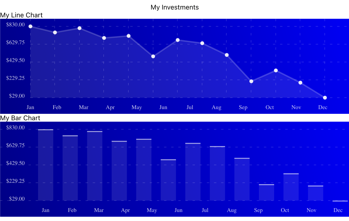
It's that simple.
Pie Chart
For pie charts, the game is, again, pretty similar. However, the data is slightly different, so we need to make some changes.
After creating a new component file called "MyPieChart.tsx," add the following code:
In this case, you are not using the data interface and just declaring the data as an array of any.
Moreover, you must provide some additional props for this chart to render. One of these props is the accessors, which indicates the label of the data to pull from. In this case, the data is labeled under population.
All you have to provide for the data structure is an array of JSON objects containing the following properties: name, population, and color. An example of this structure would be the following:
Now you can add the pie chart JSX to the return render and check out the product of your work.
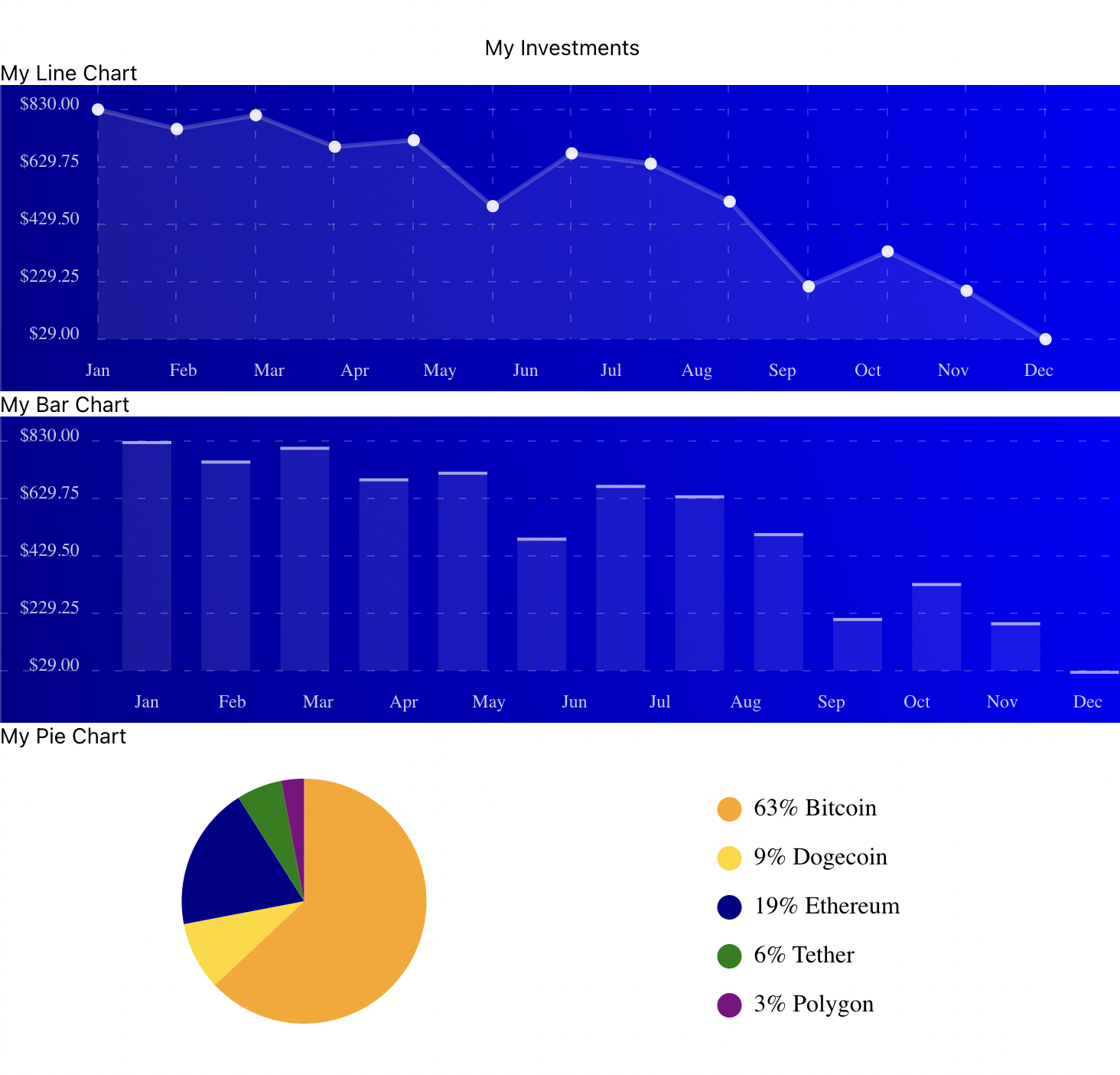
Simple and elegant.
Alternative Libraries for Charts in React Native
In terms of chart packages, there are many alternatives available for React Native. Some of the most popular are described below.
.png)
react-native-responsive-linechart
The strength of this package is illustrating data in the form of line charts on a mobile screen.
This package was written in TypeScript and is better suited for projects that need type security built for TypeScript. Additionally, it has a robust API for creating different line charts and supports adding things like tooltips.
react-native-charts-wrapper
This open-source package is exceptional, with its diverse forms of charts and its flexibility for complex data representations on both Android and iOS. Additionally, it is based on the native libraries found on the mobile platforms it works.
Among the chart types you can render on this package are the line chart, pie chart, radar chart, bar chart, scatter chart, and bubble chart.
In Conclusion
Presenting data in charts can be an invaluable feature for your users, whether you create mobile solutions for businesses with a business dashboard, finance tools, mobile banking, data analytics, e-commerce, or even health and fitness. In addition, the versatility and power that charts can offer to large platforms like social networks or games can be pretty significant for critical features.
However, adding a lot of complexity with new features can add bugs and disrupt the flow of quality on your projects.
"But testing is tedious and takes a lot of time," you might say.
Well, yes. But it doesn't have to.
We recommend that you use testing tools like Waldo's code-free testing platform to monitor and ensure the quality of your product to your clients. Check out Waldo today.
Automated E2E tests for your mobile app
Get true E2E testing in minutes, not months.