In this article, we'll explore how to create a toggle in SwiftUI. First, we'll explain what toggles are, how they work, and when they're the best choice for a UI element in your app. Then we'll go through how to successfully implement a simple, functioning toggle element in your app, customize it, and make it look great. Finally, we'll provide a simple test workflow that will allow you to trigger the toggle and check that it's working correctly.
If you're already familiar with SwiftUI, you can skip the following introduction. However, for those who may not be familiar with SwiftUI, we'll provide a brief overview before we proceed.
SwiftUI: An Introduction
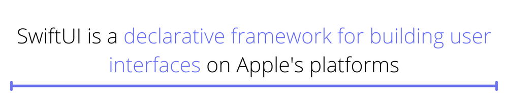
SwiftUI is a declarative framework for building user interfaces on Apple's platforms. It was introduced at the Worldwide Developers Conference (WWDC) in 2019 as a replacement for the aging UIKit framework.
SwiftUI is built on top of the Swift programming language, providing a new way to build user interfaces that are more concise and easier to understand than UIKit.
One of the key features of SwiftUI is its use of declarative syntax. With a declarative syntax, you describe the user interface you want to create, and the framework creates and updates the user interface for you. This means that you don't have to write as much code, and you can focus on the content and layout of your user interface rather than the mechanics of how it's created and updated.
SwiftUI also includes many built-in views and controls, such as text fields, buttons, and lists, which you can use to build your user interface. One such control is the toggle.
Toggles in SwiftUI
Toggles are a common UI element that allows users to switch between two mutually exclusive states, such as "on" and "off." They're often used to enable or disable a particular feature or option in an app.
For example, you might use a toggle to enable or disable an app's push notifications or switch between different display modes. A small oval button with a round dot inside typically represents a toggle. The user can move this dot to the left or right to change the current state.
In terms of functionality, toggles are similar to switches but are typically smaller and more compact. Developers and designers use toggles when there's limited space available for UI elements or when they want to provide a simple and straightforward way for users to enable or disable a particular feature.
How to Implement Toggle Elements in SwiftUI
The first step to creating a toggle in SwiftUI is to declare a Bool value in your app's state that will represent the current state of the toggle. This value is known as a binding and is used to bind the toggle to your app's state. You can then use the Toggle view and pass in the binding as a parameter to create the toggle.
Here's an example of how to create a toggle in SwiftUI:
In this example, we create a ContentView struct that conforms to the View protocol. The ContentView has a @State property called isOn, a Bool value representing the current state of the toggle. We then use the Toggle view to create the toggle and bind it to the isOn property using the isOn: parameter.
In addition to the isOn: parameter, the Toggle view also has a label parameter that you can use to specify the text that you should display next to the toggle. In this example, we use the Text view to display the label "Toggle Me."
Customizing Your Toggle
You can customize the appearance of the toggle by using the foregroundColor, accentColor, and label modifiers. For example, to change the foreground color of the toggle to red and the accent color to green, you can do the following:
The foregroundColor modifier specifies the color of the toggle itself, while the toggleStyle modifier sets the color of the toggle when it is in the "on" state.
You can also change the style of the toggle completely to more of a button style where the button can be either on or off. To do this, use the toggleStyle modifier again and use the .button value.
Pretty cool, right?
Setting the Toggle Behavior
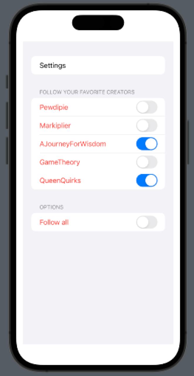
How about we add a bit more functionality to our toggle app? Let's create a simulation of a settings view where a user can choose to follow other users of a social network app.
We'll first need to create a separate struct that implements the identifiable protocol to create a list of toggles that the user can independently toggle. Then, we can track their states in a single collection.
Now create a @State variable that will contain a list of the structs previously defined. In this case, we're using a UserList containing an ID and a Bool indicating if you're following the user.
Finally, create a Form container inside the body view and add the Toggle element inside. In this case, since you're dealing with a list, you can use a ForEach helper to represent them. Contain the toggle inside a Section container to keep the elements neatly aggregated.
You can also add a separate Toggle that would trigger all other toggles as a primary control.
Notice that there's no event handler taking care of the state of the toggles. If you run this code, all toggles respond accordingly. Why is this? Well, the isFollowing variable holds the state of the toggle in question. Since this is contained inside a @State variable, the state is synchronized between all views bound to it. So, when you tap on a toggle, the state of these variables changes.
Custom Event Management on SwiftUI Toggles
But what if you wanted to add some code to do something else when the user tapped the toggle? Well, you can use the onToggle modifier to specify a closure to execute when the toggle's state changes. This closure will be called every time the toggle's state changes. Swift will then pass a Bool value representing the new state of the toggle.
Here's an example of how to use the onToggle parameter:
In this example, the closure will be called every time the toggle's state is changed. Additionally, the value parameter will be set to "true" if the toggle is turned on.
You can use this closure to perform any necessary actions in your app when the toggle's state is changed.
.png)
Testing Toggles in SwiftUI
Before testing your work, you must do a little setup and ensure that all toggles respond accordingly. First, add the accessibilityIdentifier modifier to the toggle elements and provide a unique name to them. In the case of the toggles inside the ForEach helper, you can use the current item ID.
Now, go to the UITest.swift class inside your testing target directory and add the following test case.
As you can see, you first retrieve all visible toggles in the app's current view. Then, you perform a UI action and validate your assumptions on the app's state. It's pretty straightforward.
Now, you can build from this example and validate more complex behaviors in your app.
If you don't want to deal with that hassle, I recommend checking out Waldo.io's comprehensive toolset for UI testing to avoid the complexities of developing a testing workflow. This toolset requires no coding and is easy to use, even for those who are not developers.
Moving Forward
Overall, toggles are a useful tool for allowing users to enable or disable features or options in your app. The Toggle view in SwiftUI makes it easy to add them to your app's UI.
You can find the complete project from which this article is based in this repository.
Automated E2E tests for your mobile app
Get true E2E testing in minutes, not months.