UITableViewCell is a part of UITableView that's used to create tables in iOS apps. Most popular apps are made with Table View only, like the Contacts and Settings apps of the iPhone.
Now, how can an app like Settings, which has a lot of different rows, be possible? This is because Apple allows us to configure each row with UITableViewCell, and each row can have different styles.
In this post, we'll create a simple iOS app with two types of rows in it using UITableViewCell.
Project Setup
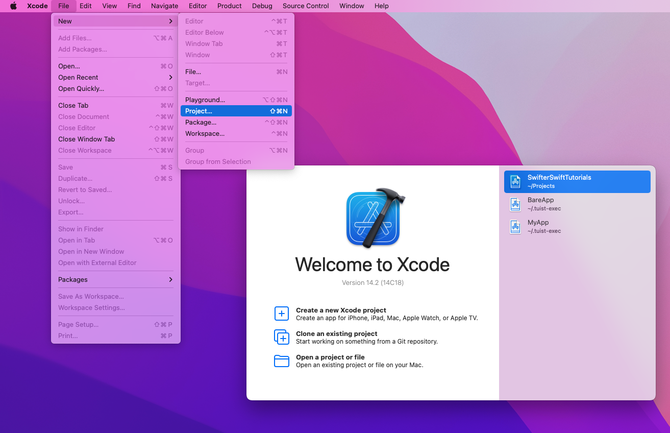
First, we'll create a new project by clicking on New > Project:
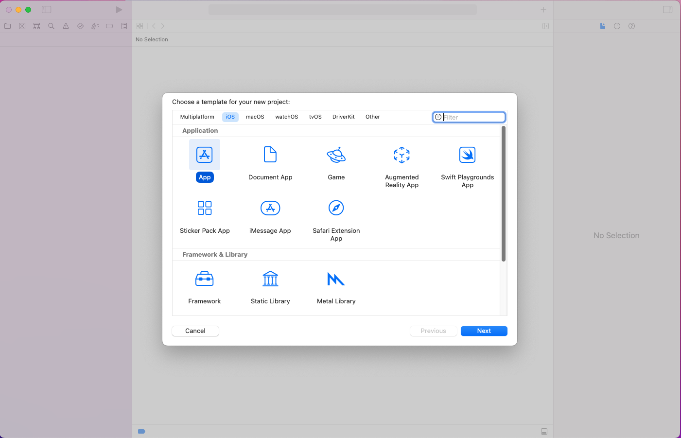
In the pop-up, click on App and then the Next button:
We'll give the product name, which is UITableViewCellDemo in our case. The interface should be Storyboard, and we'll also Include Tests in our project.
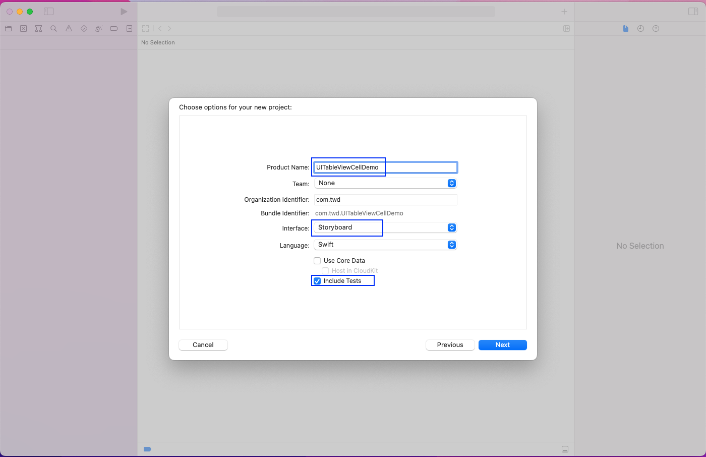
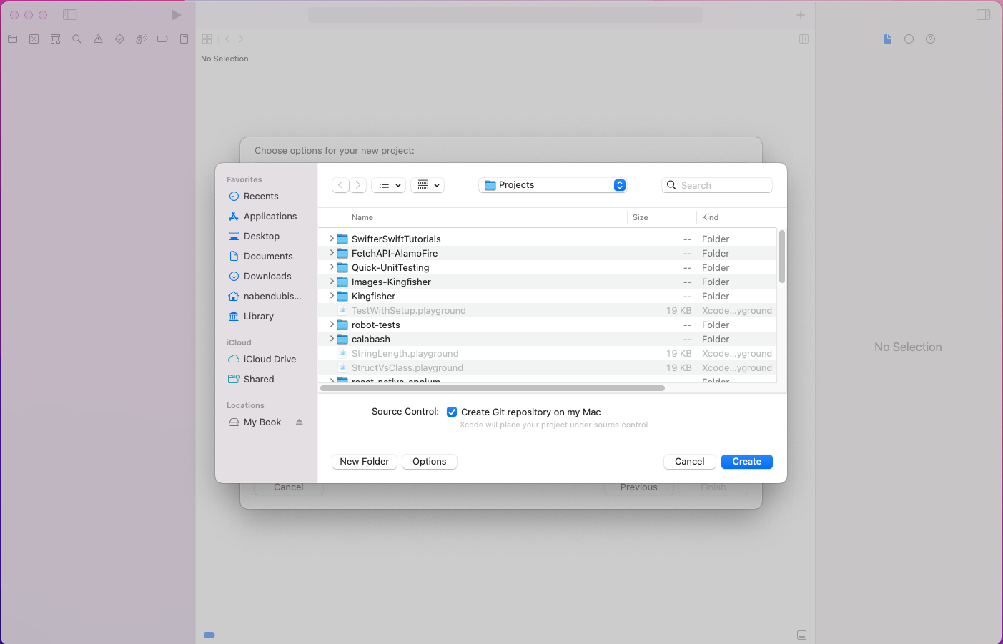
Next, click on the Create button.
Basic TableView Setup
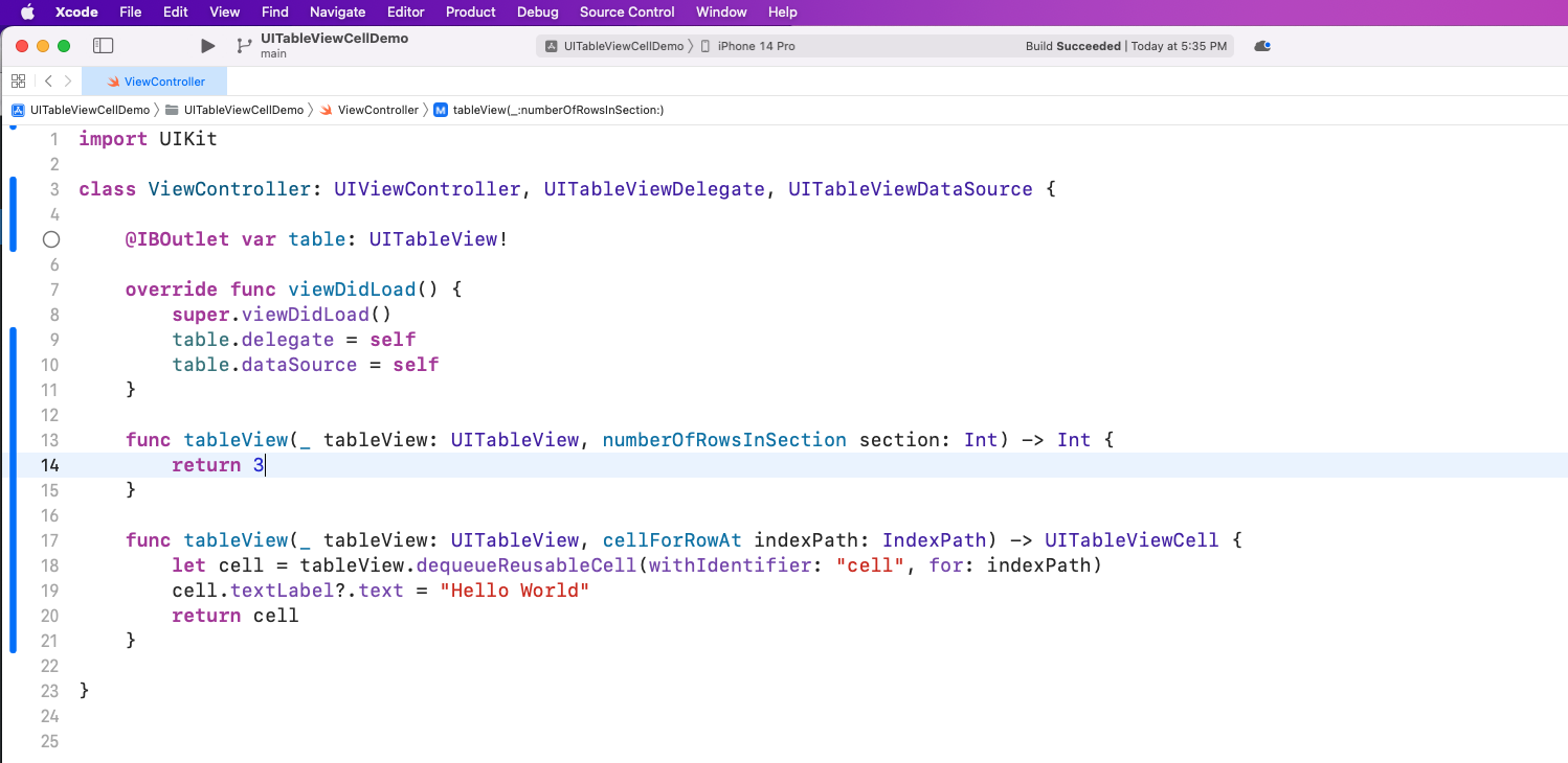
First, open the ViewController file and add the code below. Here, we have an outlet for UITableView and also add the delegate and dataSource in it.
After that, we'll return a TableView with three rows. Also, each cell will contain the text Hello World.
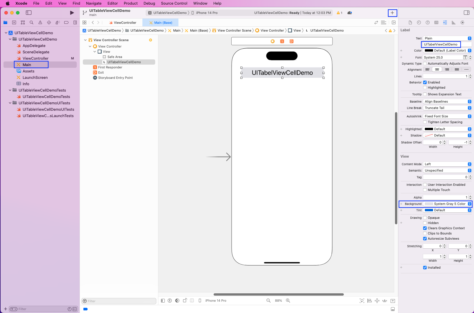
Next, open the Main file and drag a label into it. We can do this by clicking on the + sign and dragging a label.
Now, we'll give it a bit of width and height. We should also change the name and background of it.
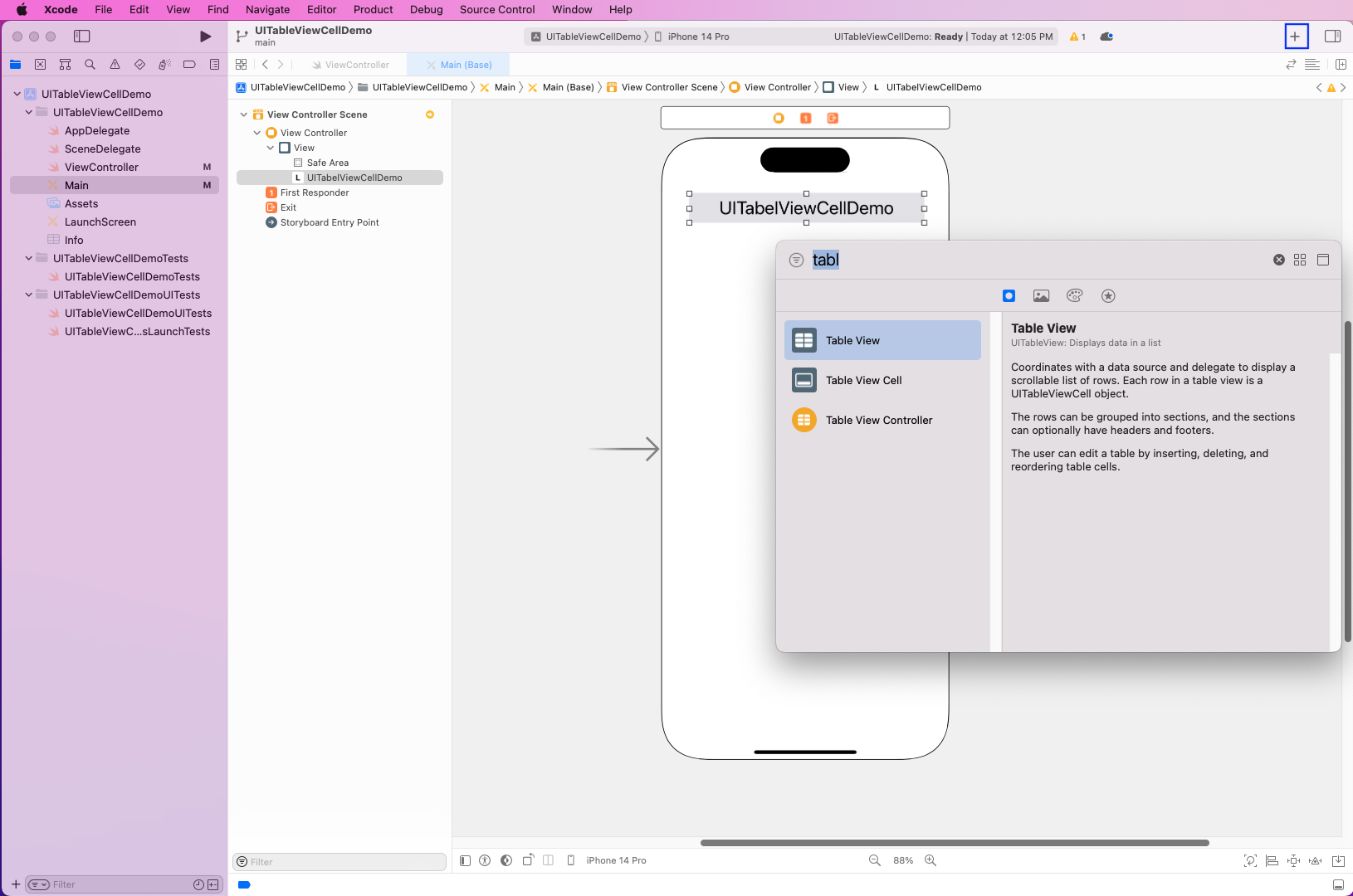
Again, click on the + sign, search for a Table View, and drag it.
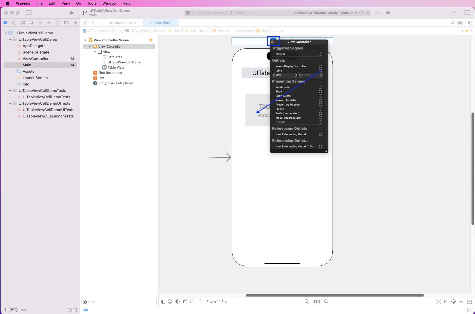
Now, right-click the View Controller icon in the header and drag the table row to Table View.
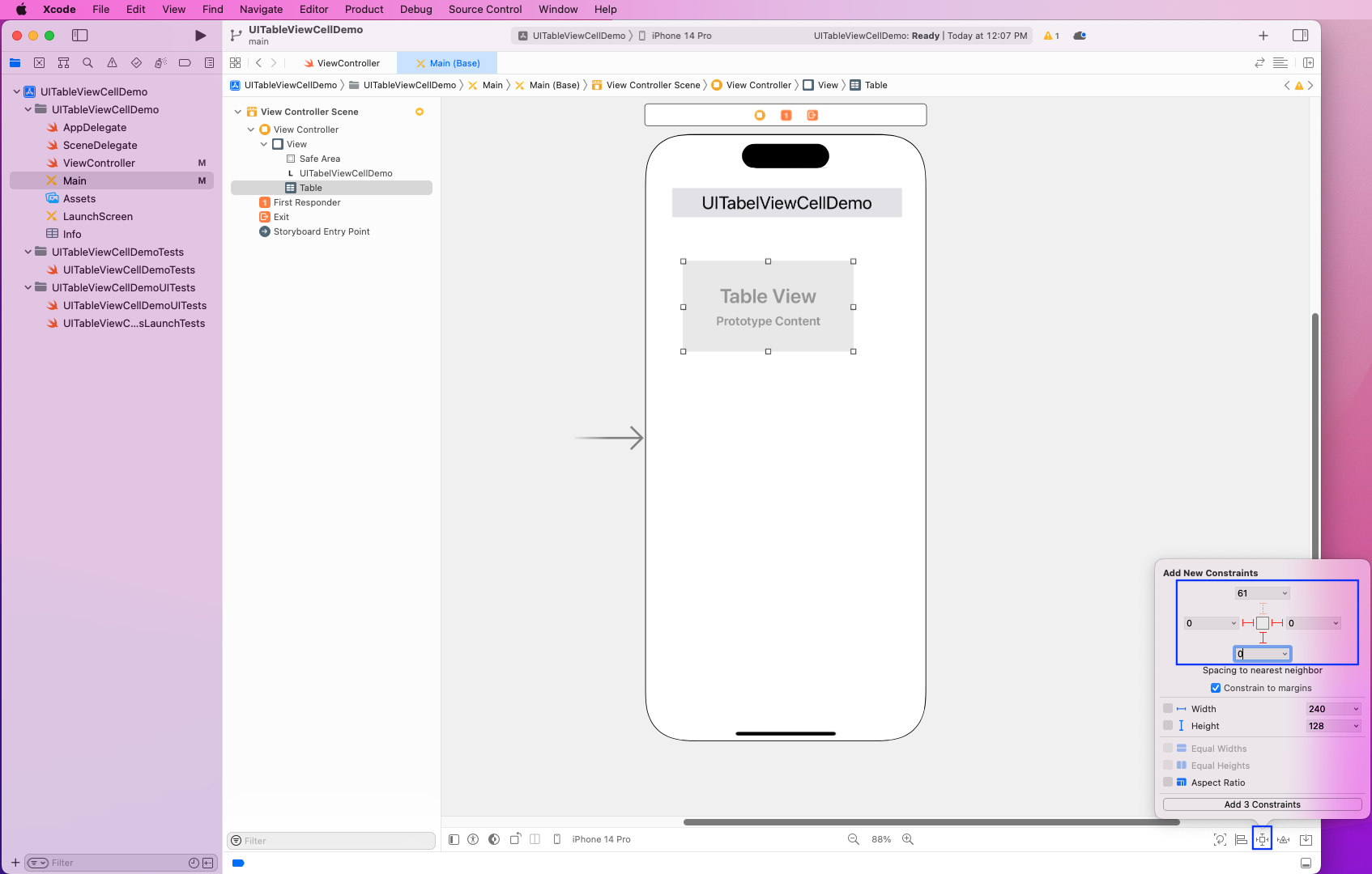
After that, click on the Add New Constraints icon on the bottom right. Then, make the left, right, and bottom constraints 0 for Table View.
Now, click on the Add 3 Constraints button.
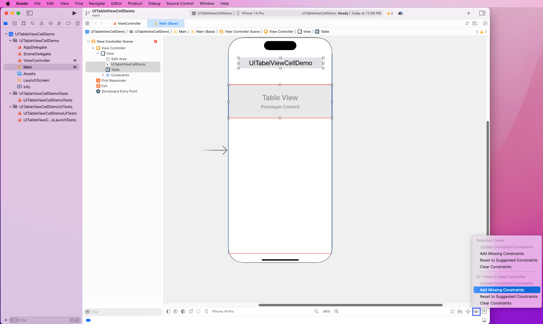
Next, select both Label and Table View and click on the Resolve Auto Layout Issues icon on the bottom-right. After that, click on Add Missing Constraints.
UITableViewCell With Switch
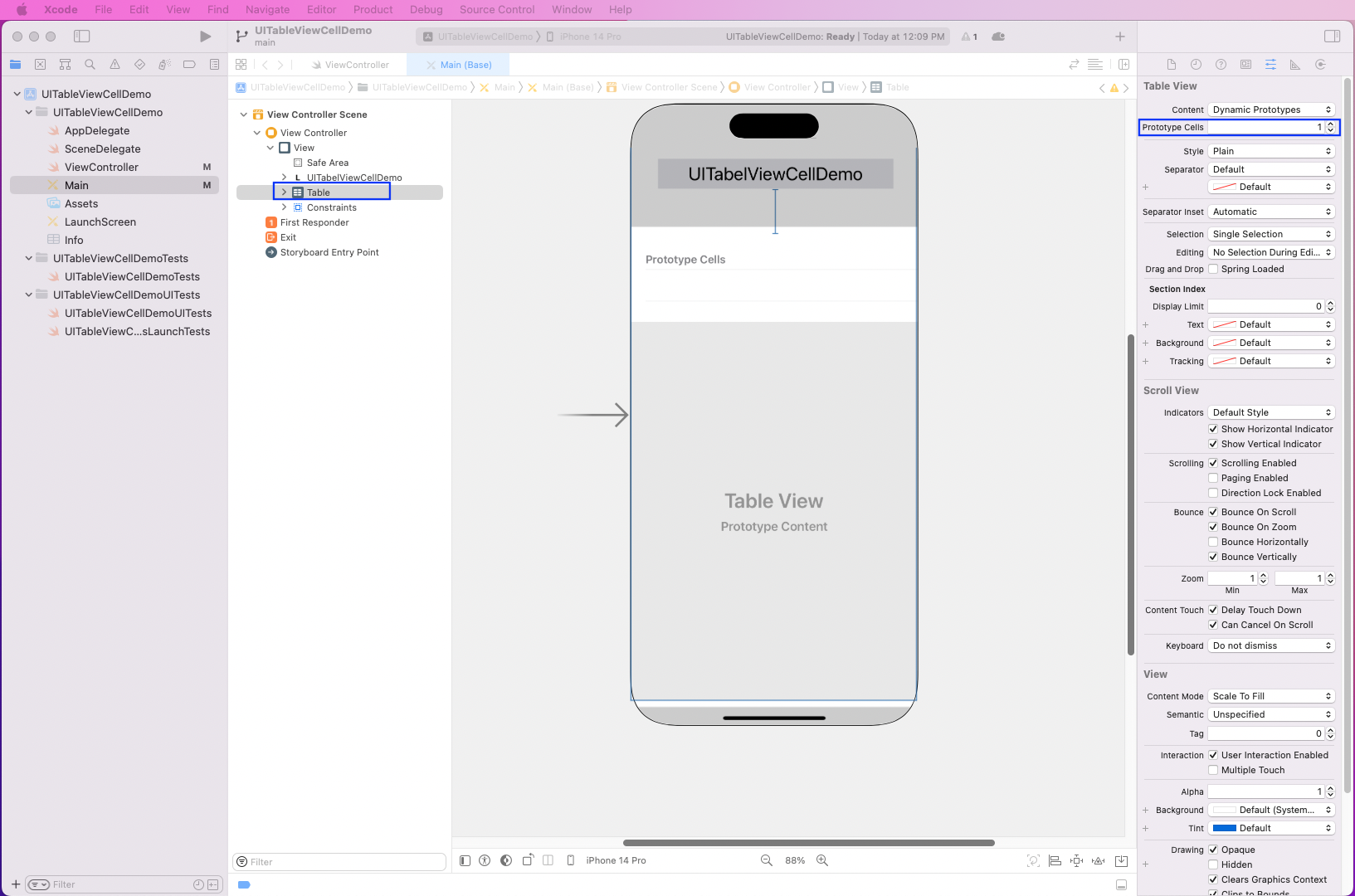
To create a cell, first click on Table in the Main menu and then make the Prototype Cells 1.
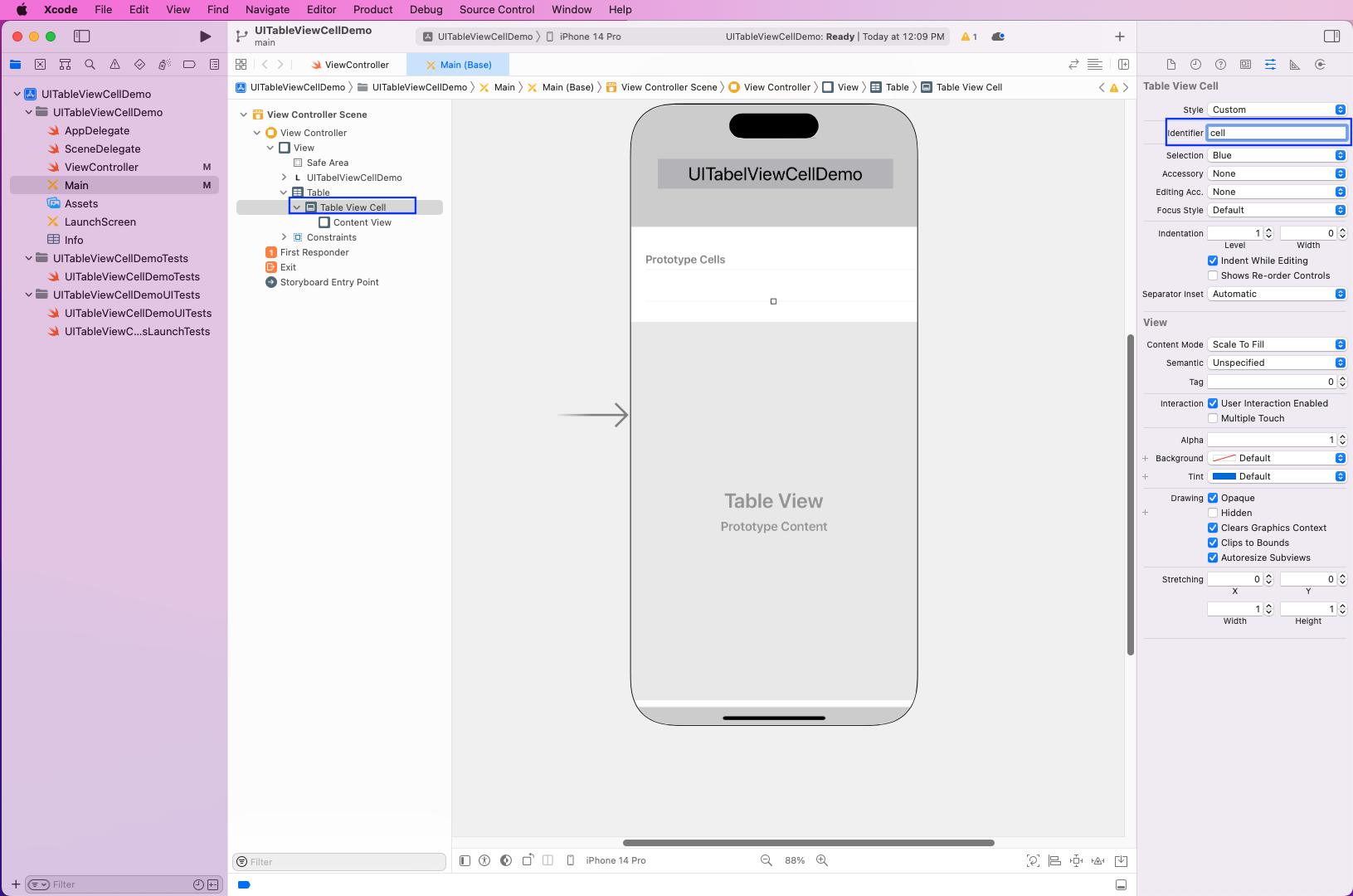
Then, click on the Table View Cell and make the identifier the cell. Notice that this is the same identifier we gave in the ViewController file.
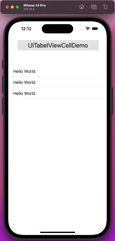
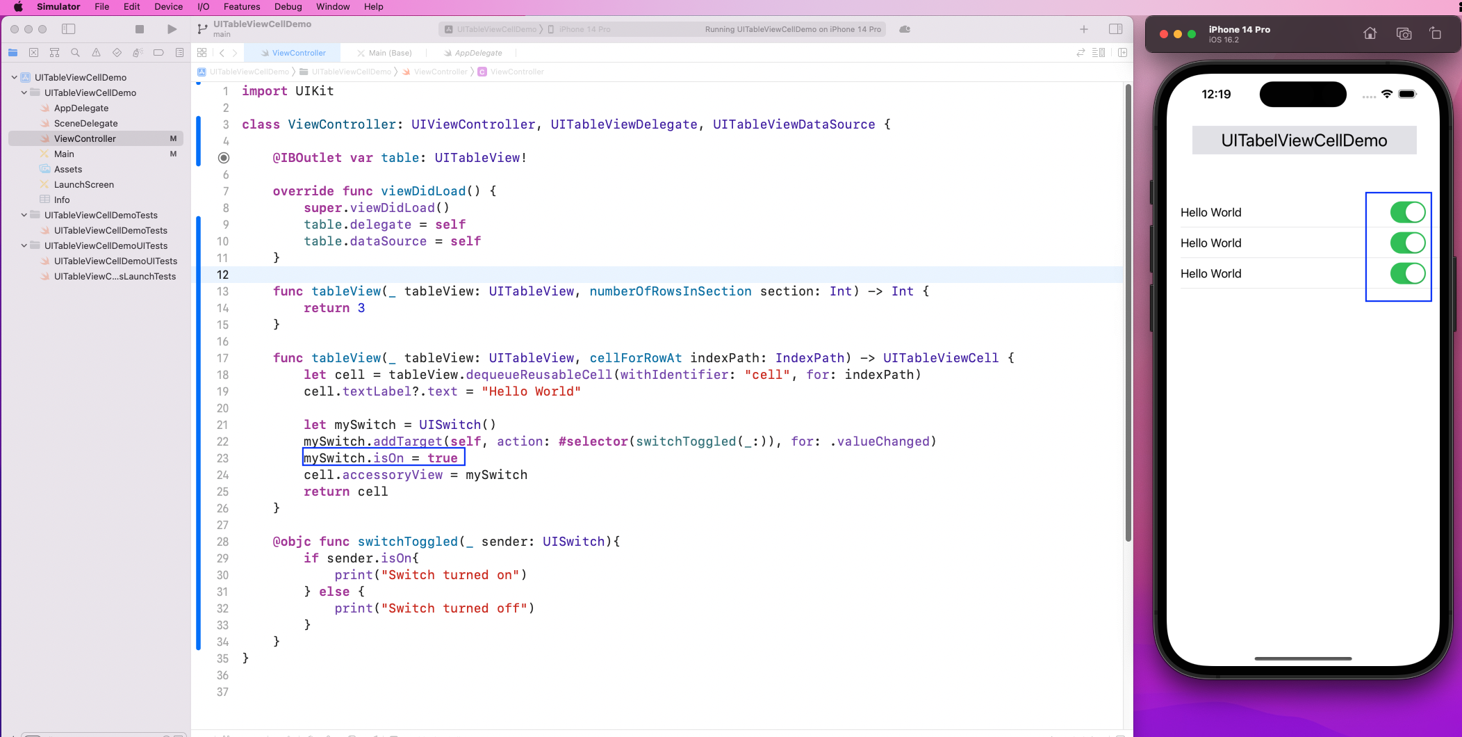
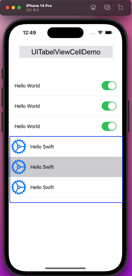
Now, run the app in the simulator, and the "Hello World" cell will be shown three times.
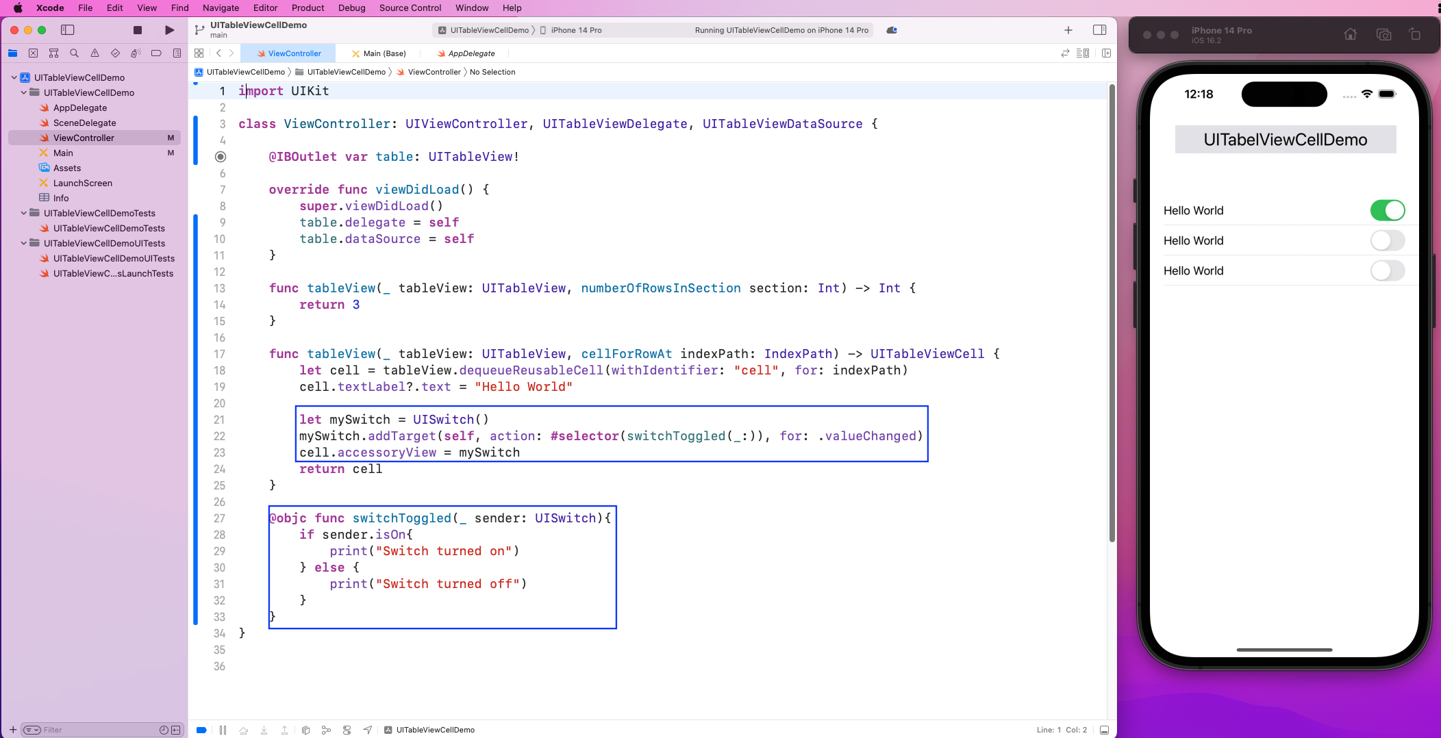
Instead of "Hello World," we'll show nice switches in each cell. For this, in the ViewController file, we'll create a switch in the TableView function.
After that, with the addTarget method, we'll add it to this Table View. We'll also call a function, switchToggled, which will fire when we click on the toggle.
Now, in our app, we'll see beautiful switches in each cell that can also be toggled.
We want all the switches to be toggled to true by default. So, we'll set a line noting mySwitch.isOn is true inside the TableView function.
Creating Custom Cell with Cocoa Touch Class
Now, let's create another set of cells with Cocoa Touch Class.
First, right-click on the root of the project and create a new file.
Choose Cocoa Touch Class and press the Next button.
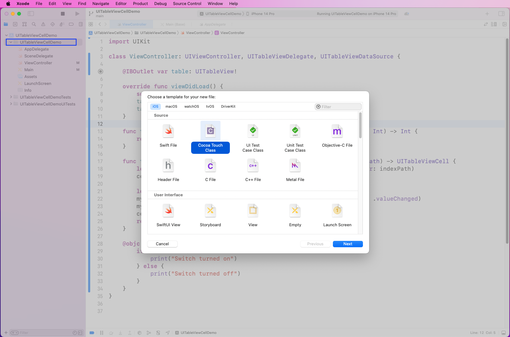
In the next pop-up, give the Class any name, which is NewTableViewCell in our case. The Subclass should be UITableViewCell, and also make sure the XIB file checkbox is selected.
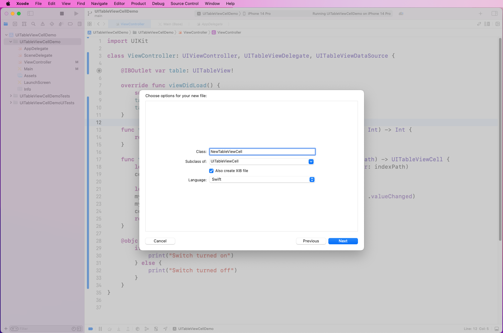
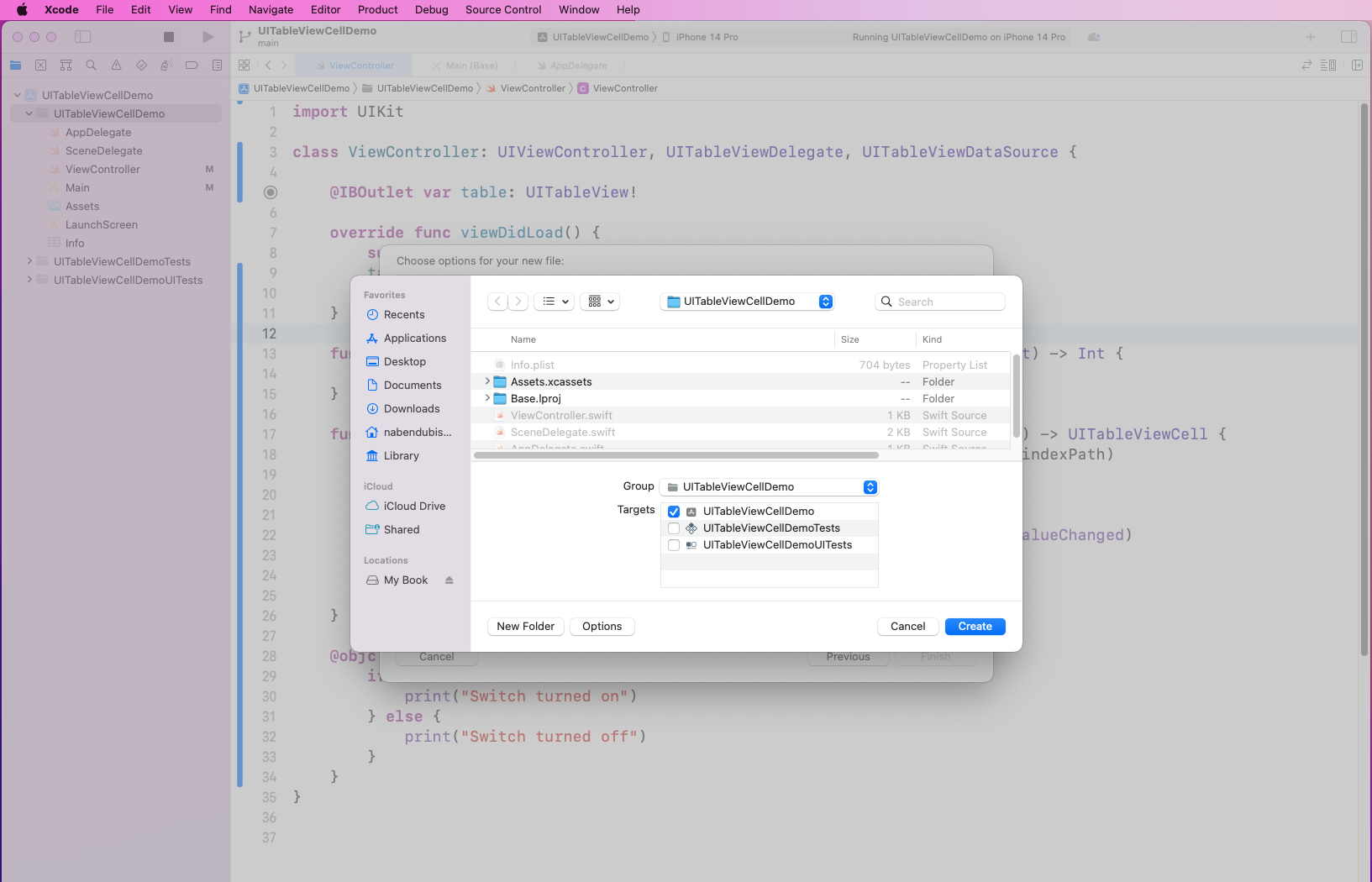
In the next pop-up, the UITableViewCellDemo should be selected under Targets.
Code and Layout for Custom Cell
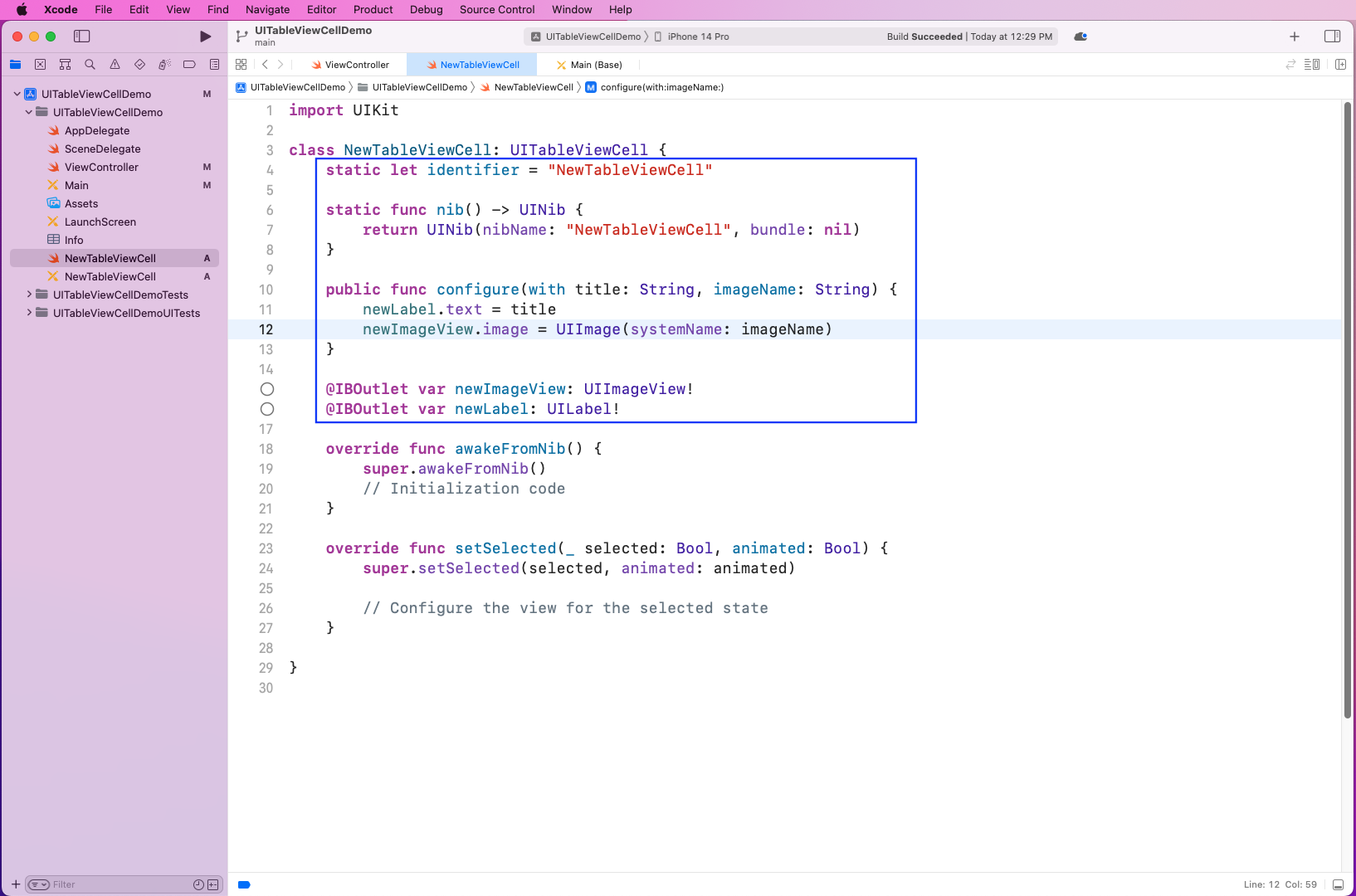
Now, in the NewTableViewCell file, we'll create a UIImageView and UILabel outlet. We also have a function called configure with which we configure both outlets with values passed.
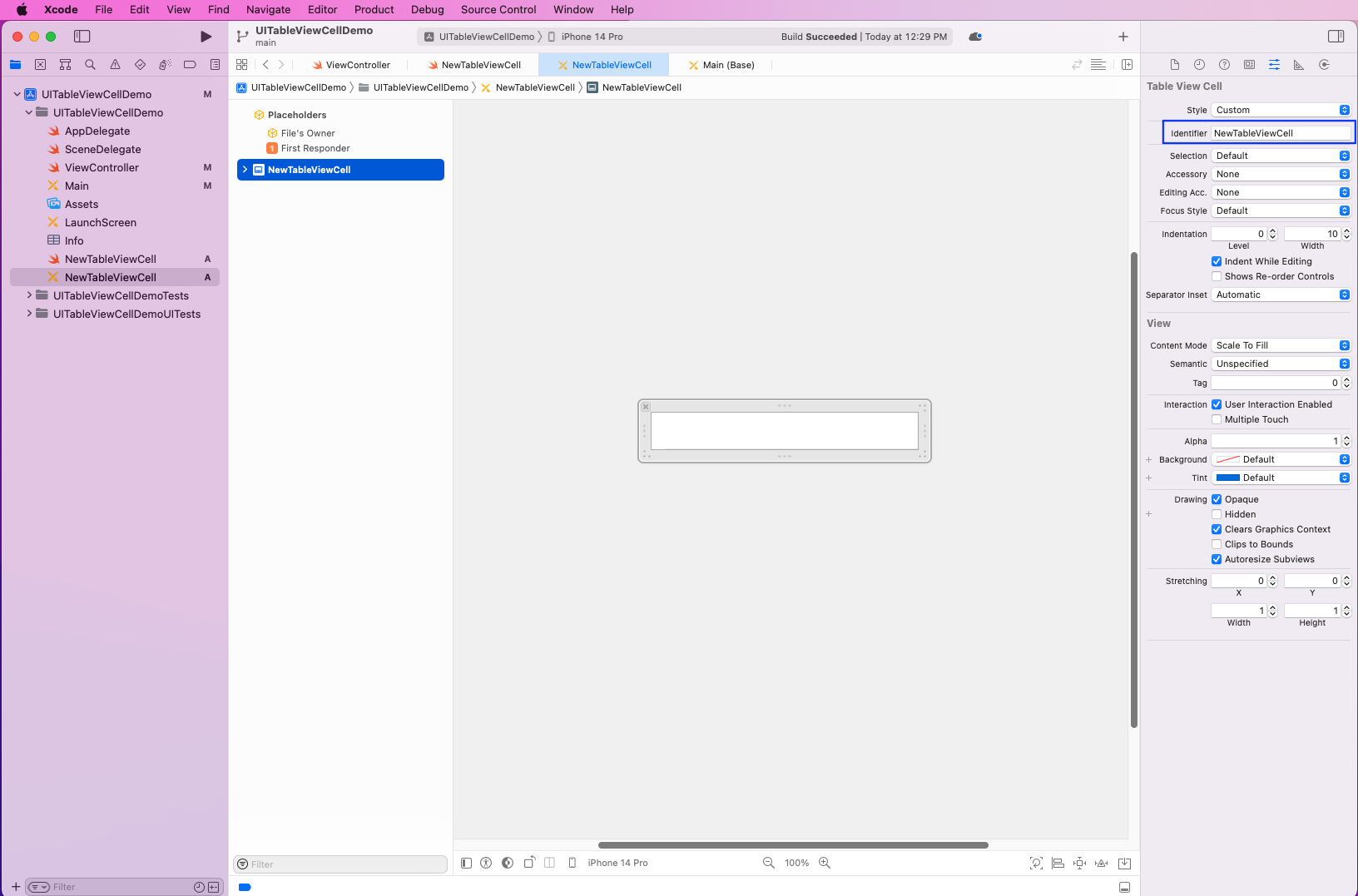
Now, open the NewTableViewCell file, which has the GUI view. Here, select it and make the Identifier name equal to the one in the earlier file, which is NewTableViewCell.
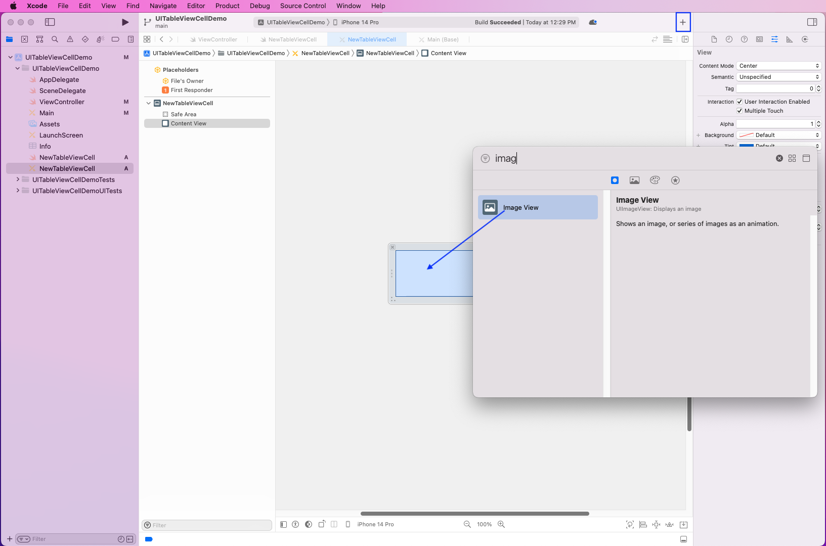
Next, click on the + sign. From the pop-up, select Image View and drop it on the cell.
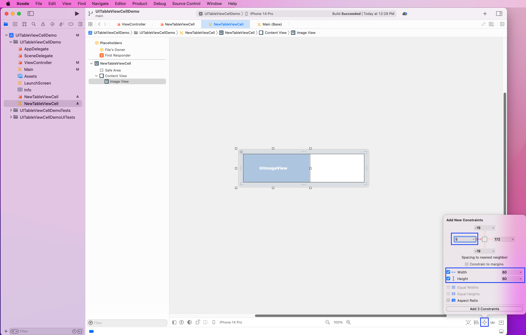
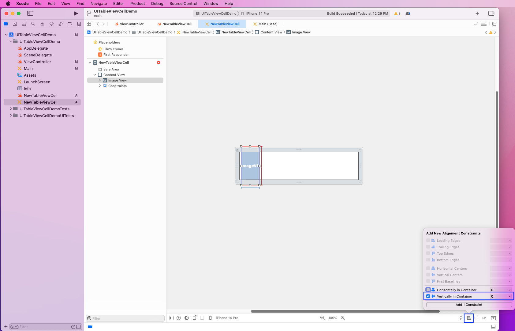
Now, click on the Add New Constraints icon on the bottom right for the Image View.
After that, make the right value 5 and also the width and height 60. Then, click on the Add 3 Constraints button.
Now, click on the Align icon and then select the checkbox for Vertically in Container. After that, click on the Add 1 Constraint button.
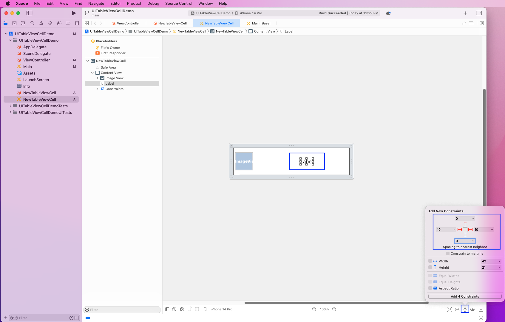
Next, we'll add a new label.
Select the Add New Constraints icon on the bottom-right for the label. Here, we've made the top and bottom 0 and the right and left 10.
Now, click on the Add 4 Constraints button.
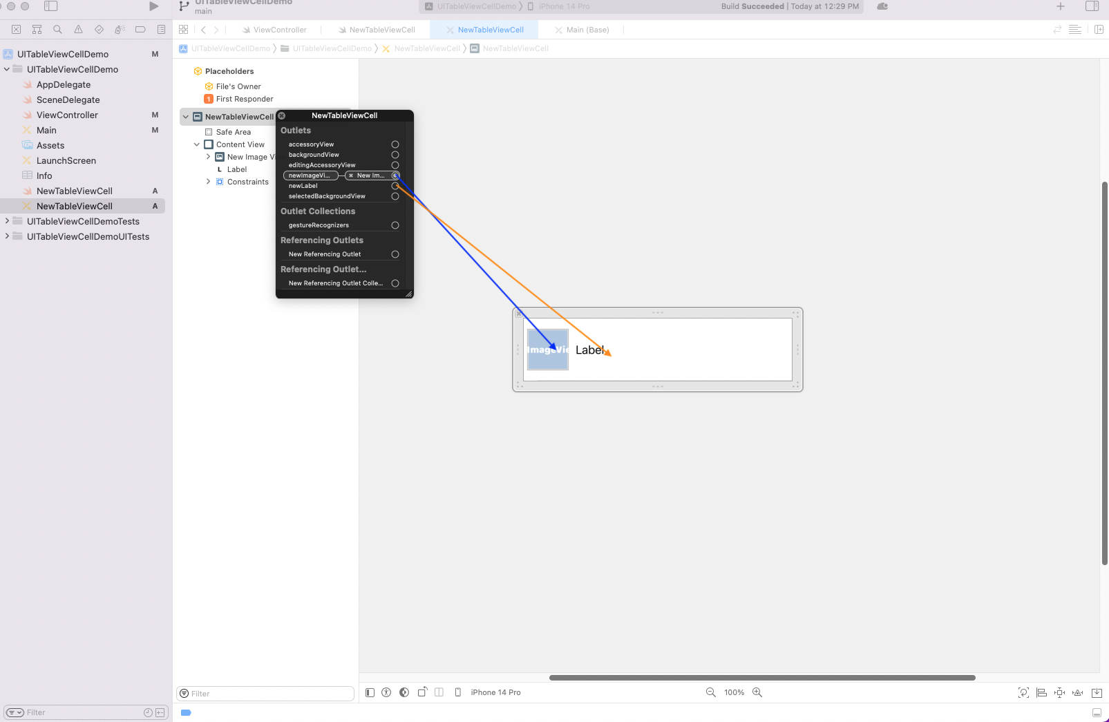
After that, right-click on the NewTableViewCell. Here, drag the newImageView to the Image View and newLabel to Label.
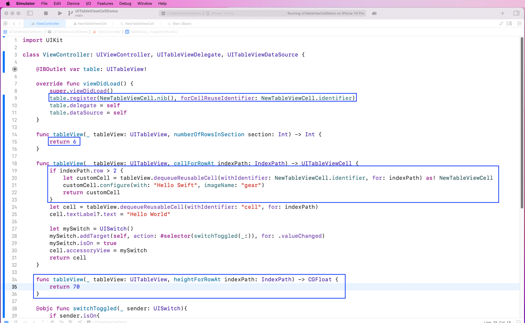
Back in the ViewController file, we'll register the NewTableViewCell. We also increased the number of rows to six.
Next, in the TableView function to create a cell, we'll check if the indexPath.row is greater than 2. Here, we'll use the custom cell and configure it with text and a gear image.
We also increased the height of the cell programmatically.
Now, the three new custom rows are showing perfectly in our iPhone simulator.
Testing the App
To test our app, we'll use built-in XCTest in XCode. The initial steps can be taken from our post on XCUI methods.
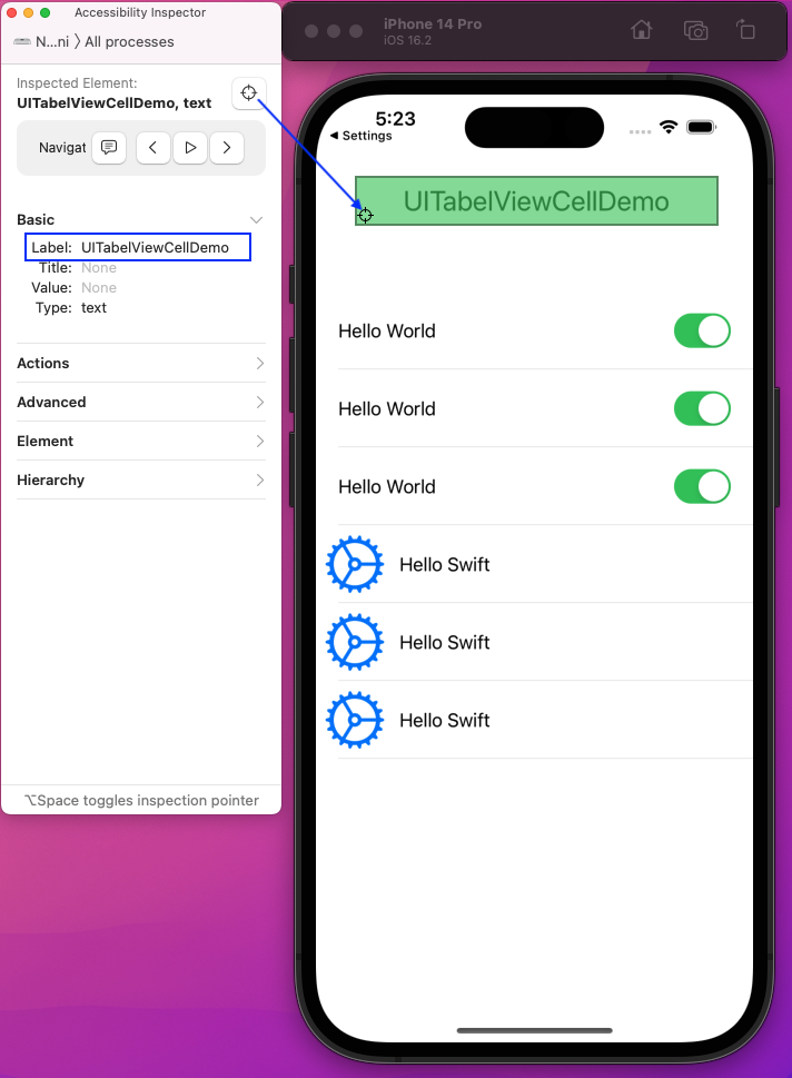
For testing, a unique ID is required for the element of our app. We'll use the Accessibility Inspector to get the unique IDs. Open it by clicking on XCode > Open Developer Tool > Accessibility Inspector.
Now, open the running iOS Simulator on the side and use the pointer from Accessibility Inspector to click on different elements.
Here, we've clicked on Header to get its Label, or unique ID, which is UITabelViewCellDemo for this element.
Writing and Executing Test Cases
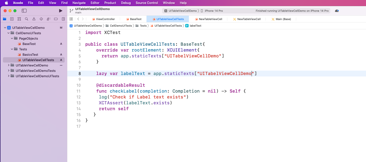
Now we want to create the file UITableViewCellTest inside the Tests folder. Here, we're overriding the rootElement to have staticTexts of the label.
Next, we'll create the checkLabel function, which will use XCTAssert to check if the label exists.
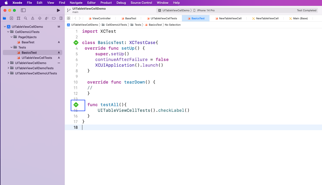
Next, in the BasicTests file, we'll call the UITableViewCellTest class and then execute the checkLabel function.
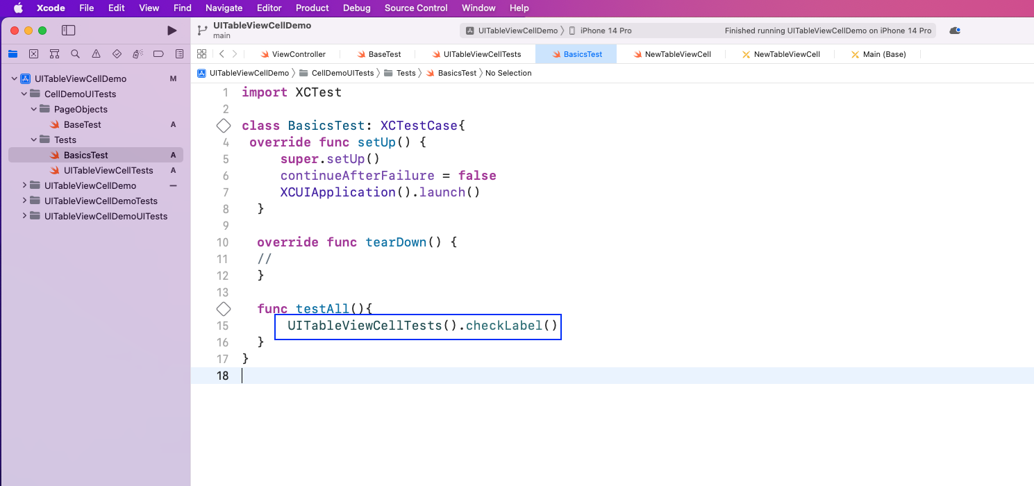
Upon clicking on the play test button in the project, our test will pass.
What We've Covered
In this post, we talked about using UITableVIew to create layouts for an iOS project. We created a simple project in XCode and then learned two methods to create UITableViewCells.
We also wrote some simple test cases using XCTest. But writing more complicated tests requires more complicated test cases.
To test your app without writing complicated test cases, try Waldo. You're only required to provide the APK or IPA file. Then, you get to interact with the mobile app like a real user. Waldo automatically generates test cases and emails you.
Automated E2E tests for your mobile app
Get true E2E testing in minutes, not months.