Be it an e-commerce app, a cryptocurrency trading app, or a social media app, all modern apps use side menus to offer a seamless navigation experience to their users. Side menus are intuitive to use and barely take up any visible space on the screen.
In this post, I’ll walk you through setting up a complete side menu navigation for your app.
Create a React Native Project Using Expo
I’m using Expo-CLI to create a React Native project. Expo-CLI lets you develop and build React Native apps quickly. If you’re new to Expo, you can read more about it here.
Head over to the directory of your choice and run:
After that, you’ll choose a template for your project, as shown:
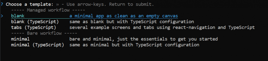
Choose a blank template to continue. A new Expo project will be created for you. Then, run the app using the following command:
Project Structure
We’ll create a side menu that renders some menus to navigate to different screens in our app. To get started, create the following files and folders inside the root directory.
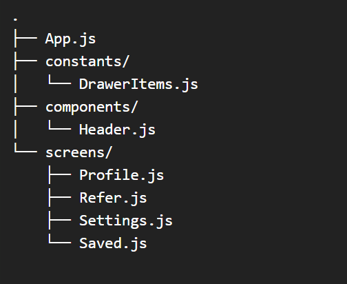
The screens directory will contain the different screens that your side menu will navigate to. Accordingly, the components folder will contain a generic <Header/> component that you can display on every screen. Also, this header will have a hamburger icon to toggle our side menu.
For brevity, most of the code pertaining to the side menu will reside inside App.js. Finally, DrawerItems.js will contain information about each menu, such as the title and icon to display.
Let’s get started by filling DrawerItems.js with relevant details of the menus your side menu will render.
Add Menu Information Inside DrawerItems.js
Inside DrawerItems.js, create an array of objects where each object contains some information about a menu to be rendered.
As shown above, each object contains the following properties:
- name: the name of the screen that the side menu navigates to
- iconType: the icon library where the icon is taken from
- icon: the name of the icon to display next to each menu
Note that I’m using the expo-vector-icons library for icons. It comes prefigured with an Expo project. If you’re on a React Native CLI project, you can use react-native-vector-icons instead.
Create Navigation Screens
The side menu will render a list of menu items defined by DrawerItems.js created previously. Since each menu will navigate to a particular screen, let’s create a simple UI to display the name of the screen. Inside Profile.js, add the following code:
The above code will render a simple UI, as shown:

You can output a simple <Text> component to display the name of the screen. Similarly, inside Refer.js, add the following code:
In a similar fashion, let’s also populate Saved.js and Settings.js files:
Great! Your navigation screens are now complete. Now let’s create and render a side menu containing links to these screens.
Configure a React Native Side Menu for Your Navigation Screens
I’ll use a popular navigation library, react-navigation/drawer, to create the side menu. Side menus are also commonly referred to as drawer menus. Hence I might use the terms “drawer menu” and “side menu” interchangeably in the next sections.
Install react-navigation/drawer
Inside the root directory, run the following command to install react-navigation/drawer:
Next, let’s set up a drawer navigator to create a side menu.
Create Drawer Navigator
Import createDrawerNavigator and NavigationContainer from react-navigation/drawer. Then, create a new Drawer instance using the createDrawerNavigator() hook. Next, nest the <Drawer.Navigator> component inside <NavigationContainer> component.
The <Drawer.Navigator> takes a prop initialRouteName that specifies the route of the first screen rendered by the side menu. Since here initialRouteName is set to Profile, it will render the <ProfileScreen> component whenever the app loads first.
I have also specified some options inside the drawerContentOptions prop. For instance, the itemStyle property takes a styles object and passes that object to each menu item rendered. You can use it to give any margins, paddings, background color, and so on, to your menus. You can pass more props listed here to give more functionality to your side menu.
Render Drawer Items Inside the Side Menu
We can use <Drawer.Screen> to create each individual menu and link it to our navigation screens. Each <Drawer.Screen> component represents a menu item, and all of them must be nested inside the <Drawer.Navigator> component.
Recall that we created an array of objects to store some information about each menu link. Let’s use it to render a list of menu items using <Drawer.Screen>. The following code simply loops through the DrawerItems array and renders a <Drawer.Screen> component for each:
There are a couple of things you need to specify to the <Drawer.Screen> component. First, you need a name prop that displays on each menu rendered inside the side menu:
Since we also have an icon and iconType property available for each menu, let’s use that information to render an icon next to each menu’s title:
Finally, you need to link your navigation screen to each <Drawer.Screen> component. You can use the component prop to map each menu to a navigation screen as shown:
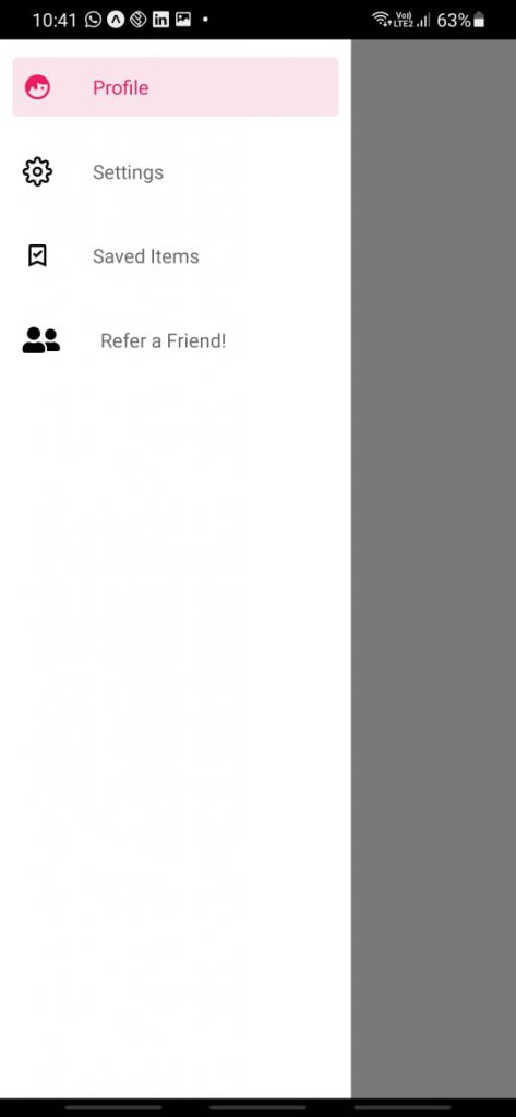
You should now have a working side menu, as shown below:
Great! Let’s add a header to all your navigation screens with a hamburger icon to toggle the side menu.
Add Header to Each Navigation Screen
Head over to components/Header.js and add the following code:
The <Header> component described above takes a screen prop as a parameter. This screen prop simply contains the title of the screen where the header will be rendered. Inside the component, we render this title along with an icon to toggle the side menu.
The navigation property provides a method toggleDrawer() to show the Side Menu if it’s hidden and vice versa. Now that the <Header> component is up, let’s use it inside <Drawer.Screen> to render it on all Drawer Screens.
The headerShown prop tells your side menu that you wish to render a custom header for your screens. Since its value is false by default, you must set it to true. Otherwise, your <Header> component will not be rendered by your drawer screens.
The header prop takes in a function and returns a JSX component. You can return your own <Header> component inside this function. This function also takes a scene object as props that you can use to get the title of the current screen.
You can pass the title computed inside the function as the screen prop to your <Header> component. Now if you check your app, all your navigation screens will render a header with the screen’s name and a hamburger icon as shown:

And that’s it! Your side menu can now be toggled via a hamburger icon from the top. Let’s finally test it on a physical device by building an APK.
Test Side Menu on a Physical Device
Let’s see how the Side Menu looks and functions on a physical Android device. We’ll make an Android APK build using Expo and install that APK on a physical device.
Build Configurational Changes
First, you need some configurational changes inside your app.json file.
Add the package property inside the android key in your app.json file as shown above.
Create APK Build
To create an Android APK build, run the following command:
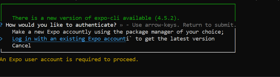
Expo-CLI will then ask you to log into your Expo account.
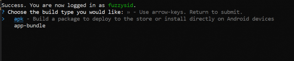
After you authenticate with your Expo account, it will prompt you to enter the type of build. The app-bundle is suited for a production build that you may want to publish to the app stores. Since we only want to create an APK for testing, choose the apk option as shown:
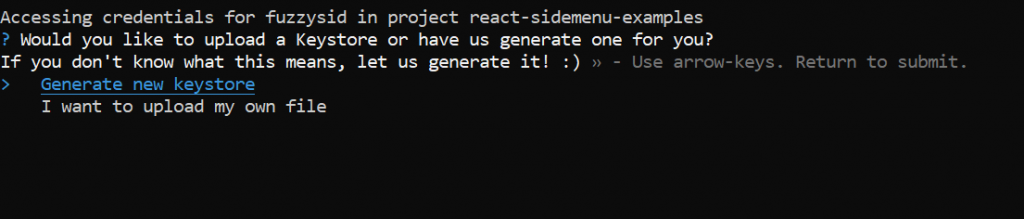
Expo might also ask you for a keystore. You can safely select Generate new keystore and Expo will automatically generate it for you.
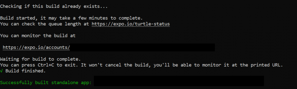
Great! Your Expo build should now be in progress. It might take a few minutes to build your APK.
Install and Test APK Build on a Physical Device
Once your build is complete, go to your Expo account to see the build. You can download the APK to your physical device from there.
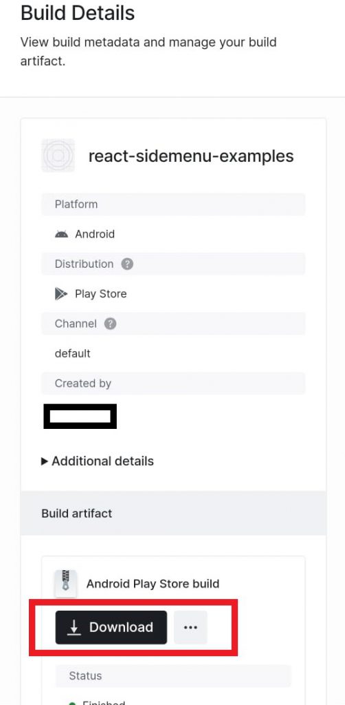
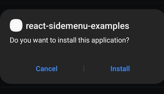
Once your download completes, click on the downloaded file and your device will attempt to install it.
Awesome! Let’s test how the side menu functions on our own Android device:
Side menu demo
It looks great! You finally have a complete side menu with drawer navigation for your app! You can slide it from the left to toggle the menu or use the hamburger icon on the header. In case you wish to test it against some automated tests, you can explore Waldo. It’s a no-code platform for testing your apps and intelligently detecting issues before accidentally shipping them.
Conclusion
In this post, you implemented a complete side menu that you can use in your apps right away. If your app is growing large and you’re adding more navigation screens than ever, you’ll definitely want to have a side menu. You can integrate it with your tab navigators to provide a rich navigation experience to your users.
You can also customize your side menu greatly. For instance, you can control how your side menu appears using the drawerType prop. You can also set the overlay’s color using the overlayColor prop. You can find an exhaustive list of functionality and features you can add to your side menu through props here.
Automated E2E tests for your mobile app
Get true E2E testing in minutes, not months.