Waldo sessions now support scripting! – Learn more
App Development

React Native Border Radius in Action: borderRadius Examples

Siddhant Varma
Siddhant Varma
React Native Border Radius in Action: borderRadius Examples
March 22, 2022
15
min read

Modern design principles actively promote rounded corners. Most websites and apps today shy away from sharp corners on UI elements in favor of a smoother appearance. Thus, most calls to action (CTAs) on websites and apps have smooth, rounded corners. In React Native, this is achieved using a special borderRadius style attribute.

In this post, I'll help you understand the borderRadius style property in React Native using a number of useful and common examples.

Create a New Expo Project

First, create a new Expo project. In the directory of your choice, run the following command:


expo init rn-border-radius

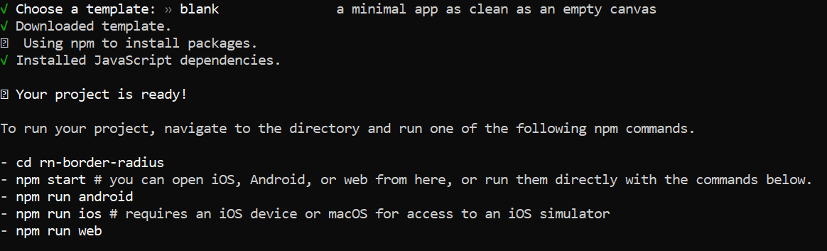
Select the blank template in the option. A new Expo-based React Native project called rn-border-radius will then be created for you.

Great! Now open this project via your editor and kickstart your Expo server:


cd rn-border-radius && expo start

Sample Boilerplate Code

In the first part of this tutorial, we'll explore the borderRadius property via various examples. For that, we'll create some boilerplate code.

First, create a new file called GlobalStyles.js inside the root directory. This file will have all the styles related to our examples. Inside this file, add the following code:


import { StyleSheet } from 'react-native';
const GlobalStyles = StyleSheet.create({
    main:{
        backgroundColor:'#FF5757',
        height: 200,
        width:200
    },
    rounded:{
    },
    circle:{
    },
    oval:{
    },
    roundedTopLeft:{
    },
    roundedTopRight:{
    },
    roundedBottomLeft:{
    },
    roundedBottomRight:{
    },
    roundedTop:{
    },
    roundedBottom:{
    },
  });
  export default GlobalStyles;

In the above code, we simply declare some style properties that we'll use later. Next, create a file called Shape.js inside the root directory. I'll get to what this component does shortly, but for now, add the following code inside it:


import {View} from 'react-native';
import { useState } from 'react';
import GlobalStyles from './GlobalStyles';
export default function Shape({type}){
    const [shapeClass,]=useState(type.split('-')[0])
    return(
        <View style={{...GlobalStyles.main,...GlobalStyles[shapeClass]}}>
        </View>
    )
}

Great! Let's move forward and cover the borderRadius property in React Native.

Border Radius in React Native

The borderRadius property can be set as the style attribute to any element. It takes a value in pixels and assigns that value to the overall border radius of that UI element. By default, the border radius of any element is 0 if you haven't added that style attribute to that element.

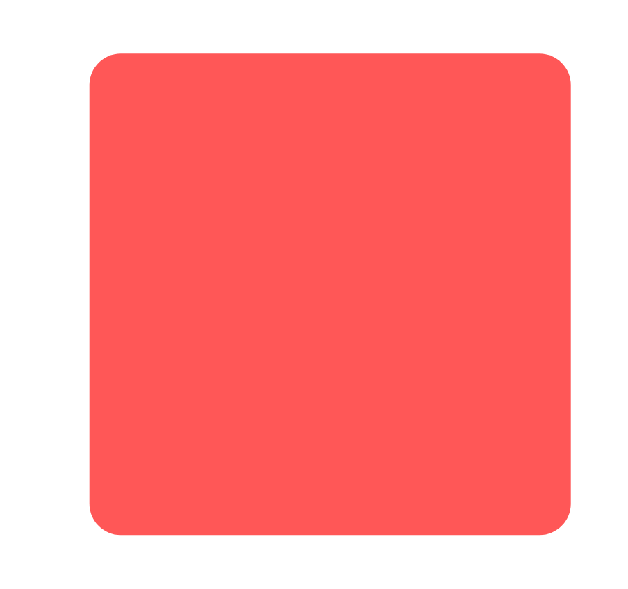
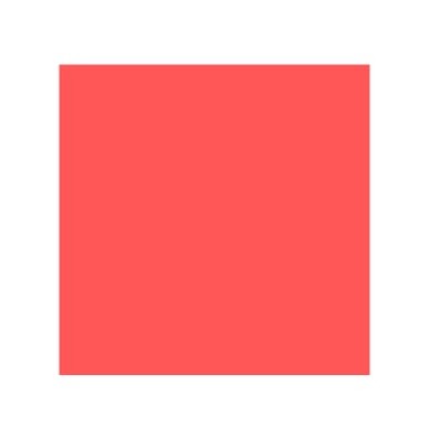
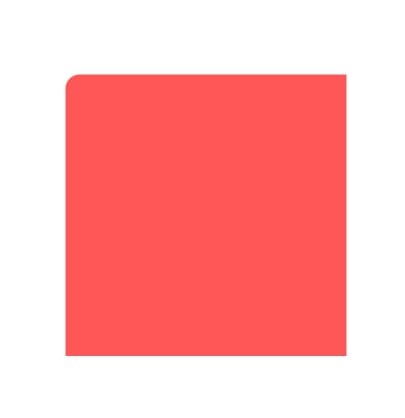
This means that all UI elements in their raw and natural form will have sharp corners. For instance, take this square as an example:

Notice how it has sharp corners. When we add a borderRadius property to its style attribute and give it an appropriate value, the element will look like this:

Thus the borderRadius property by itself makes the object rounded on all the edges. But you can also choose to curve only certain edges of an element using specific properties like borderTopLeftRadius, borderBottomLeftRadius, borderTopRightRadius, and borderBottomRightRadius.

Let's now look at all this theory in action with code using some examples.

Create Curved Edges with Border Radius

Remember how we created a Shape component? Let me quickly explain what it does.

The Shape component takes a type prop and renders a native View component. Based on the this type prop, we assign a special style object from the Globalstyles.js file. To demonstrate this, we'll go over to our App.js file. We'll render the Shape component and pass square as the type prop to it:


import { StyleSheet, View } from 'react-native';
import Shape from './Shape';
export default function App() {
  return (
    <View style={styles.container}>
       <Shape type={"square"}/>
    </View>
  );
}
const styles = StyleSheet.create({
  container: {
    flex: 1,
    backgroundColor: '#fff',
    alignItems: 'center',
    justifyContent: 'center',
  },
});

You should now see a square container rendered on your screen as shown below:

Now, you might have an idea of why we created a Shape component and a flexible GlobalStyles.js file.

Let's get this square some curved edges. We'll update the rounded object in our GlobalStyles object as shown below:


import { StyleSheet } from 'react-native';
const GlobalStyles = StyleSheet.create({
    main:{
        backgroundColor:'#FF5757',
        height: 200,
        width:200
    },
    rounded:{
        borderRadius:10
    },
  ...
  });
  export default GlobalStyles;

We specify the borderRadius property to our rounded object. Now we can simply pass the relevant type prop for this style to our Shape component:


...
export default function App() {
  return (
    <View style={styles.container}>
       <Shape type={"rounded-square"}/>
    </View>
  );
}
...

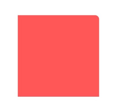
Once you do that, you should now see the same square but this time with some curved edges:

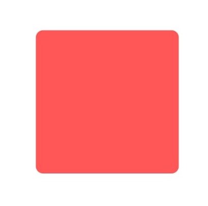
Since we use the borderRadius style property, our element gets a 10-pixel border radius from all the corners. This type of design is used in most UI elements, such as buttons, cards, images, input fields, etc. We'll explore the practical use case of this later, but let's first look at another border radius use case.

Create a Circle With Border Radius

I bet you've seen lots of circles in apps and websites that you commonly visit. From image placeholders to ripple effect on buttons to icons, circles are popular. Interestingly, we can turn any container element like a native View component into a circle using the borderRadius property.

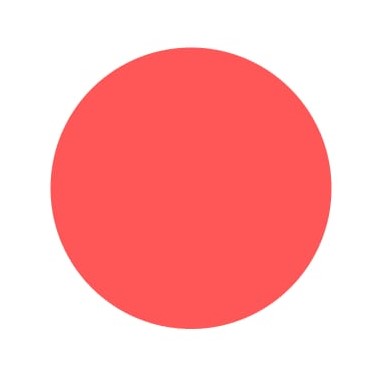
All you need to do is set a value of borderRadius for that element that is greater or equal to 50 percent of the container's dimensions. Our Shape component has a height and width equal to 200 pixels. Thus, we need to set a borderRadius of 100 pixels or more to give it a circle shape. So let's do that inside the circle property of our GlobalStyles object:


import { StyleSheet } from 'react-native';
const GlobalStyles = StyleSheet.create({
    main:{
        backgroundColor:'#FF5757',
        height: 200,
        width:200
    },
    rounded:{
        borderRadius:10
    },
    circle:{
        borderRadius:100
    },
 ...
  });
  export default GlobalStyles;

Remember, we also need to update the type property to circle in the App.js file:


...
export default function App() {
  return (
    <View style={styles.container}>
       <Shape type={"circle"}/>
    </View>
  );
}
...

Once you do that, the same object should now look like this:

Awesome! However, you may not know the exact dimensions of an element. For instance, what if your container has dynamic width and height that might be coming from an API? Instead of programmatically calculating the value of borderRadius, you can simply set it to a large value.

In this case, we can set it to 999 pixels. That would yield the same result as above.


import { StyleSheet } from 'react-native';
const GlobalStyles = StyleSheet.create({
  ...
    circle:{
        borderRadius:999
    },
   ...
  });
  export default GlobalStyles;

Also, you can't use this approach to turn rectangular elements into a circle. To better demonstrate this, let's move to our next example.

Create an Oval With Border Radius

An oval shape can be achieved by changing one pair of dimensions of a 2D shape and giving it a border radius value equivalent to that of a circle. Thus, all rectangular objects, if given a border radius equal to or more than one of the dimensions, will look like an oval.

We'll head back to our GlobalStyles.js file. Let's update the oval property here as shown below:


import { StyleSheet } from 'react-native';
const GlobalStyles = StyleSheet.create({
    main:{
        backgroundColor:'#FF5757',
        height: 200,
        width:200
    },
    rounded:{
        borderRadius:10
    },
    circle:{
        // borderRadius:999,
        borderRadius:100
    },
    oval:{
        width:150,
        borderRadius:100
    },
    ...
  });
  export default GlobalStyles;

Now we'll update the type prop to oval in the App.js file:


...
export default function App() {
  return (
    <View style={styles.container}>
       <Shape type={"oval"}/>
    </View>
  );
}
...

We should now have a shape that's somewhat of an oval and looks like this:

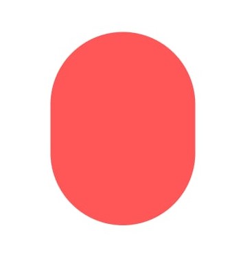
We've basically tried to shape the container of unequal dimensions to a circle. Since the dimensions are different, the circle elongates along that dimension into an oval.

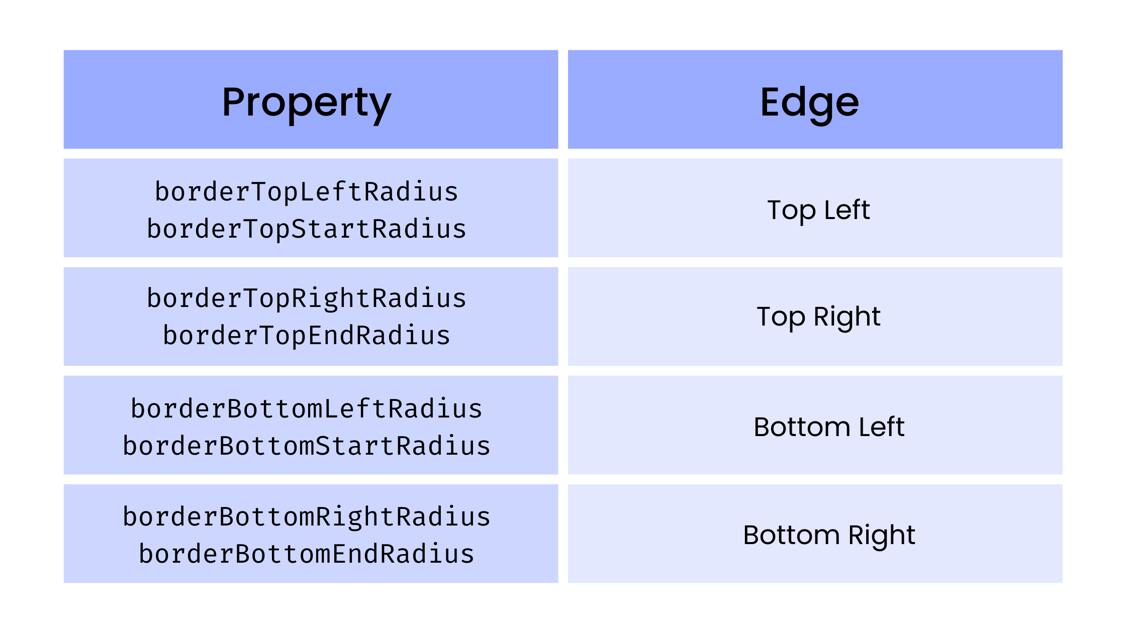
Add Border Radius to Specific Edges

Besides the original borderRadius property, React Native also provides another property that sets the border radius only to a specific edge or corner of the element. These are mostly self-explanatory, so here's the updated the GlobalStyles object with some more styles that use those properties:


import { StyleSheet } from 'react-native';
const GlobalStyles = StyleSheet.create({
    main:{
        backgroundColor:'#FF5757',
        height: 200,
        width:200
    },
    rounded:{
        borderRadius:10
    },
    circle:{
        // borderRadius:999,
        borderRadius:100
    },
    oval:{
        width:150,
        borderRadius:100
    },
    roundedTopLeft:{
        borderTopLeftRadius:10,
        // borderTopStartRadius:10
    },
    roundedTopRight:{
        borderTopRightRadius:10 ,
        // borderTopEndRadius: 10
    },
    roundedBottomLeft:{
      borderBottomLeftRadius:10,
    //   borderBottomStartRadius:10
    },
    roundedBottomRight:{
        borderBottomRightRadius:10,
        // borderBottomEndRadius:10
    },
    roundedTop:{
        borderTopStartRadius:10,
        borderTopEndRadius:10
    },
    roundedBottom:{
        borderBottomStartRadius:10,
        borderBottomEndRadius:10
    },
  });
  export default GlobalStyles;

See the table below if you want more clarity:

Let's now test each of these and see what they yield.

Top Left Border Radius

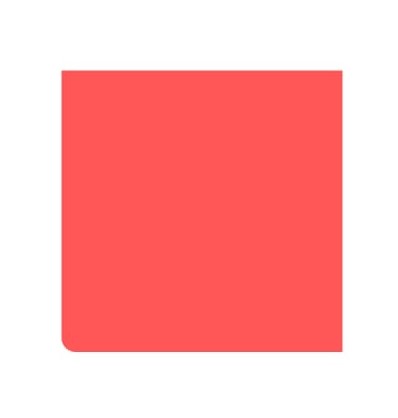
Using the roundedTopLeft style, we can assign the borderTopLeftRadius to our Shape component by passing the roundedTopLeft-square prop:


...
<Shape type={"roundedTopLeft-square"}/>
...

That should only curve the top left edge of the element:

Top Right Border Radius

Using the roundedTopRight style, we can assign the borderTopRightRadius to our Shape component by passing the roundedTopRight-square prop:


...
<Shape type={"roundedTopRight-square"}/>
...

That should only curve the top right edge of the element:

Bottom Left Border Radius

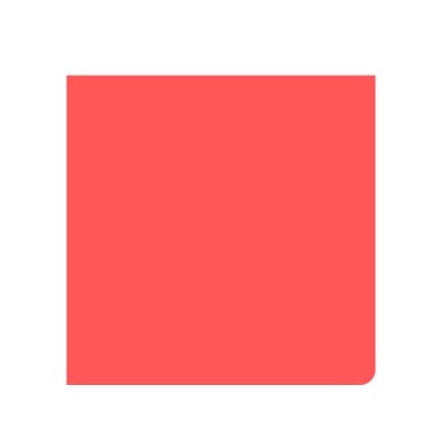
Using the roundedBottomLeft style, we can assign the borderBottomLeftRadius to our Shape component by passing the roundedBottomLeft-square prop:


...
<Shape type={"roundedBottomLeft-square"}/>
...

That should only curve the bottom left edge of the element:

Bottom Right Border Radius

Using the roundedBottomRight style, we can assign the borderBottomRightRadius to our Shape component by passing the roundedTopRight-square prop:


...
<Shape type={"roundedBottomRight-square"}/>
...

That should only curve the bottom right edge of the element:

Based on some combination of the above four properties, we can also curve only the top or bottom edges of the element. We have already added the relevant style properties in the stylesheet, so why don't you give it a shot and see what it looks like!

If you've seen popups sliding from the bottom of the app screen or notifications sliding from the top, that's a great practical use case for the above.

Practical Examples of Border Radius

Let's now put everything together and create a simple dashboard or profile page for a personal or routine monitoring application. Here we'll use border radius to style profile images, cards, buttons, input fields, and icons.

Create a new folder called screen inside the root directory. Inside this screen folder, create another folder called components. Also, create a file called ProfileScreen.js where we'll render all our components. Add the following boilerplate code inside it:


import { View, StyleSheet, Text } from "react-native";
export default function ProfileScreen(){
    return(
        <>
        </>
    )
}
const styles = StyleSheet.create({
  });

Border Radius on Images

Inside the components folder, create a new file called ProfilePicture.js. Add the following code inside it:


import {Image, StyleSheet} from 'react-native';
export default function ProfilePicture(){
    return(
        <Image
            style={styles.profile}
            source={{
            uri: 'https://i.stack.imgur.com/QQcdg.png',
            }}
        />
    )
}
const styles = StyleSheet.create({
    profile:{
        marginTop:20,
        height:100,
        width:100,
        backgroundColor:'wheat',
        borderRadius:50
    }
  });

We have given a circular border radius to our Image component. That should make the image look like this:

This is commonly used when styling profile picture thumbnails.

Border Radius on Input

Similarly, create a new file called SearchInput.js with the following content:


import { TextInput, StyleSheet } from "react-native"
export default function SearchInput(){
    return(
        <TextInput
            style={styles.input}
            placeholder="Seach your items.."
       />
    )
}
const styles = StyleSheet.create({
    input:{
        marginTop:20,
        height:40,
        width:250,
        backgroundColor:'#f9f9f9',
        padding:10,
        borderRadius:5,
        elevation:0.2
    }
  });

We now have an input field with curved edges that looks like this:

Great! Let's now create a card with border radius.

Border Radius on Cards

Inside the components folder, create a file called ActionIcon.js with the following code:


import { MaterialCommunityIcons } from '@expo/vector-icons';
import {MaterialIcons} from '@expo/vector-icons';
import { FontAwesome5 } from '@expo/vector-icons';
import { Entypo } from '@expo/vector-icons';
export default function ActionIcon({action}){
    return(
        <>
            {
                action.title=='Gym' ?
                <MaterialCommunityIcons name="weight-lifter" size={24} color="white" /> :
                action.title=='Tasks' ?
                <FontAwesome5 name="tasks" size={24} color="white" /> :
                action.title=='Work' ?
                <MaterialIcons name="work" size={24} color="white" /> :
                action.title=='Sleep' ?
                <MaterialCommunityIcons name="sleep" size={24} color="white" /> :
                action.title=='Music' ?
                <FontAwesome5 name="music" size={24} color="white" /> :
                <Entypo name="game-controller" size={24} color="white" />
            }
        </>
    )
}

Next, create another file called ActionCard.js. This where we'll create a container and give it rounded corners using borderRadius style. We'll also render the previous ActionIcon component inside it.


import { View,StyleSheet,Text } from 'react-native';
import ActionIcon from './ActionIcon';
export default function ActionCard({action}){
    return(
        <View style={{...styles.card,backgroundColor:action.color}}>
            <ActionIcon action={action} />
            <Text style={styles.text}>{action.title}</Text>
        </View>
    )
}
const styles = StyleSheet.create({
    card:{
        marginTop:20,
        height:90,
        width:150,
        backgroundColor:'#f9f9f9',
        padding:15,
        borderRadius:5,
        elevation:3,
        marginRight:10,
        display:'flex',
        flexDirection:'row',
        alignItems:'center',
        justifyContent:'space-around'
    },
    text:{
        fontSize:20,
        fontWeight:'700',
        color:'#fff'
    }
  });

Finally, inside the ProfileScreen.js file, create a sample data for the card and render the ActionCard component:


import { View, StyleSheet, Text } from "react-native";
import { TouchableOpacity } from "react-native";
import ActionCard from "./components/ActionCard";
import IconTray from "./components/IconTray";
import ProfilePicture from "./components/ProfilePicture";
import SearchInput from "./components/SearchInput";
const actionCards=[
    {title:'Gym',color:'#ff5757'},
    {title:'Tasks',color:'#00c2cb'},
    {title:'Work',color:'#ff914d'},
    {title:'Sleep',color:'#7ed957'},
    {title:'Music',color:'#cb6ce6'},
    {title:'Games',color:'#5271ff'}
]
export default function ProfileScreen(){
    return(
        <>
          ...
            <View style={styles.flexRow}>
                {
                    actionCards.map(action=><ActionCard key={action.title} action={action} />)
                }
            </View>
           ...
        </>
    )
}
const styles = StyleSheet.create({
    flexRow:{
        padding:10,
        display:'flex',
        flexDirection:'row',
        alignItems:'center',
        justifyContent:'space-around',
        maxWidth:400,
        flexWrap:'wrap',
        marginTop:20
    }
  });

You should now have these great-looking cards with different colors, rounded edges, and soothing shadow as shown below:

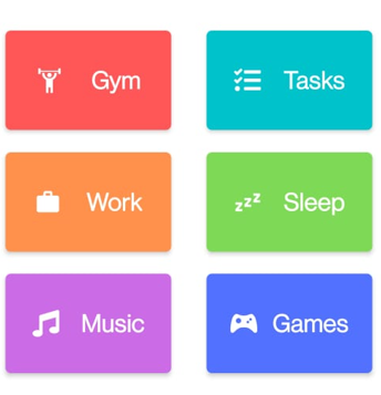
That looks great, doesn't it?

Border Radius on Icons and Buttons

Inside the components folder, create a new file called IconTray.js. Add the following code inside it:


import { Ionicons } from '@expo/vector-icons';
import { Entypo } from '@expo/vector-icons';
import {View} from 'react-native';
export default function IconTray({styles}){
    return(
        <View style={{...styles.flexRow,...styles.iconTray}}>
            <View style={styles.icon}>
                    <Ionicons name="settings" size={20} color="#545454" />
            </View>
            <View style={styles.icon}>
                    <Ionicons name="notifications" size={20} color="#545454" />
            </View>
            <View style={styles.icon}>
                    <Entypo name="edit" size={20} color="#545454" />
            </View>
        </View>
    )
}

We'll now render all our previously created components along with the IconTray component in our ProfileScreen.js file:


import { View, StyleSheet, Text } from "react-native";
import { TouchableOpacity } from "react-native";
import ActionCard from "./components/ActionCard";
import IconTray from "./components/IconTray";
import ProfilePicture from "./components/ProfilePicture";
import SearchInput from "./components/SearchInput";
const actionCards=[
    {title:'Gym',color:'#ff5757'},
    {title:'Tasks',color:'#00c2cb'},
    {title:'Work',color:'#ff914d'},
    {title:'Sleep',color:'#7ed957'},
    {title:'Music',color:'#cb6ce6'},
    {title:'Games',color:'#5271ff'}
]
export default function ProfileScreen(){
    return(
        <>
            <ProfilePicture/>
            <Text style={styles.text}>Siddhant Varma</Text>
            <IconTray styles={styles}/>
            <SearchInput/>
            <View style={styles.flexRow}>
                {
                    actionCards.map(action=><ActionCard key={action.title} action={action} />)
                }
            </View>
            <TouchableOpacity style={styles.button}>
                <Text style={{color:'white'}}>Logout</Text>
            </TouchableOpacity>
        </>
    )
}
const styles = StyleSheet.create({
    flexRow:{
        padding:10,
        display:'flex',
        flexDirection:'row',
        alignItems:'center',
        justifyContent:'space-around',
        maxWidth:400,
        flexWrap:'wrap',
        marginTop:20
    },
    iconTray:{
        maxWidth:400,
        justifyContent:'space-between',
        marginLeft:20
    },
    icon:{
        height:40,
        width:40,
        borderRadius:25,
        backgroundColor:'#F4F4F4',
        marginRight:20,
        display:'flex',
        alignItems:'center',
        justifyContent:'center'
    },
    text:{
        marginTop:15,
        fontSize:16,
        fontWeight:'400'
    },
    button:{
        marginTop:30,
        backgroundColor:'#545454',
        borderRadius:20,
        height:40,
        width:120,
        display:'flex',
        flexDirection:'row',
        alignItems:'center',
        justifyContent:'center'
    }
  });

Note that I have also added a logout button in the above UI with some border radius. Your entire profile screen UI should look like this:

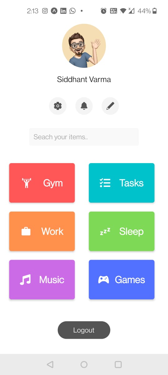
That looks fantastic, just like a real-world app, right? These subtle border radii will make your UI look more appealing to users.

Test Border Radius

Before we sign off, I want to show you a quick automated unit test that you can use for border radius. For this, we'll create a generic container component called RoundedContainer under RoundedContainer.js file inside the root directory:


import { View, StyleSheet } from "react-native";
export default function RoundedContainer({
    children,
    type='rounded',
    height=300,
    width=300
}){
    return(
        <View  style={{...styles.container,...styles[type],height:height,width:width}}>
            {children}
        </View>
    )
}
const styles = StyleSheet.create({
    container: {
      backgroundColor: '#f9f9f9',
    },
    rounded:{
        borderRadius: 10
    },
    circle:{
        borderRadius: 999
    }
  });

This container will take in a prop and add a style property to itself that will give it some border radius. Since we have a default prop as well, we intend this container to always have some border radius no matter the use case. We can use this container as a higher-order component for custom cards, modals, etc.

Now that the intention is clear, we'll set up Jest and React Test Rendered to write our unit test.

Set Up Jest and React Test Renderer

First install Jest and jest-expo by running the following:


expo install jest-expo jest

Then install React Test Rendered by running the following:


npm i react-test-renderer@17 --save-dev

Now update your project's package.json to accommodate the following changes:


"scripts": {
  ...
  "test": "jest"
},
"jest": {
  "preset": "jest-expo"
}

Great! We're all set up now.

Border Radius Unit Test

Next we'll create a file inside the root directory called RoundedContainer.test.js. This will have a simple test that checks if the RoundedContainer component has a border radius value greater than zero.


import React from 'react';
import renderer from 'react-test-renderer';
import RoundedContainer from './RoundedContainer';
describe('<RoundedContainer/>', () => {
  it('Has Border Radius', () => {
    const roundedContainer = renderer.create(<RoundedContainer/>).toJSON();
    expect(roundedContainer.props.style.borderRadius).toBeGreaterThan(0);
  });
});

Alright, now let's run this with the following command:


npm run test

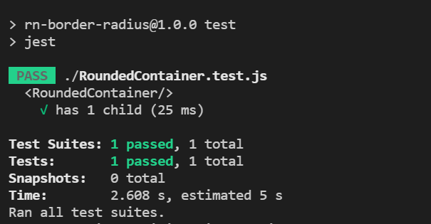
The test passes with flying colors!

If you want to have more fun testing your app and also test it directly in your browser against some airtight automated test cases, consider using the no-code testing tool Waldo. It's a script-free way to quickly build a comprehensive test suite without compromising on speed or quality.

For further reading, you can take a deeper dive into border radius here. Also, here's the link to the entire code for this tutorial if you wish to check it out and play around with it. See you next time.

Automated E2E tests for your mobile app

Waldo provides the best-in-class runtime for all your mobile testing needs.
Get true E2E testing in minutes, not months.

Reproduce, capture, and share bugs fast!

Waldo Sessions helps mobile teams reproduce bugs, while compiling detailed bug reports in real time.