- Auditory
- Cognitive
- Neurological
- Physical
- Speech
- Visual
In this post, we’ll focus on how to make React Native applications accessible for visually impaired users. We will cover all the necessary actions you can take to optimize your mobile applications to be more accessible.
What we’ll build
One of the most used parts of web pages and mobile applications in recent times are interactive parts, such as forms. These parts require your users to perform certain actions in your product, these actions will lead to more actions until the process is completed or terminated.
This is why I’ve decided to build a form for this demonstration. It will give us the experience of the visually impaired users when they interact with form fields or perform actions such as typing or clicking buttons.
You can go ahead and create a new React Native project, I will call mine accessible_demo. When you’re done, create a new form.js file in the projects root directly and render it in the App.js file like so:
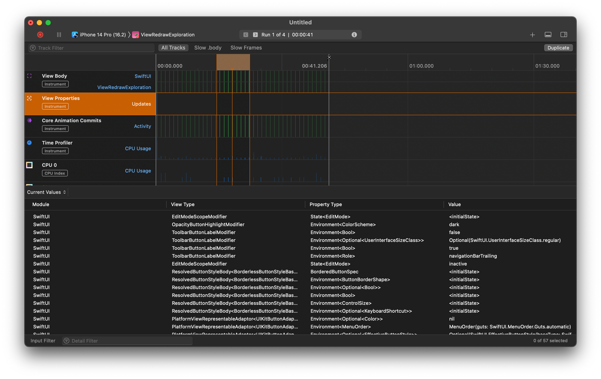
In the form.js file, create a sample form with 3 input fields and a submit button:
At this point, if you run the app, you should get the following output on your device or simulator.
While the form looks good and ready, the question is, is it accessible? Thinking in terms of accessibility requires that you consider all user groups in your design.
Since we are tasked with catering to visual accessibility in this tutorial, let’s test this form with the iOS VoiceOver tool to better understand it’s shortcomings (accessibility-wise) and optimize them.
Following through the VoiceOver, one might think that the form is still great. If you do feel that way, It’s probably because you can see the app properly. Now, try closing your eyes and interacting with the app, that’s someone else’s reality.
Issues with the form
- Enable accessibility
- Use Label instead of placeholder
- Font sizing
- Colors and contrast
- Focusable content
Enabling accessibility
In the latest version of React Native, the team introduced some very helpful accessibility properties that make it easier to build more accessible React Native apps. Let’s take a look at some of them:
- accessible — This is a property that makes React Native UI elements accessible by assistive technologies like screen readers when passed a true value.
- accessibilityLabel — This property is used to provide string descriptions for every UI element it is provided for. This is more like what placeholders do for you in HTML form fields.
- accessibilityHint — As the name implies, it is used to help users understand what will happen when they act on the accessibility element it is provided for.
There are a number of properties that can help you build more accessible React Native apps and you can find them and their definitions on the official documentation page.
Updating our existing form to use the accessible property, we’ll have:
I implore you to test the current implementation yourself with VoiceOver on iOS or TalkBack on Android to get a better understanding of the benefits the accessible property presents to users.
Use Label instead of placeholder
When you build your product for multilingual support, browsers and React Native compilers will auto-translate the content on your pages. Often they ignore the placeholder text leaving them untranslated for users, causing major problems.
Generally, unlike placeholders, accessibility labels are auto-translated along with other text on a page. Here’s how to use the accessibilityLabel instead of placeholders:
Font sizing
Certain eye conditions require that people significantly increase the text size on their mobile devices. If you don’t build your application to remain accessible at increased text sizes, it will break and become inaccessible for that category of users.
To ensure that we account for that possibility, let’s wrap the component in a ScrollView. Wrapping the root View in a ScrollView will ensure that when texts get overly large, they don’t spill offscreen.
Here, we wrapped the root <View> component with a <ScrollView> to ensure that all contents are scrollable and the display area can expand based on content length and width. You can also pass a horizontal prop to ScrollView to enable horizontal scrolling.
Colors and contrast
The general recommendation is to use a contrast ratio of 4.5 for small text or 3 for large text which is 24px or 18px bold. I recommend using the tool ColorSafe to generate accessibility friendly colors with safe contrast ratios for your products.
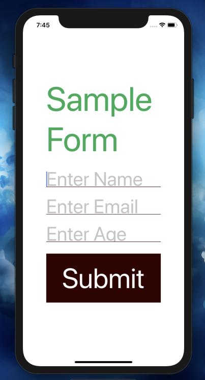
Using this tool, I’ve been able to understand that the contrast ratio of the text color I used for the form title to the white background is an alarming 18.05.
Note that for a large text of size (24px) the required contrast ratio is 3.0. As a result, the current form is not contrast friendly and will not be optimal for users with a color-vision deficiency.
This implies that using a more friendly color with at least a 3.0 contrast ratio will be best to accommodate all categories of users. The color #00aa55 on a white background will give a contrast ratio of 3.05 (according to ColorSafe) which is ideal for users with a color-vision deficiency.
Focusable content
Another accessibility issue remains. The form doesn’t focus on the next element after we’ve completed an interaction with the previous. At the moment, you will have to individually click on the different text input fields to focus on them.
Here’s how we can automatically focus on the next element using refs and state:
With the new implementation, we can directly focus on the next element immediately after completing the current one. This way, you reduce the number of times your users have to click around your form just to edit the fields.
Up next
In the next part of this series on React Native accessibility, we will take a look at other ways of optimizing React Native apps for accessibility.
Note that I did not include the styles for the form fields in this project to maintain simplicity, however, you can find the project source code on this repository for your use.
The concept of accessibility stems from the universal need to design and develop software, tools and technologies to accommodate every category of users. There’s a popular misconception that accessibility benefits only people with disabilities. This is not entirely true given that a good percentage of able people oftentimes have special needs for your products. For instance, a greater percentage of software developers would prefer to read product documentation or have their code editors run on a dark background. Accessibility is a broad concept that tends to improve the experiences of individuals with all forms of disabilities including:
Automated E2E tests for your mobile app
Get true E2E testing in minutes, not months.