


Welcome to our new “The basics of” series. In this series we’re going to tackle all the questions related to mobile design, mobile QA and testing. We’ll be looking at issues both big and small–nothing shall be overlooked.
(Psst! Make sure to subscribe to the blog in the menu on your right so you don’t miss the latest.)
Now, we’re gonna kick things off with one of the first and most crucial steps when it comes to mobile design and UX: the onboarding experience.
Let’s hit it.
What’s onboarding all about?
User onboarding for mobile is tough and that’s why we talk about it a lot. But it really can’t be stressed enough: The onboarding process is the make or break moment of your mobile app. Why? Because it’s when the user decides whether to abandon (and probably delete) your app or keep using it.
The purpose of the onboarding experience is to demonstrate the value of your app and get new users to engage with it. It often consists of a set of screens users interact with, which serves the purpose of setting the expectations for the app.
In a recent post, we looked at some intimidating figures when it comes to user expectations for mobile app onboarding. A study by Clutch revealed that nearly three-quarters (72%) of respondents thought the app onboarding process should take 60 seconds or less.
Eek.
As per usual, numbers don’t lie. Do you see a huge number of installations, but no one completes the onboarding process? Or maybe users even delete the app before finishing the signup process? Well, then your onboarding flow (and probably load time) isn’t quite up to par.
The goal of the onboarding experience
Onboarding isn’t necessary for every app. You need to take the time to evaluate whether your app needs it. And if it does, you have to determine the best way to design and implement one.
The goals of the onboarding experience are threefold:
- Get your users to complete the signup process
- Get your users to understand the value of your app
- Get your users to engage with your app
Sounds easy enough, doesn’t it? Then how come so many apps fail at first impression? The reason for failure, is also often threefold:
- The onboarding process is too long; apps ask for too much information
- The user experience is confusing; clunky UI, and bad visual aid
- The load time is too slow
Let’s take a look at the most common types of onboarding.
Three common types of onboarding
Normally, we see three different purposes behind onboarding. They are:
- Benefits-oriented onboarding does, as the name suggests, present the benefits (i.e. the value) of the app by communicating what the app does, how it helps the user in their daily life and what overall value that will provide.
- Function-oriented onboarding focuses on the app’s key functionality and informs the user what the key functionality is and when and how to use it in order to make the most of the app.
- Progressive onboarding is essentially “learning by doing.” As the user interacts with the app, they get helpful information. For example, if you’re in on your “My Account” screen, you’ll see a notification telling you to add your phone number.
Now, let’s take a look at a couple of examples of what mobile app onboarding experiences can look like.
The mobile app onboarding experience: Rayka and Mystro
Onboarding screens have become a common practice in mobile apps. These are meant to help new users complete registration and start engaging with the app.
Here, we’re going to take a closer look at the onboarding experience of two travel apps that have entered the scene fairly recently:
First up, Rayka.
Rayka – The onboarding experience
Rayka, the app that calls themselves “the world’s social recommendation platform for travel.” Allegedly, the cofounder is the youngest American to travel to every country in the world. So let’s see if the amount of planes he’s boarded translates to a great mobile onboarding experience.
Here’s what Rayka’s onboarding experience looks like.
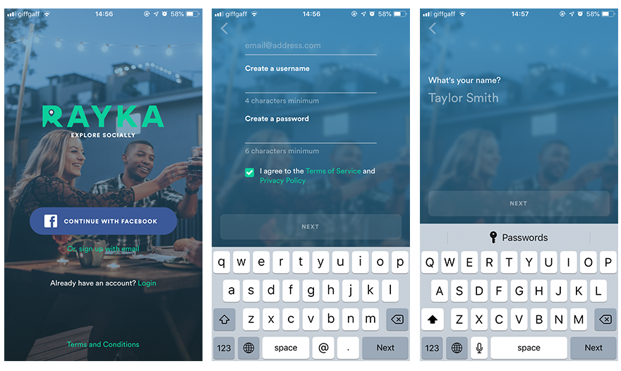
Screen 1: Rayka’s first screen gives off a nice and sleek impression and also manages to give off a certain “vibe” with their choice of background image. They’ve gone with two signup options: Facebook and email. An app which mission is to explore socially, it makes sense that they position Facebook as the preferred alternative to register. If we can nitpick, it would be great to have a reminder as to why you should sign up. Yes, you might have downloaded the app, that doesn’t necessarily mean you’ll feel strongly enough to actually complete the signup process. Value proposition reminders are always good, especially on the first screen.
Screen 2: Here, I opted for the email option (as I always do). The reason for this is twofold:
- I’m not very active on Facebook.
- I don’t trust what, when and how my information is shared.
Other than that, it’s a simple and straightforward screen asking for the bare minimum. Like!
Screen 3: On the following screen I’m asked for my name, which I’m assuming is to complete my profile.
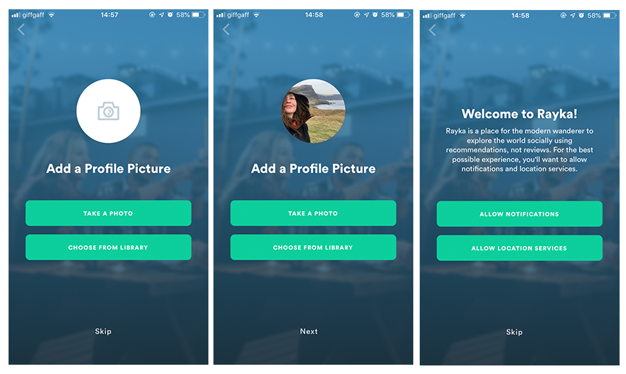
Screen 4 and 5: The next screen, I’m asked to add a profile picture. A step I’m also allowed to skip, which is always appreciated. It does however raise the question, if it’s an app you’re using to explore socially, wouldn’t profile completion be one of the most important aspects of the experience? That being said, I’ve trusted many a Yelp reviews without a profile pic. In this case, I chose to add one of my very windswept face to prove I’m part of the traveling community.
Screen 6: There it is! On screen six I’m seeing the value proposition I wanted to see on the first screen. I opted to allow location services, but I’m a “Zero notifications” kind of person, so I said no to that part.

Screen 7 and 8: The last step of the onboarding is to pick a group or an individual (or both) to follow. Naturally, I went with the Food Experts group. At this point, they’ve made a slightly awkward choice of copy for the CTA. “Take me to the app!” doesn’t quite make sense when you’re already in the app. Perhaps a CTA based on the groups or individuals you’ve chosen to follow would create a better narrative for the experience.
Screen 9: The last screen gives you a nice little summary of the functionality in order to prompt you to continue to use it after signup and onboarding is complete.
Rayka in summary
Rayka’s onboarding experience was overall quick and seamless. They asked for minimal information and you were allowed to skip tasks such as uploading your profile photo and follow groups and individuals. It’s clear that they’ve opted to keep the threshold low in order to allow for an increased signup completion rate.
Mystro – The onboarding experience
The team at Mystro has set out to build an app that makes it easy and fun to plan a trip. It’s collaborative planning with friends, but without the headache(s).
Here’s how Mystro’s onboarding experience compares against Rayka.

Screen 1-4: Mystro, just like in the example we saw for Trips.com, goes for a benefits-oriented onboarding starting out with making benefit one clear: Organize your trip. On the second screen, we immediately learn that this app should be used with others. The third screen however, is slightly confusing. “Take it with you.” Not sure what this prompt refers to, but surely they could have dug deeper for an option with more purpose.

Screen 5: On the following screen, the signup process begins. Here, the primary choice is completing it by using your email and choosing a password–which happens to be my favorite method. However, they do give you the option of using both Facebook and Google.
Screen 6 and 7: Aha! A step Rayka skipped–the account activation part. Emails (especially activate/confirm/complete emails) easily get lost in the inbox, so I can see why Rayka chose not to include it. But on the other hand, when the account has been activated, your user is likely to be more engaged with your app/brand.

Screen 8-11: Following account activation, they suggest you create your next trip. Your presented with a map, you type in your destination (in my case, Split, Croatia), and add your travel dates. But next (and rather surprisingly), you’re asked to complete your profile. Because without it, you can’t add travelers to your trip–not even yourself. Just like Rayka, Mystro’s profile setup is simple, just your name and a picture is enough.

Screens 12-14: Following profile completion, I can finish creating my first trip by entering a destination. During this process, Mystro, provides you with function-oriented tips. Here, you can get as elaborate as possible depending on what kind of traveller you are.
Mystro in summary
Mystro’s onboarding experience was overall quick, but definitely a bit more choppy than Rayka’s. While also asking for minimal information, being “thrown around” between tasks isn’t optimal. Like many social apps, Mystro relies on critical mass (aka your friends) to join, so perhaps it would make sense to incentivize inviting your pals. Because isn’t traveling about sharing experiences in the end?
The do’s and don’ts of designing an onboarding experience
A popular opinion in mobile design circles is that if your app needs onboarding, well then it’s simply flawed to begin with because it lacks the simplicity and user-friendliness mobile apps call for. But remember that every app is unique. And the need for onboarding is absolutely not a negative thing.
If you do opt for an onboarding process, here are our do’s and don’ts for designing a mobile app onboarding experience.
The do’s
- Have a clear focus and narrative
- Use value propositions throughout
- Incentivize users to complete onboarding
- Use progress indicators
- Make skipping possible
- Make the most of UX copy
The don’ts
- Add too many screens
- Ask for too much information
- Force users to complete tasks
- Ask users to complete too many tasks
- Use too many animations or visuals
Final thoughts
Designing a mobile app onboarding experience isn’t easy. It’s requires a lot of research, planning, and most importantly–testing. Just like any other endeavour, it’s a trial and error process where you need to analyze the data to understand when, why and where your users are abandoning tasks.
Always let behavioral data inform your design process and avoid saying, “Let’s do this, it worked for company X.” Your onboarding process should be tailored to your app, your brand and your users alone. Nothing else should be the guiding principle throughout the design process.
You never get a second chance to make a first impression, so make sure you set your app up for the success it deserves.
Whip your mobile app into shape with waldo (no code needed)
Want to make sure your onboarding experience doesn’t cost you signups, users and revenue? Make your mobile QA process quick, reliable and painless with waldo.
Try waldo today for free and start running all your tests in one place–without the need for code.
>>> Try waldo now
Automated E2E tests for your mobile app
Get true E2E testing in minutes, not months.

